


Course project
Archivo de Fotos - Proyecto en Progreso
by Edgar Mendez @emendez00
- 504
- 16
- 2
Muy buenos proyectos hay aqui! Gracias Adrian por la clase. Este es un proyecto personal en progreso que va tener continuidad pero queria tu opinion.
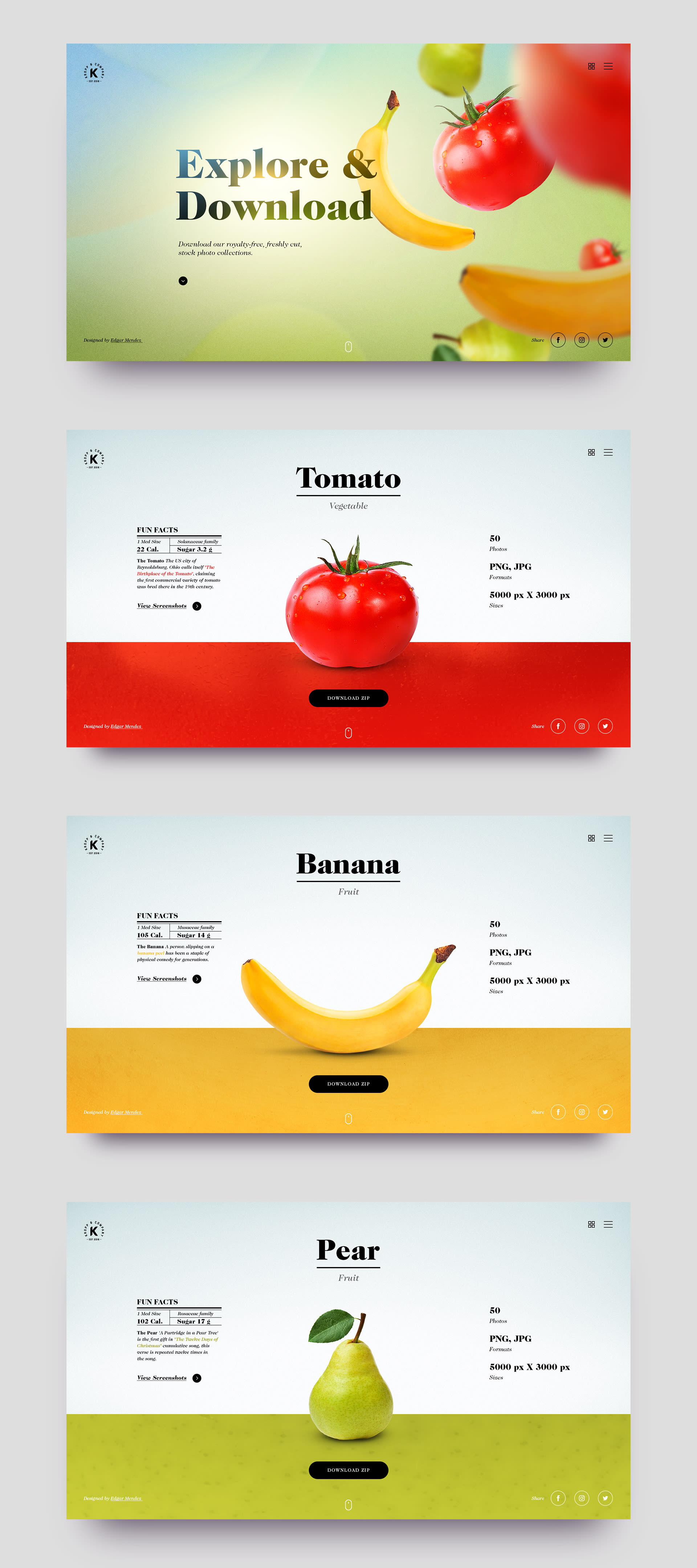
Esta pagina ofrece Stock Photography gratis de frutas y verduras. Al mismo tiempo dando datos de cultura relacionados al contenido. Por el momento use fotos stock para el concepto pero el objetivo es de tomar mis propias fotos. El Landing Page va tener animacion de la fruta cayendo. Espero crear esto usando Semplice si es posible.
Muchas gracias por todo! Aprendi mucho de esta clase. Saludos!
2 comments
adriansomoza
Teacher PlusHi Edgar!
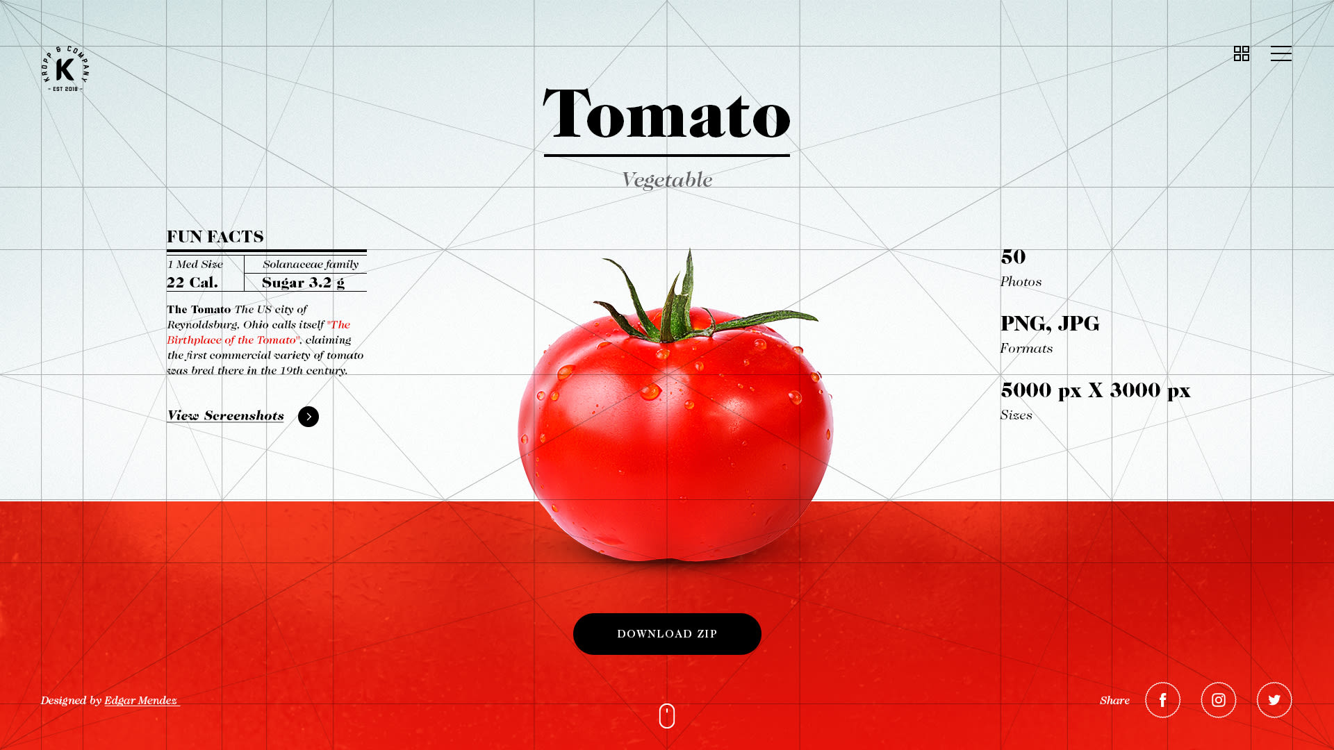
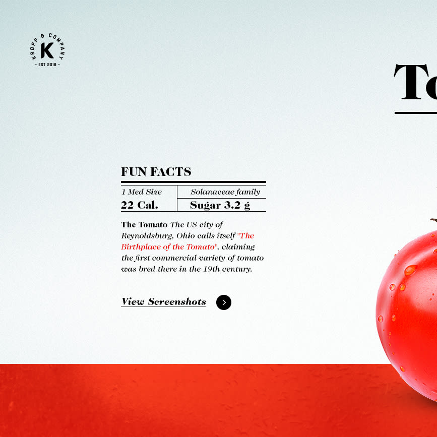
Here I appeared hehe. The project was very good, I thought the idea was fun too. I like how you created a lot of depth with big fruits out of focus and smaller fruits. The same with typography, you have very large and clear titles, and very small but legible text, and that generates a nice depth. You also used overlay with in the fruit view.
I would be missing you to tell me a little about the creative direction and art direction. How you made the decisions such as the typeface you chose, the colors, etc. When you can tell me a little more.
Some comments that come to mind without knowing much about your decisions:
- Between the landing and the rest of the fruit pages I feel that there is a bit of a visual disconnect. From the colors, the way in which the effect of the light treads on the title in the landing vs. the title of the fruit which is smooth black, etc. There I think you could try to see how to integrate the visual decisions so that the pages do not feel disconnected. Think of it as if it were a landscape, where there is a light that illuminates all objects and dyes them in the same tone, there are a series of elements of nature that are repeated, and even if for example you are looking at a forest and from afar you only see the tops of the pines, if you get closer you will continue to see the pines, only in greater detail. I don't know if I explain myself haha anything you tell me.
- The size of the main title also changes from the landing to the detail pages. But the change is very subtle. I would question if that change is necessary, because I can't finish reading a clear intention, but with my eye I realize that there is a change.
- The texts, icons, logo, and buttons of the menu have a dark color from moments, and light from moments. I would define one of the two and keep it the same everywhere. Because this way you visually connect everything that is information / navigation. I think that black is usually read as being further away, and white as being closer, so having elements in black and others in white, all at the same level, makes me wonder what you wanted to achieve by changing the colors, because some are sometimes further behind than others, and what it depends on.
- I think that just as in the landing you generated a dynamic composition by aligning the elements to the left, you could do the same in the detail pages, which now have a rather symmetric / static composition.
- I wonder why on the landing there are fruits falling, which generates a lot of dynamism, and on the detail page the fruits are supported, there is only one, and it is still. This was on purpose? What was your intention
Returned, very good in general, very good contrasts with the typography, and I highlight the times you aligned to the left which were quite a few, because it seems to me that those instances generate a lot of visual interest and generate a nice visual journey.
Hug!
See original
Hide original
emendez00
Adrian! Hey, thanks for the comments. You are right that there is a disconnect between the landing and the other pages. I will have to revisit the landing page or maybe the inner pages.
The art direction was to have the UI black and white to make the colors stand out and to have the fruit as if it were on a presented table. The typeface was inspired by elegant restaurant combined with the labels that we look at in the markets where it has the information on nutrition. As if it were a fancy label.
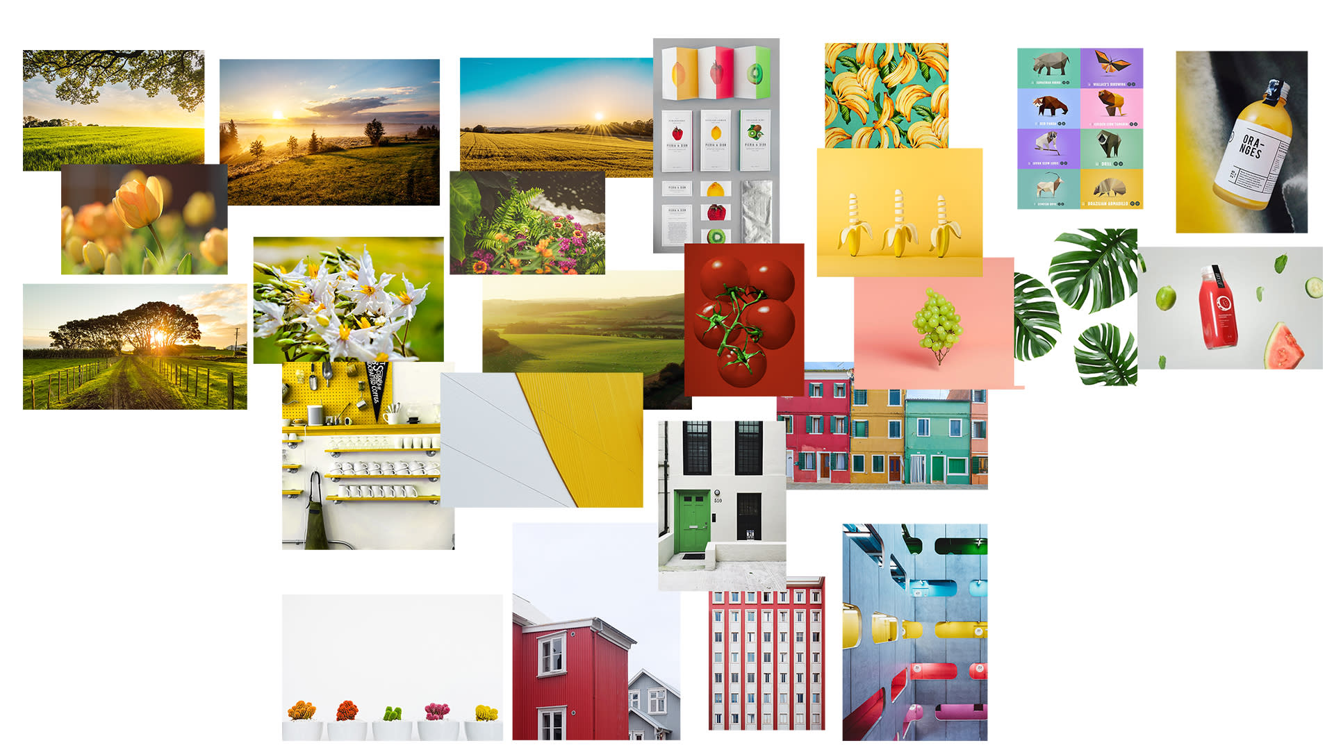
For the landing, I deviated and took inspiration from a landscape (look at moodboard). Using the concept of "Download" I wanted to put fruit falling. I'll have to check and see what direction to take.
Thanks a lot! This helps me vastly. Greetings.
See original
Hide original
Log in or join for Free to comment