


Course project
Vía crucis Iztapalapa
by patricia garcia @nexus_disenoografico
- 172
- 4
- 3
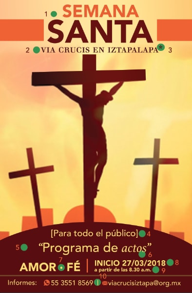
1. Se aplico como título "Negrita"
2. Subtítulo una "Versalita"
3. Aplicación de "Llamada en el texto"
4. Corchete
5. Comillas altas
6. Cursiva o itálica
7. Bala
8. Barra inclinada
9. Horas, minutes
10. Pleca

3 comments
nexus_disenoografico
Hello Raquel, I would like you to give me your comments and to be able to improve my work. Thanks greetings.
See original
Hide original
Lalolagráfica
Teacher PlusHello @nexus_disenoografico :
There are some inaccuracies in your poster. The use of bold and small caps is not enough for me because you have not used it for typographic purposes, only for aesthetic purposes. This exercise is useful because it is about using typography to communicate something that has a linguistic background. There are missing accents on the poster (Via crucis) and others are left over (for example, the word 'Faith' should not be marked with an accent). On the other hand there are words that are in italics that I do not see sense being written in italics, for example _actos_. Dates are fine, hours are fine, brackets are fine, but you should correct these details.
a greeting
See original
Hide original
nexus_disenoografico
Thank you very much Raquel! I will make the observed adjustments.
See original
Hide original
Log in or join for Free to comment