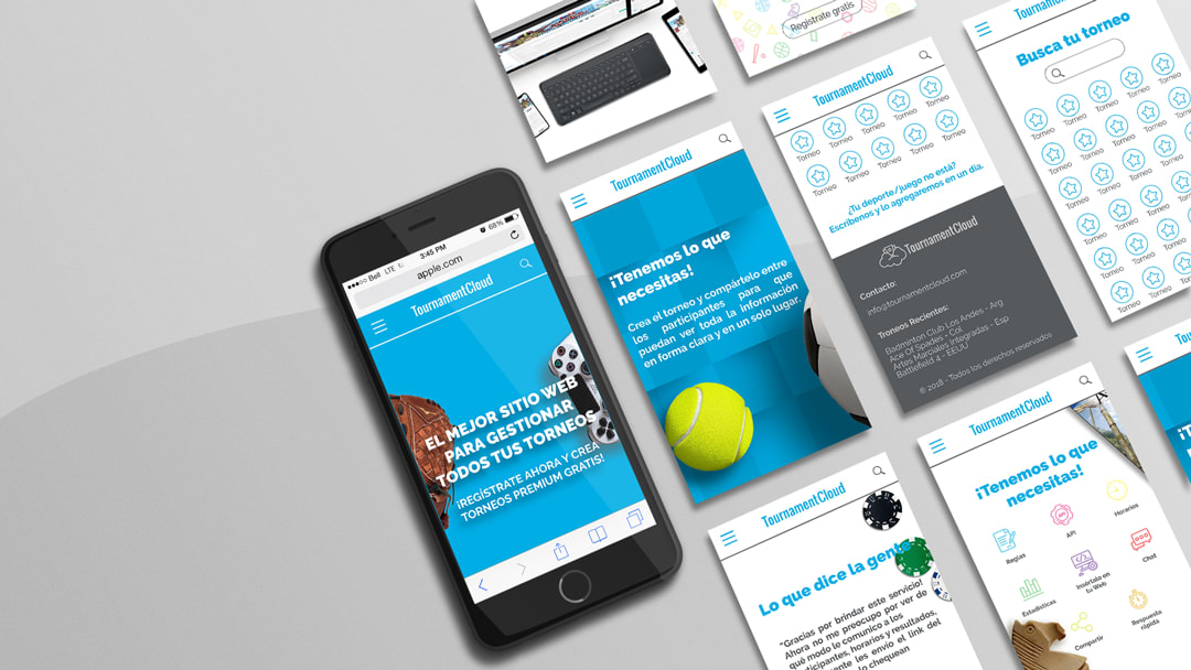
The idea is good. But I need to see a little more of the landing page, the photo of the laptop mockup is not able to distinguish what it says. As for the Art Direction, I like that you used objects that refer to games. Perhaps in general I see the design very loaded with patterns, textures, objects, shadows, and little negative space to give hierarchy to the composition.
On the other hand, I would like you to tell me a little about the project, the decisions you made and the intention with each decision. To correct you accordingly, I would need to assess what your goal was with each aesthetic decision, in order to give you a feedback on whether the intention is visually clear or not, and perhaps ideas to improve it.


1 comment
adriansomoza
Teacher PlusHi, Pablo!
The idea is good. But I need to see a little more of the landing page, the photo of the laptop mockup is not able to distinguish what it says. As for the Art Direction, I like that you used objects that refer to games. Perhaps in general I see the design very loaded with patterns, textures, objects, shadows, and little negative space to give hierarchy to the composition.
On the other hand, I would like you to tell me a little about the project, the decisions you made and the intention with each decision. To correct you accordingly, I would need to assess what your goal was with each aesthetic decision, in order to give you a feedback on whether the intention is visually clear or not, and perhaps ideas to improve it.
Cheers!
See original
Hide original
Log in or join for Free to comment