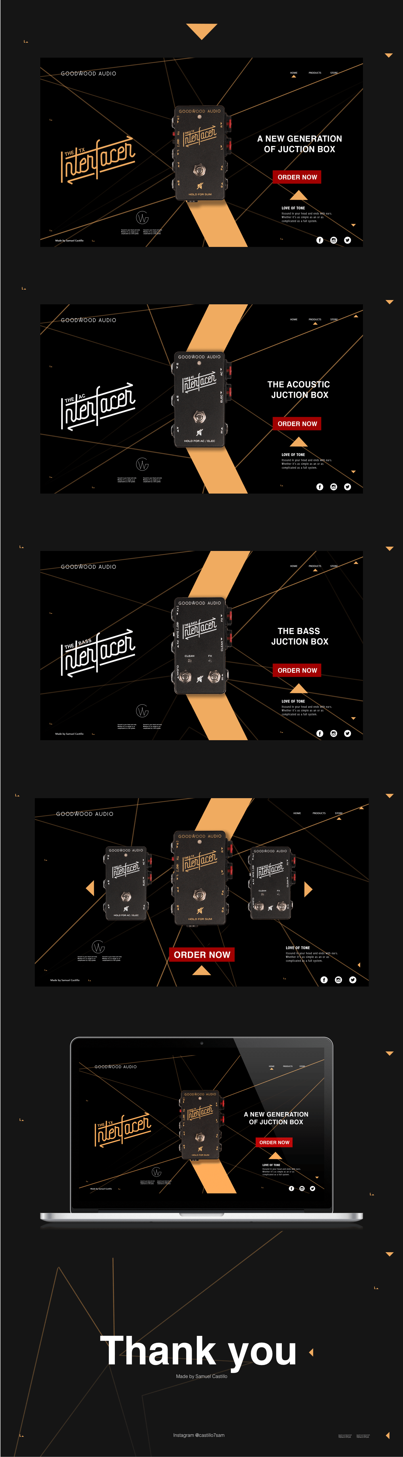
From what I see and talk personally, I like how you made graphic decisions based on the product itself. The bottom lines add a lot of pizzazz to the composition, but perhaps they are a little overbearing and take the focus off the product. I would try to use them in a way that they don't compete so much with the product itself. I don't know how much the large logo adds to me because I already have it on the product, and I also think that it is taking the pedal off the mark. And another idea is that the title, the CTA, and the text below (the part on the right), you could align them all to a single axis and that would help a lot to neatness and improve reading.


1 comment
adriansomoza
Teacher PlusHi bro!
From what I see and talk personally, I like how you made graphic decisions based on the product itself. The bottom lines add a lot of pizzazz to the composition, but perhaps they are a little overbearing and take the focus off the product. I would try to use them in a way that they don't compete so much with the product itself. I don't know how much the large logo adds to me because I already have it on the product, and I also think that it is taking the pedal off the mark. And another idea is that the title, the CTA, and the text below (the part on the right), you could align them all to a single axis and that would help a lot to neatness and improve reading.
Hug!
See original
Hide original
Log in or join for Free to comment