


TP Duro
by Wete @wete
- 667
- 10
- 1
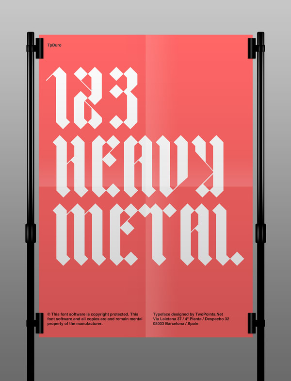
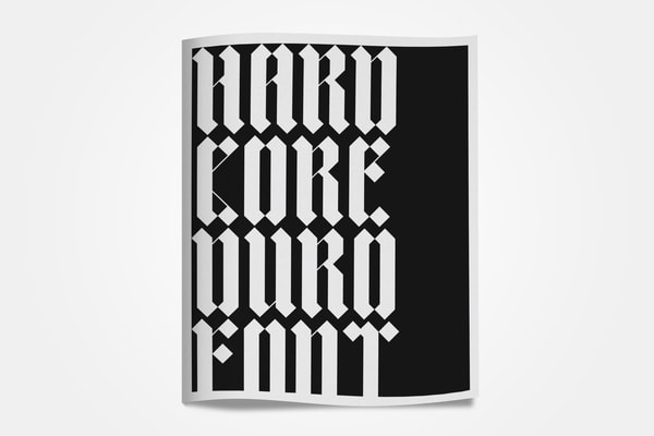
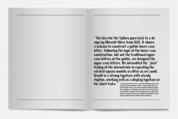
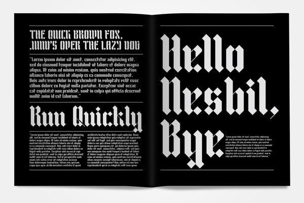
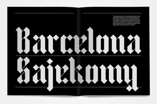
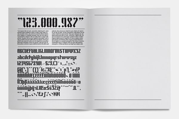
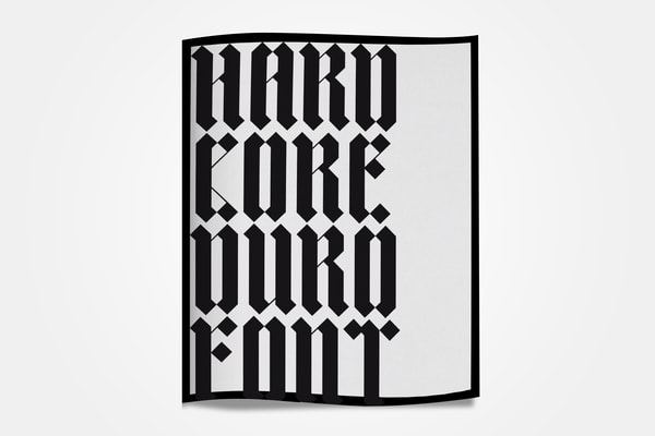
The idea for the TpDuro goes back to a design by Albrecht Dürer from 1525. It shows a schema to construct a gothic lower case letter. Following the logic of the lower case construction, but not the traditional upper case letters of the gothic, we designed the upper case letters. We intensified the "pixel" feeling of the downstroke in repeating the rotated square module as often as we could. Result is a strong typeface with steady rhythm, working well as a display typeface or for short texts.
TwoPoints.Net


1 comment
Ana Villalba
Good job. !! Congratulations!!
See original
Hide original
Log in or join for Free to comment