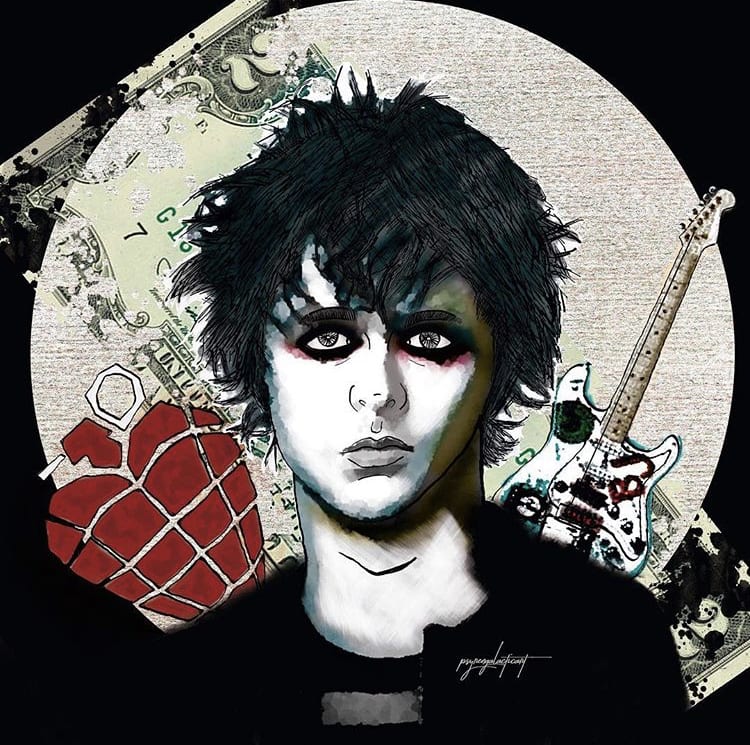
Hi Paola, good job! I tell you some things that I see:
- I do not appreciate the second layer of shading well. It looks like you've used another filter.
- The hair wouldn't have made it so streaky. I would have drawn it in strokes.
- I like the background but the guitar would have made it a bit bigger and used a different texture for the circle.
I hope it serves you and that you have enjoyed the course!
I liked the course but I also have some points that I wanted to tell you. -The brush settings for the path never appeared to me as it was seen in the classes. -The point of contrasts should be more explained for people who do not know about photography, I mean that you do not know when the photo is very white.
@oscargimenez
Hi from @psyren_galactic , glad you liked it. Regarding what you tell me:
- In the forum I gave you my brush configuration (which was different from yours) so that you could modify it. Among other things, you had the dispersion effect activated. Did you make the changes to see if it improved?
- I also have no idea of photography, I contrast each photo as best I can and if I see that it is not quite right when applying the filter, I take a step back, repeat the contrast and apply the filter again, like this until it looks good.
Anyway, if I remember correctly, I did the steps with your original photo to guide you. Didn't it work for you?
Next time do not hesitate to insist that I explain more if you think that everything is not clear enough. I am very active in the course forums, as you may already know.
If you want to do a new project to polish the technique and that I advise you in the forum step by step, do not hesitate, I will be there;)
Greetings.


3 comments
oscargimenez
Staff PlusHi Paola, good job! I tell you some things that I see:
- I do not appreciate the second layer of shading well. It looks like you've used another filter.
- The hair wouldn't have made it so streaky. I would have drawn it in strokes.
- I like the background but the guitar would have made it a bit bigger and used a different texture for the circle.
I hope it serves you and that you have enjoyed the course!
See original
Hide original
psyren_galactic
I liked the course but I also have some points that I wanted to tell you. -The brush settings for the path never appeared to me as it was seen in the classes. -The point of contrasts should be more explained for people who do not know about photography, I mean that you do not know when the photo is very white.
@oscargimenez
See original
Hide original
oscargimenez
Staff PlusHi from @psyren_galactic , glad you liked it. Regarding what you tell me:
- In the forum I gave you my brush configuration (which was different from yours) so that you could modify it. Among other things, you had the dispersion effect activated. Did you make the changes to see if it improved?
- I also have no idea of photography, I contrast each photo as best I can and if I see that it is not quite right when applying the filter, I take a step back, repeat the contrast and apply the filter again, like this until it looks good.
Anyway, if I remember correctly, I did the steps with your original photo to guide you. Didn't it work for you?
Next time do not hesitate to insist that I explain more if you think that everything is not clear enough. I am very active in the course forums, as you may already know.
If you want to do a new project to polish the technique and that I advise you in the forum step by step, do not hesitate, I will be there;)
Greetings.
See original
Hide original
Log in or join for Free to comment