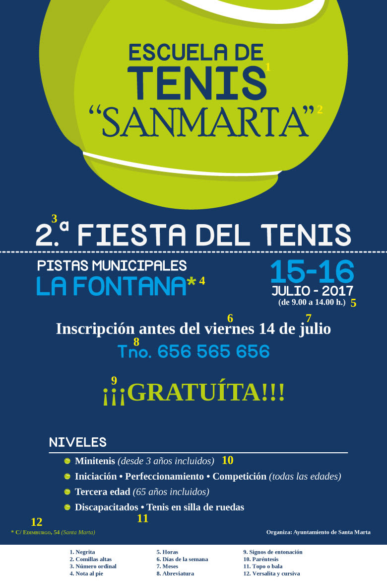
As you can see, it is more difficult to make the poster than the exercises since when we start writing, we have a thousand doubts. I see some errors and an abuse of italics on this poster and some glitches.
1. SANTA MARTA: should not be in quotation marks.
2. TNO. Telephone abbreviations can be: tel .; phone; phone, but not phone.
3. FREE does not have an accent mark.
4. From 3 years included, all ages, 65 years included it could not be in italics. It's already in parentheses, I think it's diacritical enough.
5. Initiation · Improvement · Competition
This use of the midpoint is a bit questionable by him (all ages). The midpoint is used to separate individual words and in this case it is not so recommended. If you use it as I do (regardless of all ages in that same line), it is more correct.
Good night Raquel.
Thank you very much for the corrections and I thought it was almost perfect;).
From what I see in my daily work I make a lot of these mistakes.
The truth is that it is difficult to discern between the correct and the aesthetic.


2 comments
Lalolagráfica
Teacher PlusThere, I go, @javitiuno :
As you can see, it is more difficult to make the poster than the exercises since when we start writing, we have a thousand doubts. I see some errors and an abuse of italics on this poster and some glitches.
1. SANTA MARTA: should not be in quotation marks.
2. TNO. Telephone abbreviations can be: tel .; phone; phone, but not phone.
3. FREE does not have an accent mark.
4. From 3 years included, all ages, 65 years included it could not be in italics. It's already in parentheses, I think it's diacritical enough.
5. Initiation · Improvement · Competition
This use of the midpoint is a bit questionable by him (all ages). The midpoint is used to separate individual words and in this case it is not so recommended. If you use it as I do (regardless of all ages in that same line), it is more correct.
Cheers!
See original
Hide original
javitiuno
Good night Raquel.
Thank you very much for the corrections and I thought it was almost perfect;).
From what I see in my daily work I make a lot of these mistakes.
The truth is that it is difficult to discern between the correct and the aesthetic.
a greeting
See original
Hide original
Log in or join for Free to comment