


Course project
Proyecto final: Sal de Plata.
by Alberto López @eque_lopez
- 331
- 7
- 4
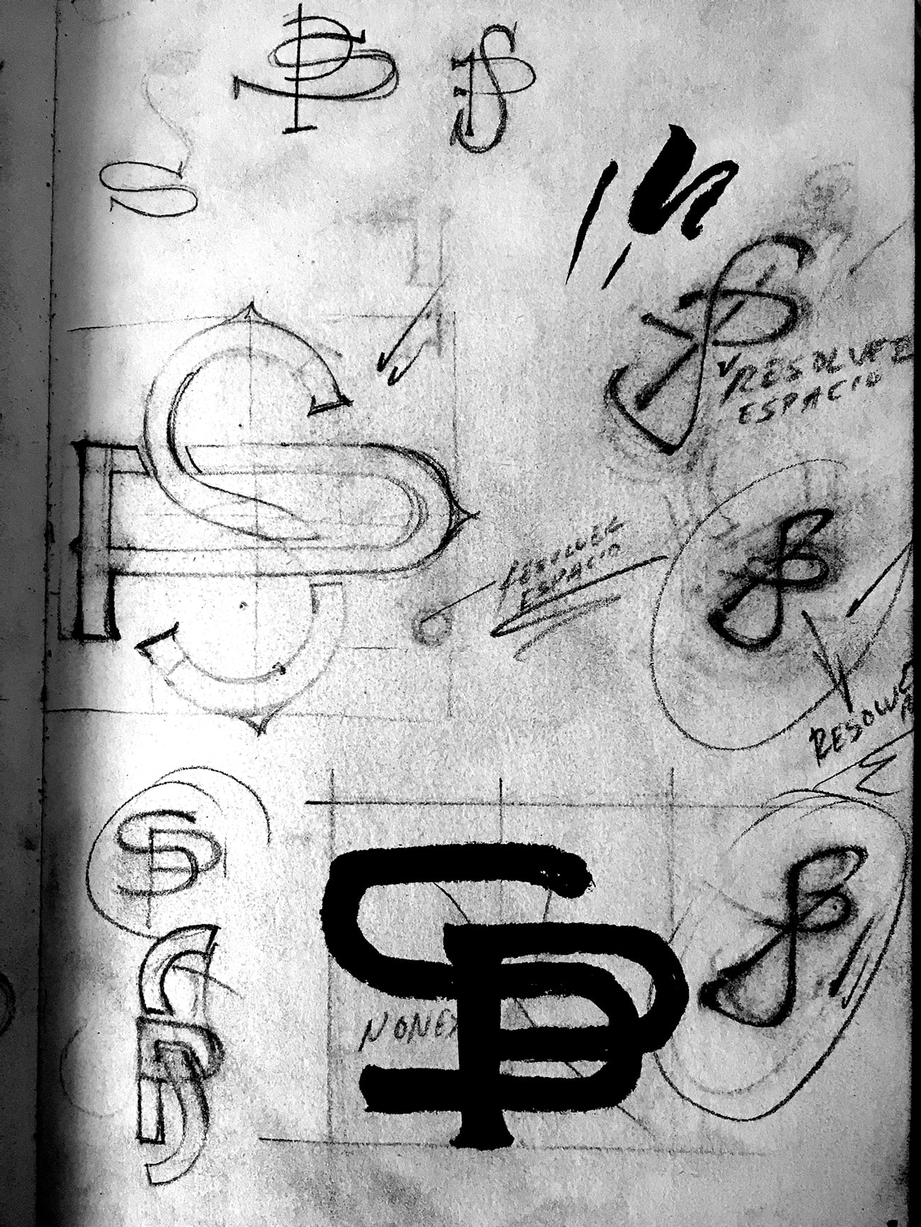
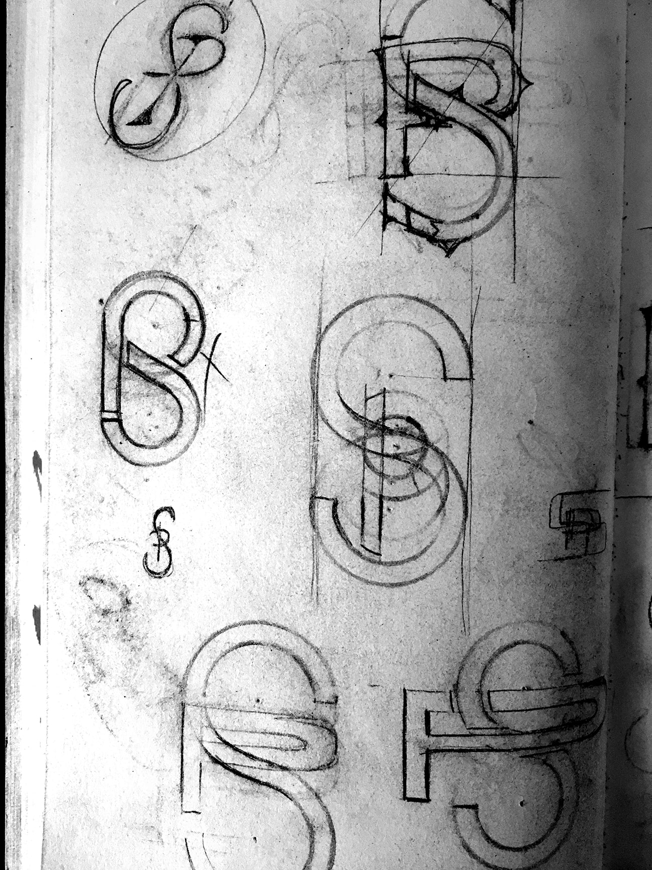
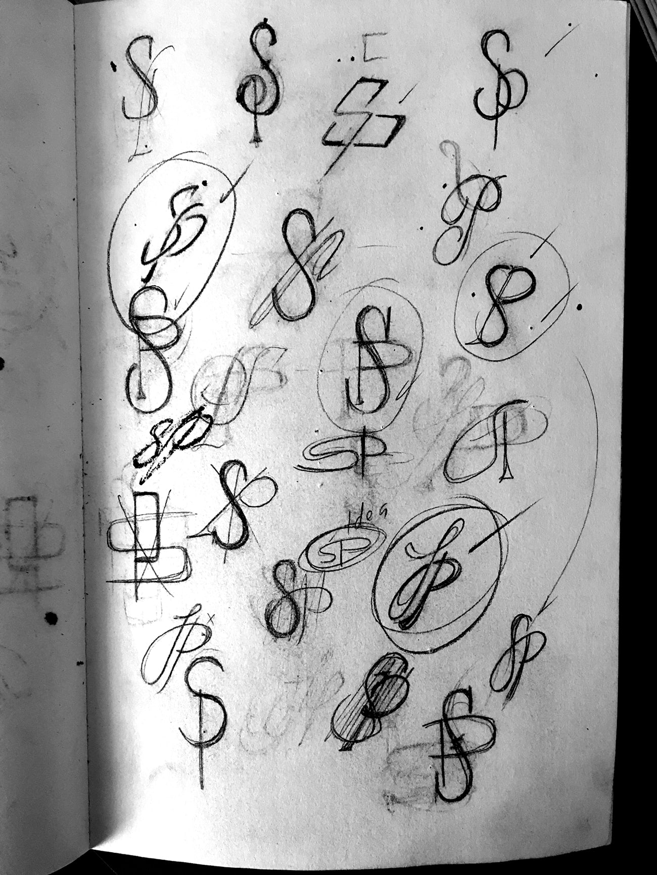
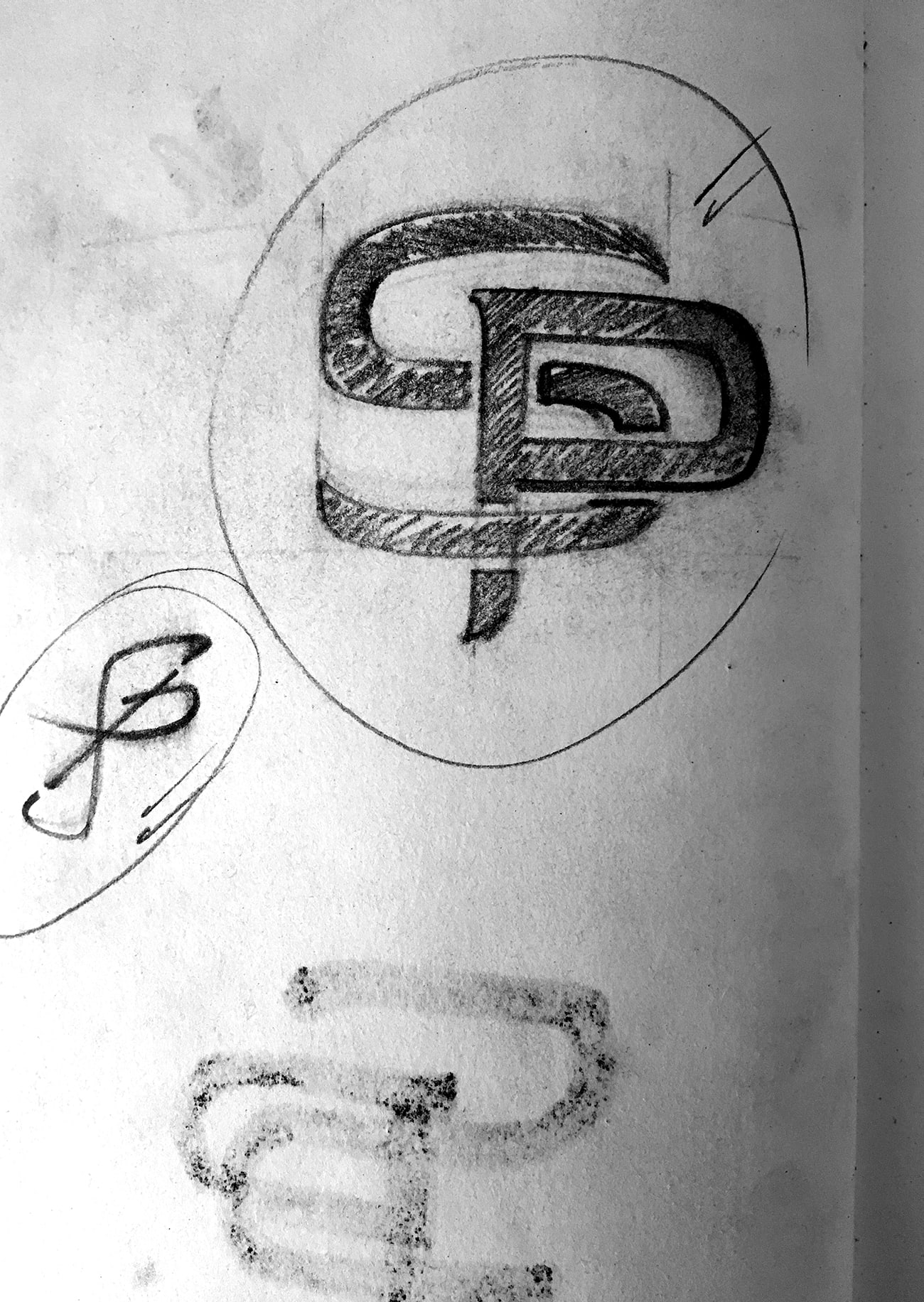
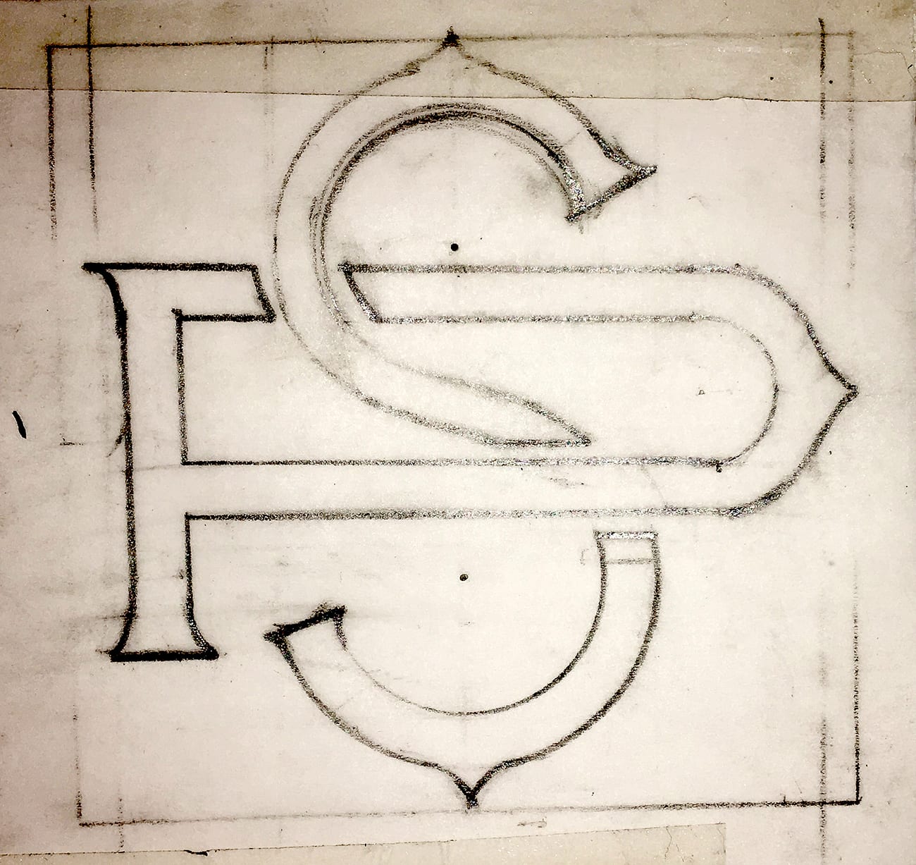
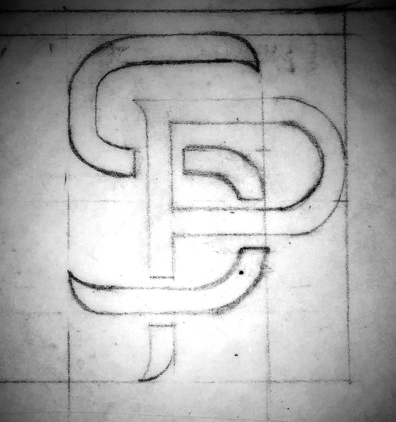
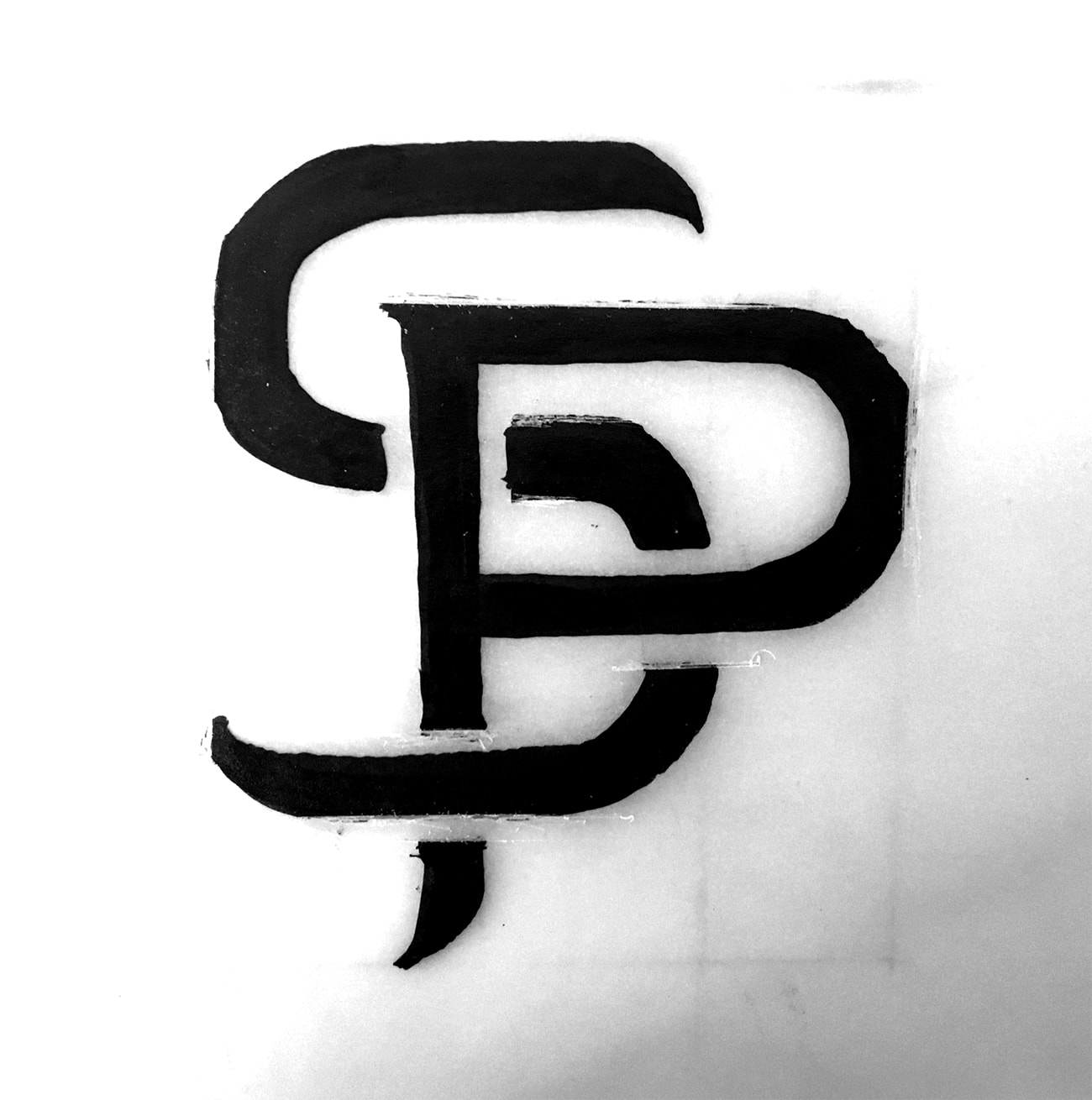
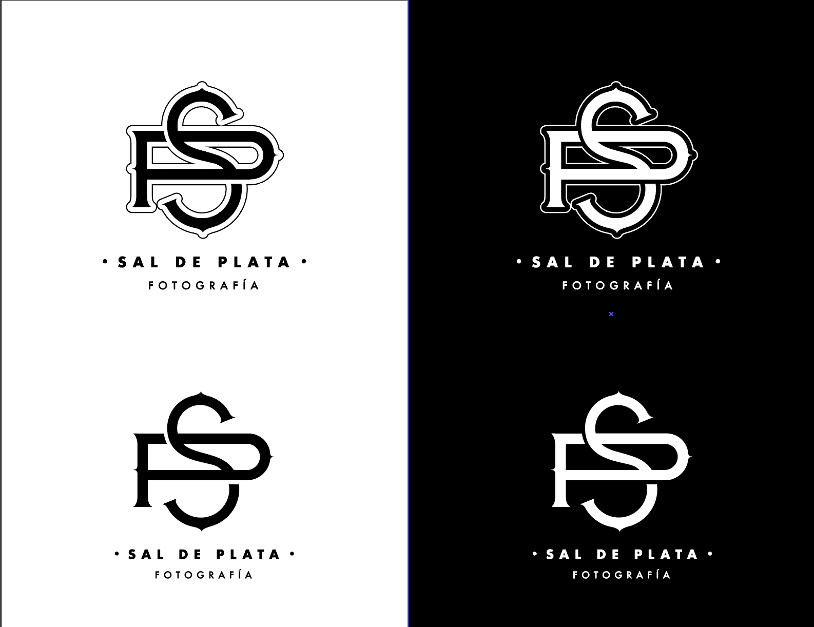
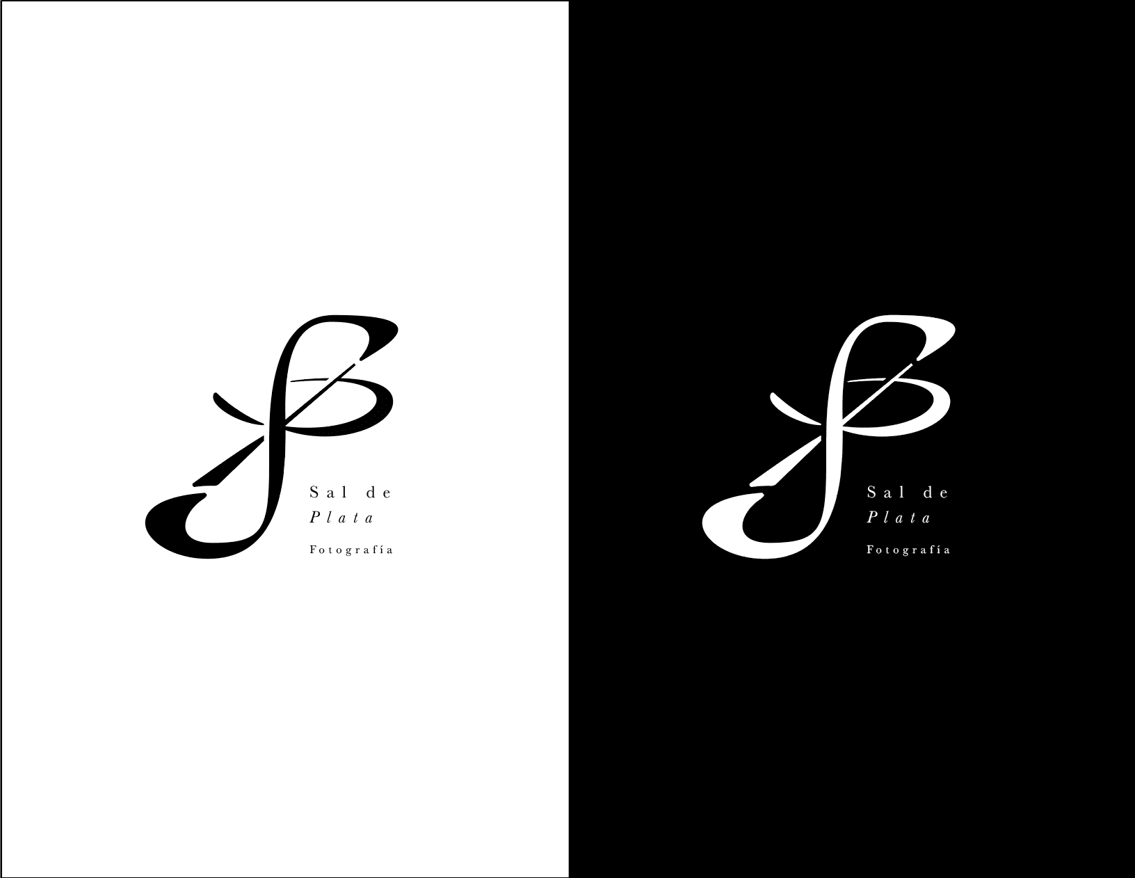
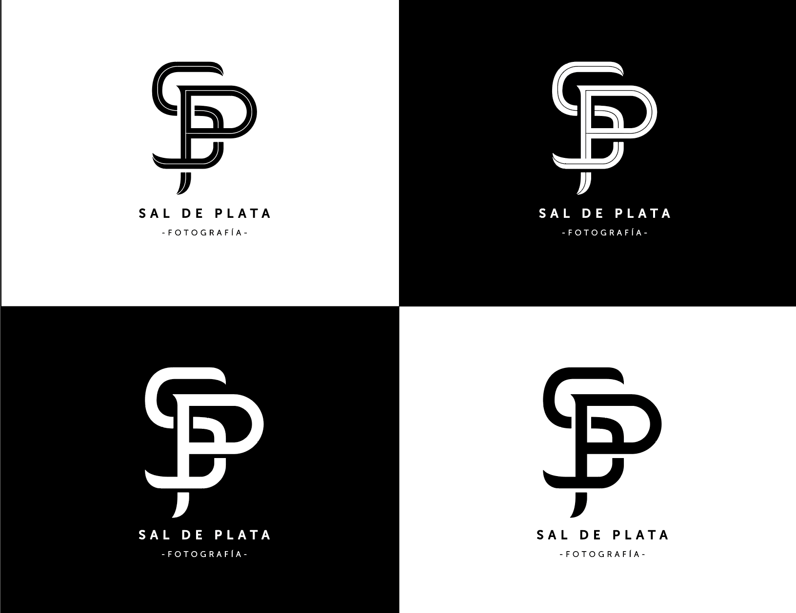
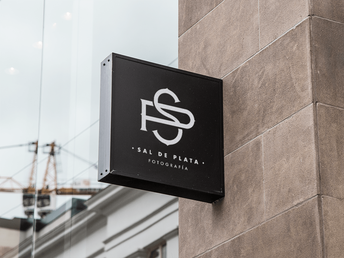
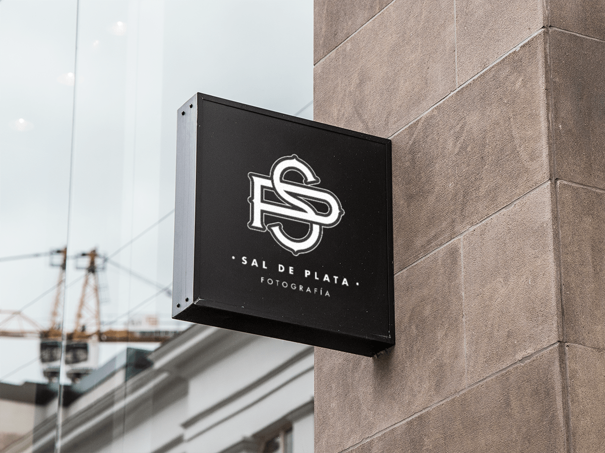
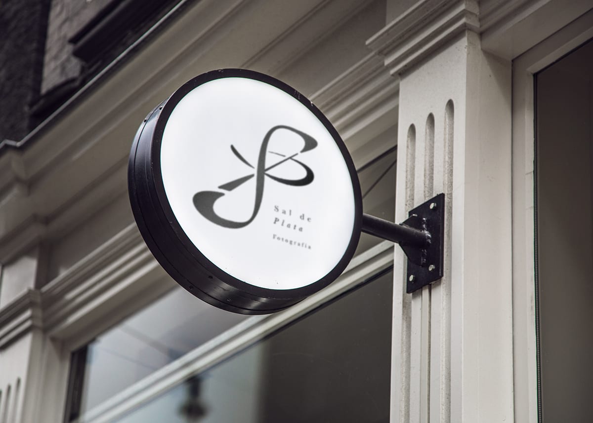
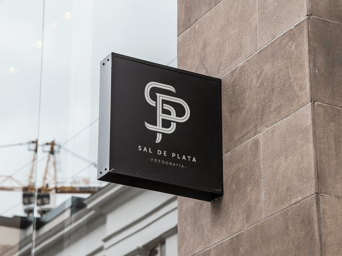
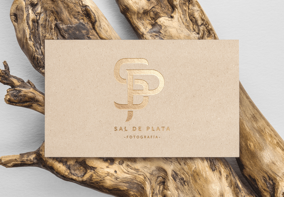
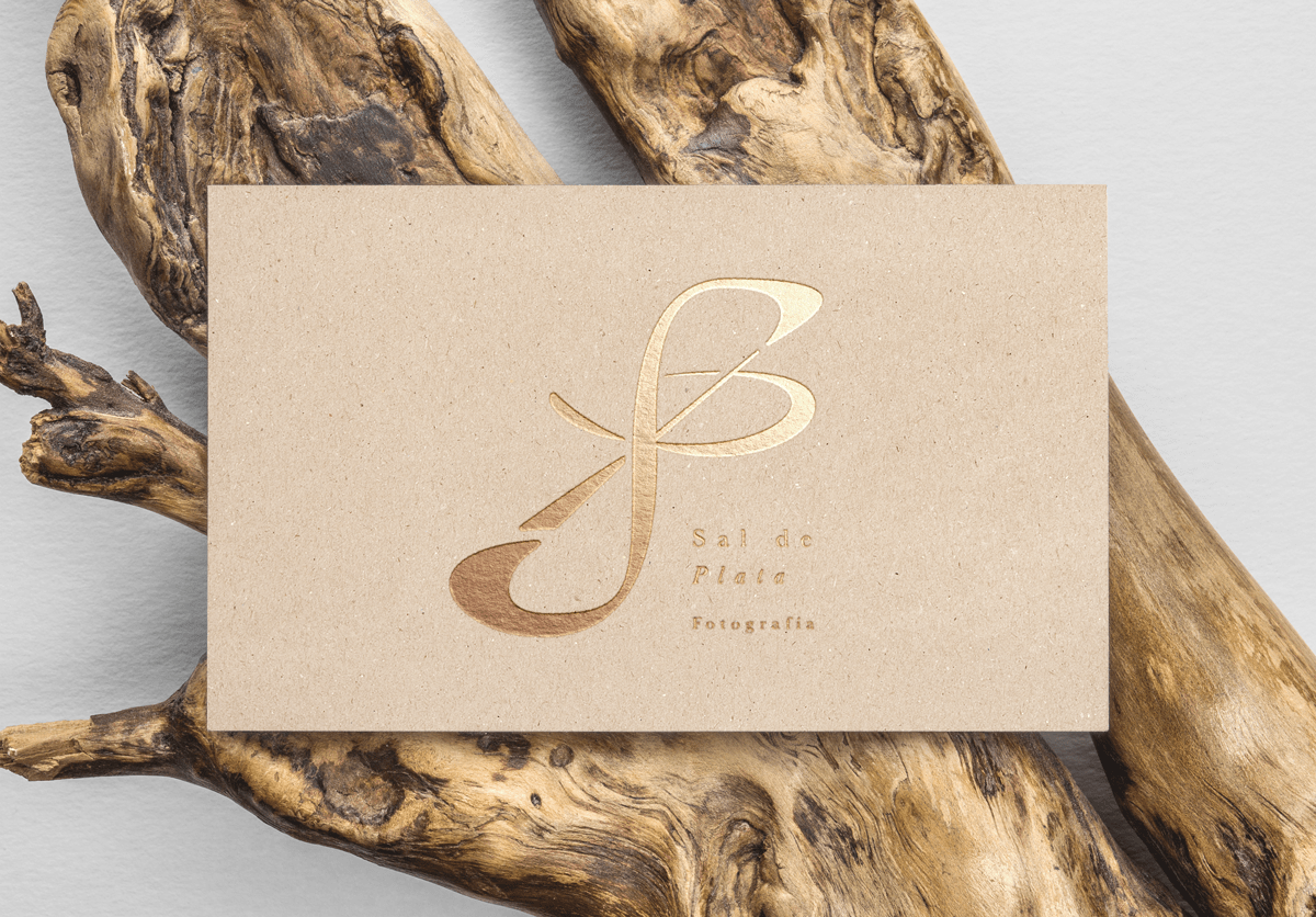
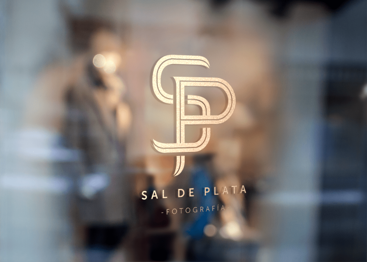
Sal de Plata es un estudio de fotógrafos localizados en Chihuahua, México y que me comisionaron la realización de su identidad por medios tipográficos. Tomé este curso pensando en expandir mis habilidades al respecto y creo que el resultado funciona a la perfección; ellos buscaban un logotipo formal y elegante, por lo que el uso de un monograma queda bastante bien para lograrlo. Aquí el proceso que seguí y el resultado aplicado en materiales publicitarios. ¡Espero les guste!


4 comments
osvaldo_juarez_r
I like the third proposal it is well understood, at the first impression :)
See original
Hide original
eque_lopez
It is precisely the one they have chosen @osvaldo_juarez_r ... thanks for the comment!
See original
Hide original
roxananunezkamargo
I liked the second, only not so much for photography and the third is fine and I think that the S at the top should be above, then below (as is) and finally above (as is).
This is how Meave explained it.
See original
Hide original
eque_lopez
Thank you very much for the feedback @roxananunezkamargo !
See original
Hide original
Log in or join for Free to comment