


Crematorio
by Barfutura @barfutura
- 2297
- 16
- 16
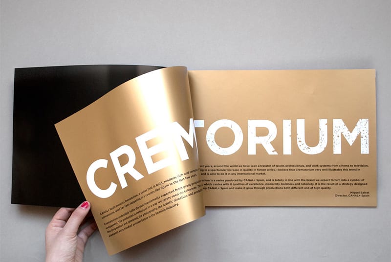
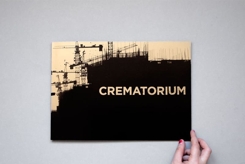
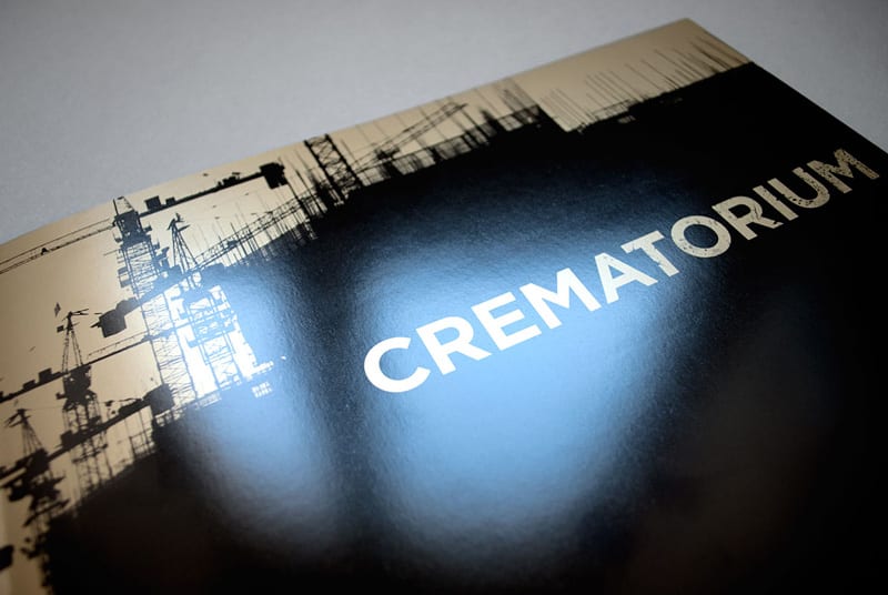
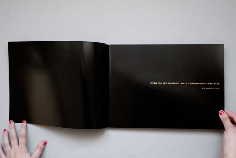
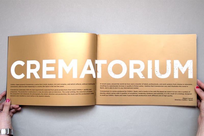
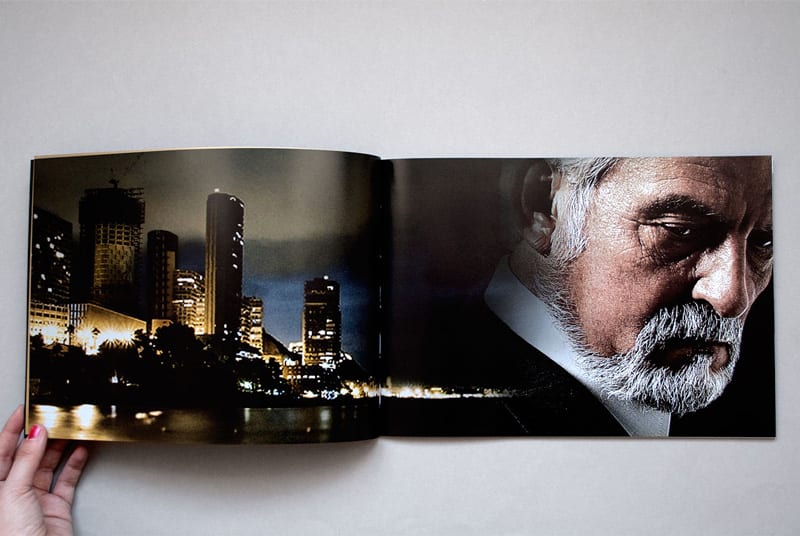
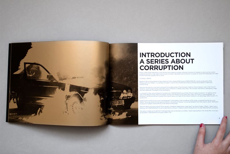
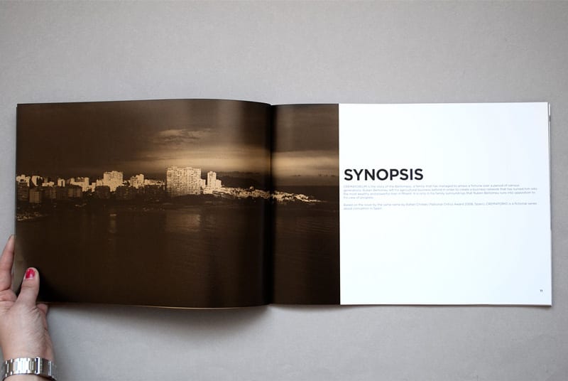
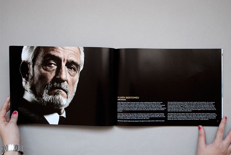
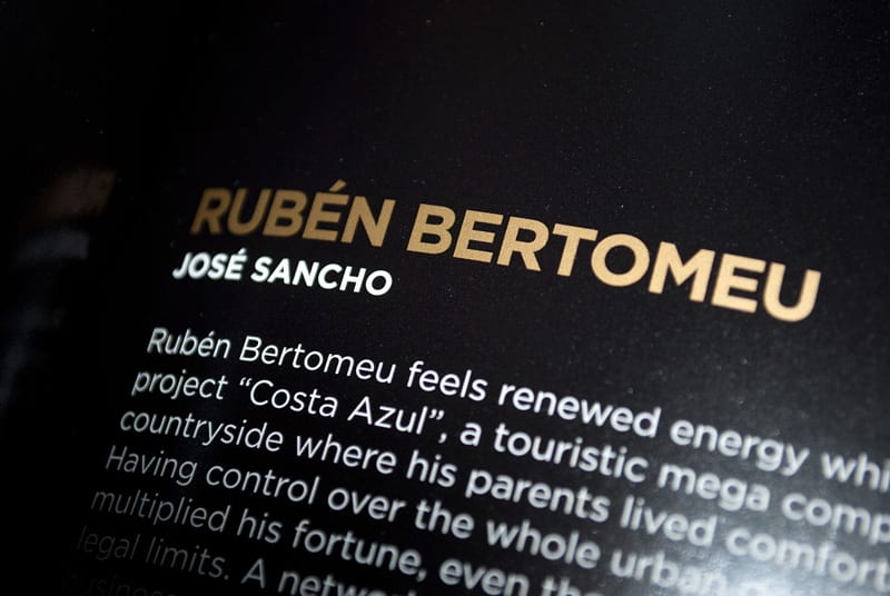
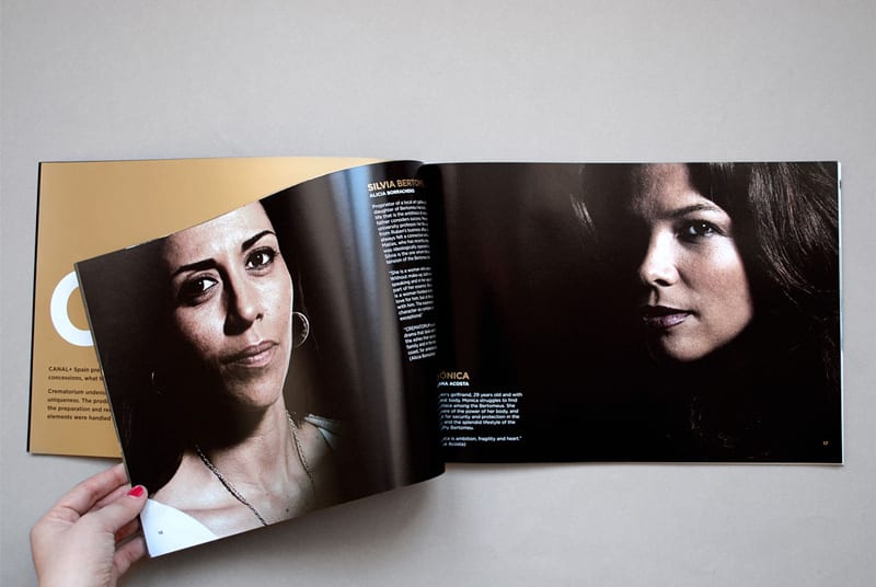
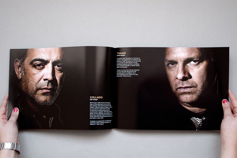
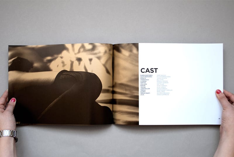
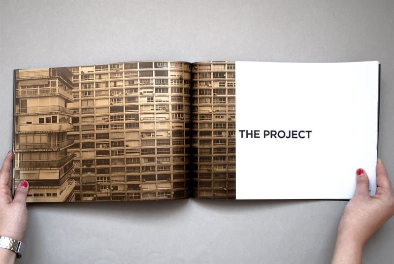
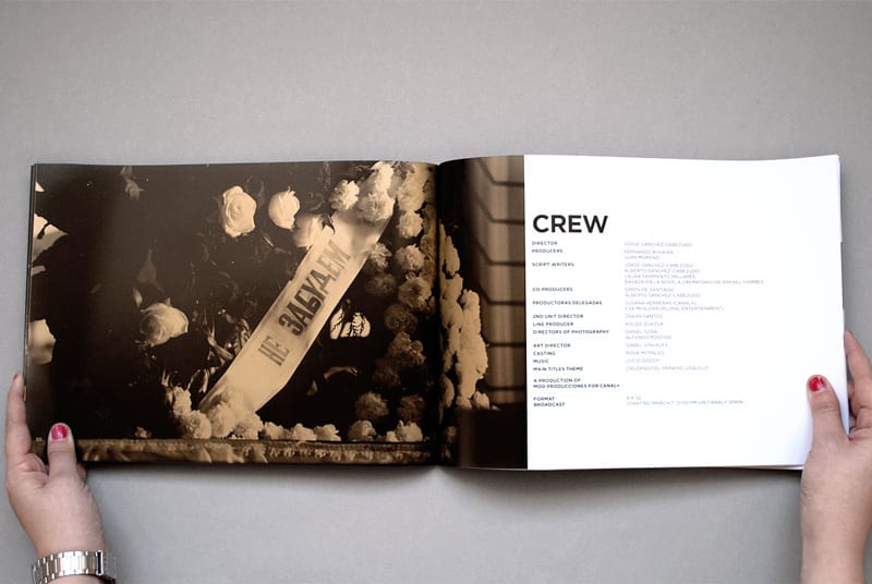
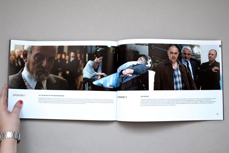
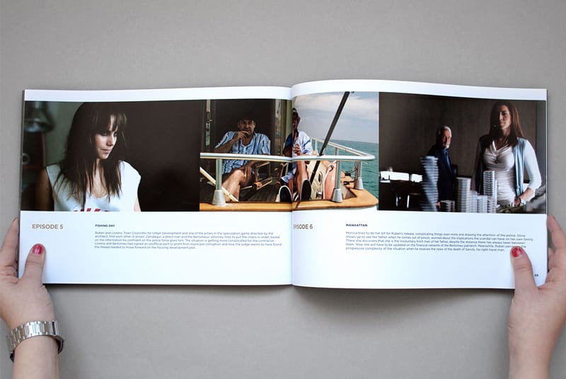
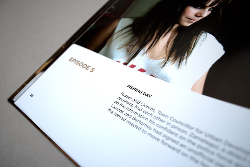
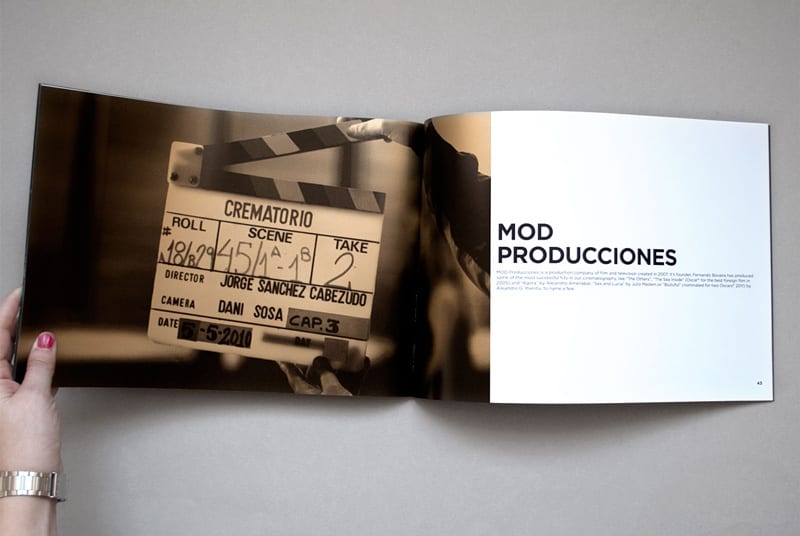
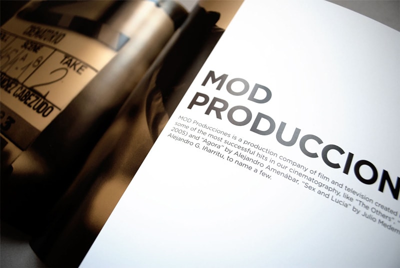
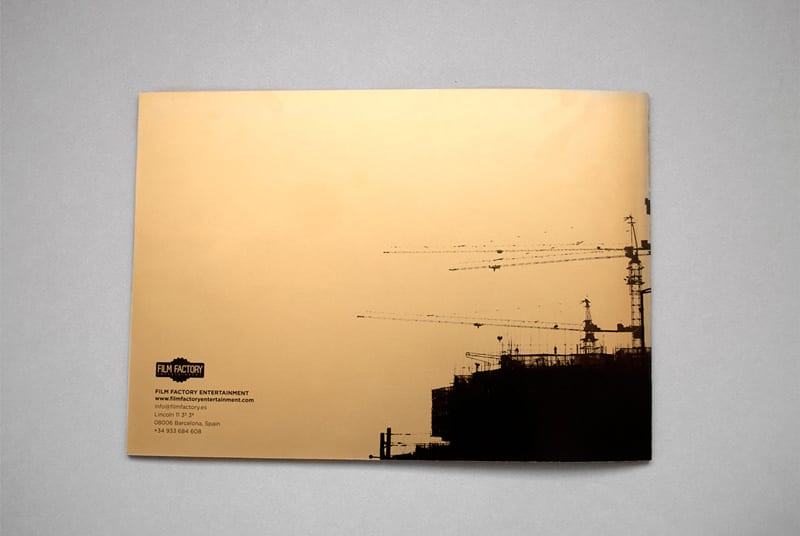
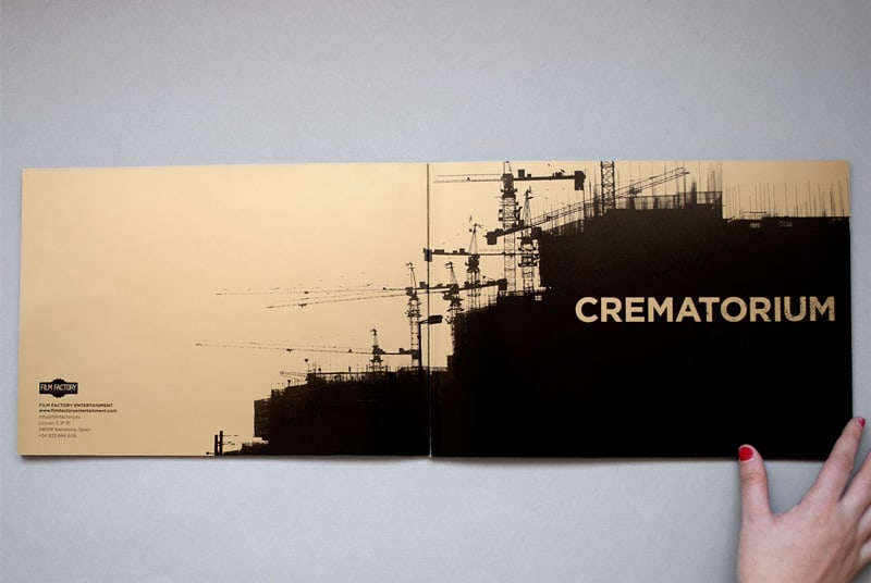
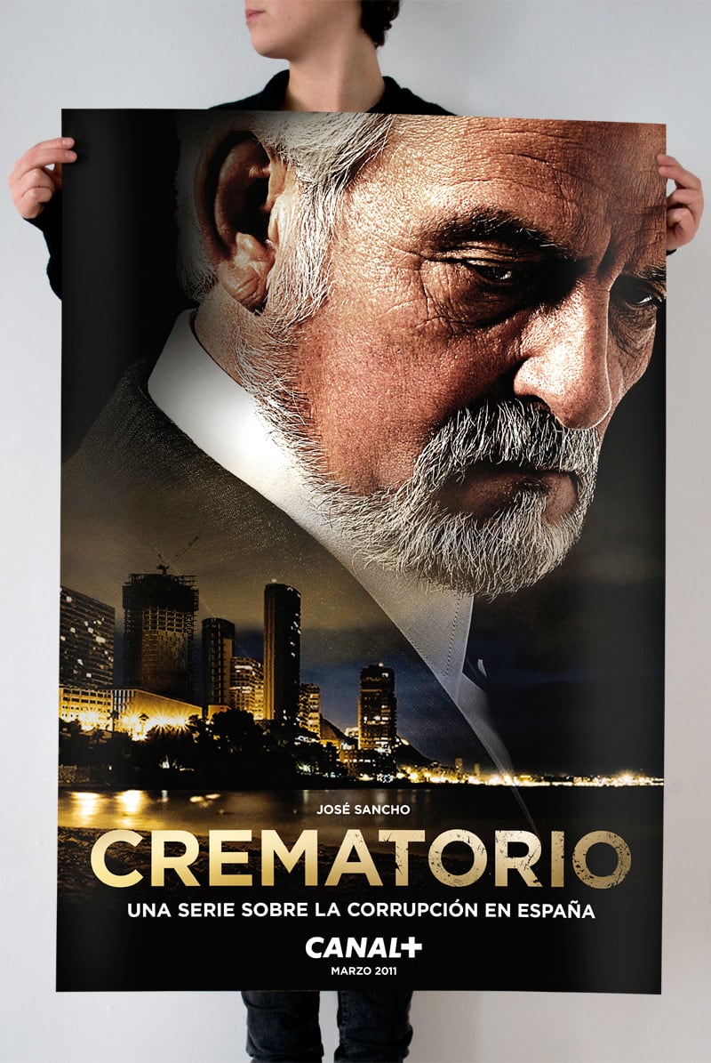
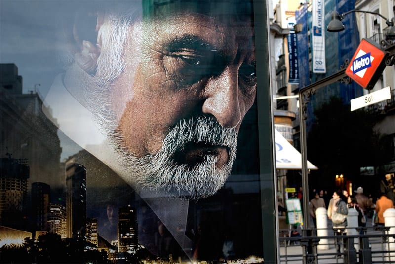
Elaboración de los materiales destinados a la promoción de "Crematorio", una serie de Canal+ sobre la corrupción inmobiliaria en España protagonizada por José Sancho. Esta campaña incluye cartel, piezas para exteriores, online y el pressbook impreso con un Pantone dorado para reflejar la vida lujosa que viven los personajes de la serie.


16 comments
Bisbis
Oysters that good looking as standard!
and the classic and stylish poster.
See original
Hide original
helloiamramon
Class...
See original
Hide original
Sergi ferrando
Very cool!
See original
Hide original
escdesign
It seems spectacular to me, the "manual" seems like a pass and the poster another of the same, what image quality and how elegant everything ...... What a luxury to see things like that, they motivate you more.
See original
Hide original
HOJA ROJA
I know that gold inks are the most polluting ... but I want to print with that PANTONE !!!
See original
Hide original
jana_perez
Let's use the gold inks only when they are essential ... like here! Congratulations!
See original
Hide original
holasergio
Nice work
Leewellyne
I love! Congratulations!
See original
Hide original
Mafflo
I agree: elegance and sobriety
great job!
See original
Hide original
maria caballer
PlusI love all your works, great!
See original
Hide original
BARFUTURA
Thank you very much to all for your comments!
See original
Hide original
Enblanc
Great job, congratulations.
See original
Hide original
Ignacio Aragonés López
Very good and after watching the series more. Congratulations
See original
Hide original
ingridjean
sublime
GREdis
Spectacular!!! ... I don't know the series ... but this "catalog" is one more reason to create and feel proud to be a designer. Thank you for sharing this beauty of design.
See original
Hide original
unoo
Wow, it shows the great work involved. I liked the finish of the print. Great job.
See original
Hide original
Log in or join for Free to comment