Hello Nuria,
interesting work but we have two criticisms:
1. To be an infographic there is too much text. The idea is that the visual synthesis is made in such a way that it is not necessary to use so much text. In addition, with the striped background that you have used and the chosen font, readability is very difficult.
2. The other thing that squeaks us a bit is the style chosen because it lacks consistency. Darwin's portrait is very complex and organic, the icons are more synthetic and geometric, and the illustrations below are a mix of both. For visual coherence issues, it would be better to unify everything.


2 comments
relajaelcoco
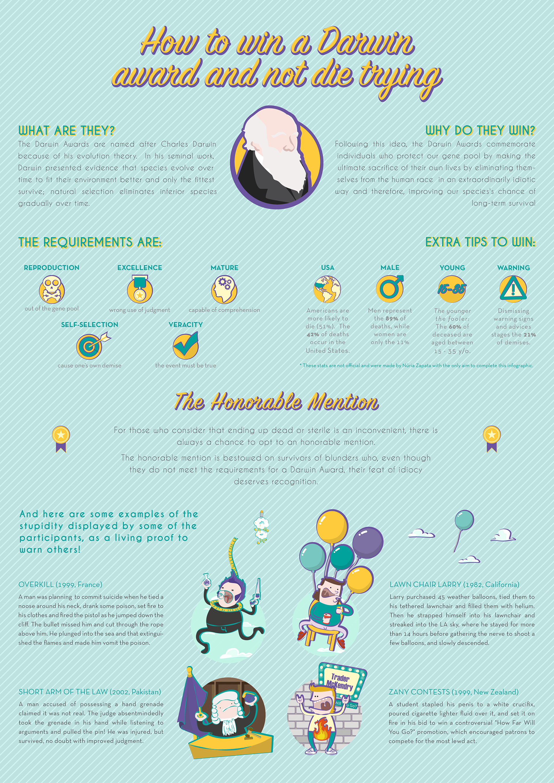
Teacher PlusHello Nuria,
interesting work but we have two criticisms:
1. To be an infographic there is too much text. The idea is that the visual synthesis is made in such a way that it is not necessary to use so much text. In addition, with the striped background that you have used and the chosen font, readability is very difficult.
2. The other thing that squeaks us a bit is the style chosen because it lacks consistency. Darwin's portrait is very complex and organic, the icons are more synthetic and geometric, and the illustrations below are a mix of both. For visual coherence issues, it would be better to unify everything.
A hug,
See original
Hide original
nuriazall
All right. I had such a good time doing this one that I want to do another one, with other stories. I will keep these tips in mind. Thank you!
See original
Hide original
Log in or join for Free to comment