


Packaging Cacao Nómada
by Borja @hurasima
- 227
- 2
- 0
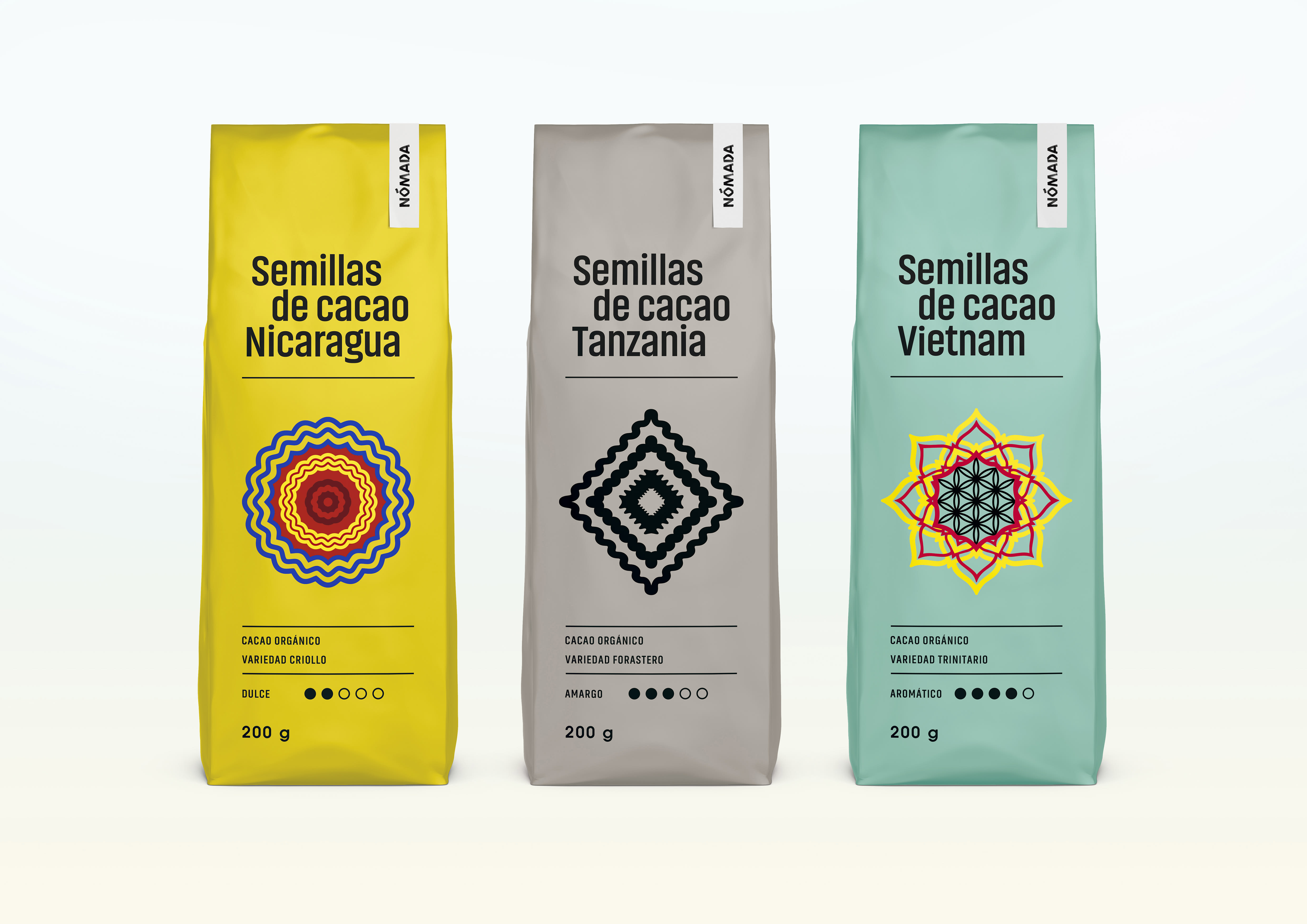
Criollos, forasteros y trinitarios son las tres variedades del cacao, con sus propias particularidades. El lugar y la forma en que se cultiva cada variedad le otorga un carácter y aroma específico.
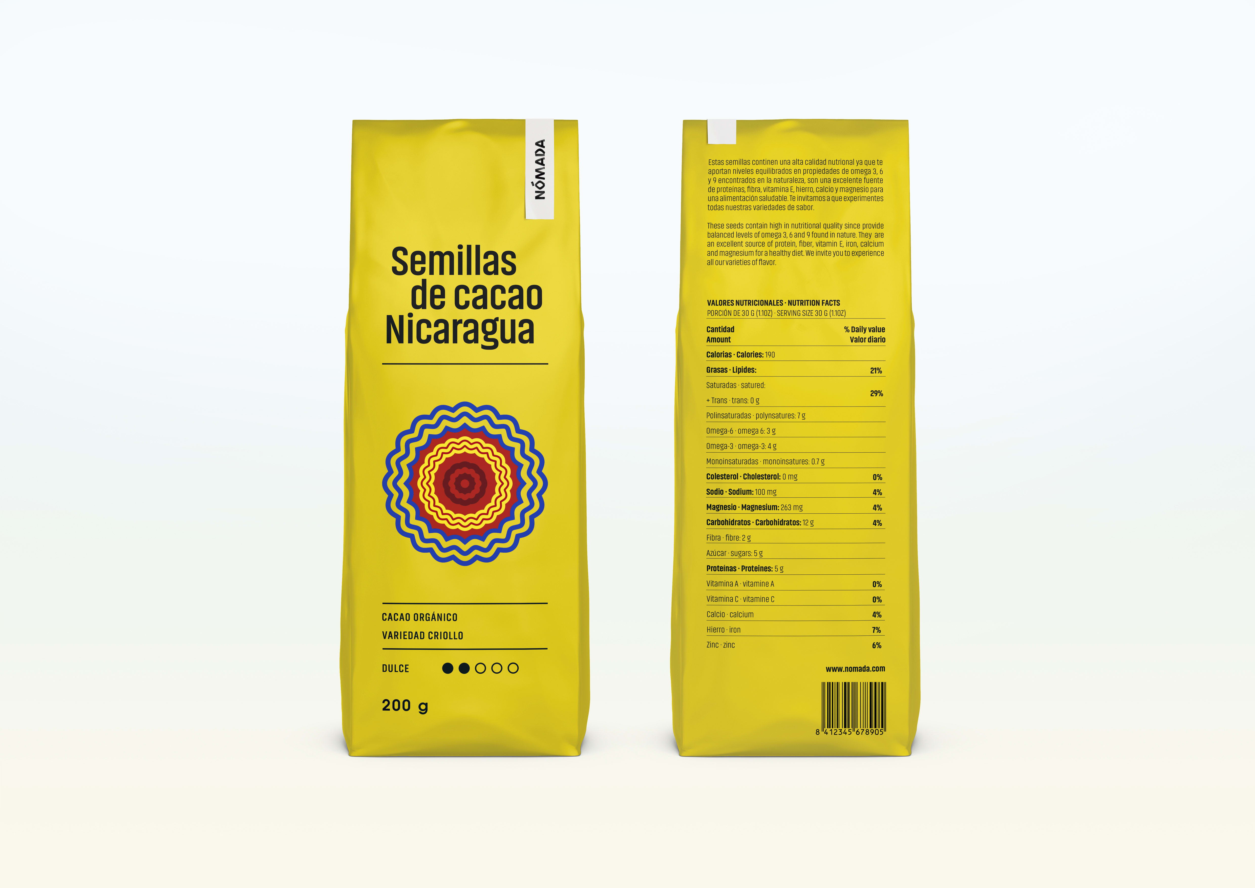
Para la construcción de marca se ha realizado un trabajo caligráfico basado en la tipografía Neuland. La imagen de marca exigía un logotipo de naturaleza étnica fundamentado en el concepto de dejar huella y en su cualidad de ejercicio manual, de hecho a mano, lo que le confiere una impronta arcaica y tradicional. Sus trazos desvanecidos aluden de nuevo al concepto de dejar huella en relación a las costumbres Nómadas.
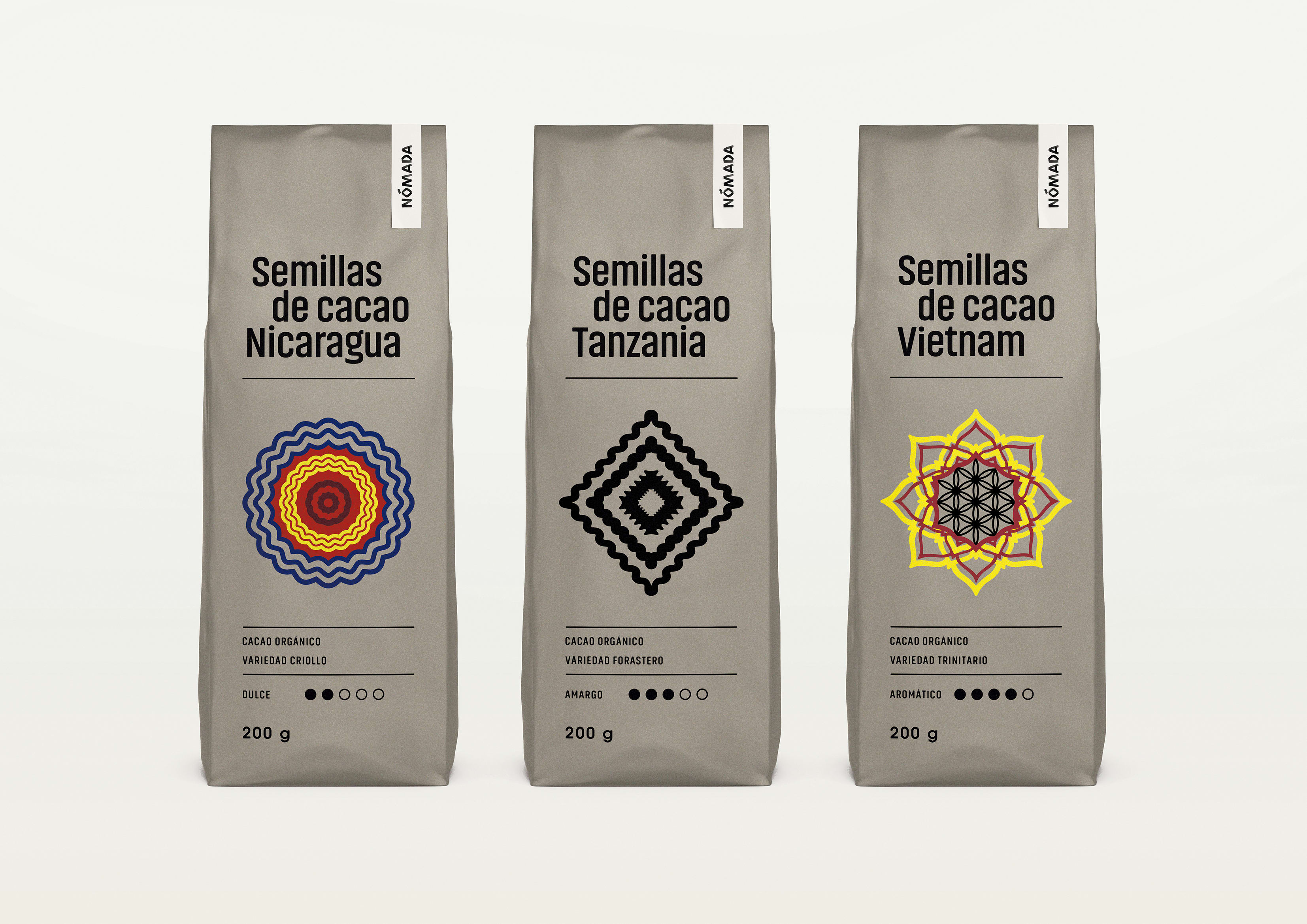
El color es un elemento clave y elección responde a cuestiones de asociación y representación en relación a cada país de origen. El verde pretende comunicar la naturaleza húmeda y montañosa de Vietnam. El amarillo, en Nicaragua, representa el sol, el calor y el clima tropical y en Tanzania el beige tostado nos transporta a un Safari.
Los símbolos gráficos articulan el concepto de packaging fundamentandose en tres elementos que evocan el carácter y esencia de cada país de origen. Nicaragua se representa mediante las faldas de las danzas del folklore propio de algunas de sus regiones. Ondas, movimiento y color sugieren estos característicos y alegres bailes típicos de la cultura nicaragüense. Para Tanzanía se emplea el rombo que es un elemento muy recurrente en los textiles africanos. Por último, Vietnam es representado mediante la flor de loto, que es uno de los símbolos de Vietnam y flor nacional del país. Esta flor vista desde arriba también alude al mandala Svadhisthana, segundo chakra que en el budismo, una de las religiones oficiales de Vietnam representa el sentido del gusto.
Criollos, forasteros and trinitarios are the three varieties of cocoa, with their own particularities. The place and the way in which each variety is grown gives it a character and specific aroma.
For the construction of the mark, a calligraphic work has been carried out based on Neuland typography. The brand image required a logo of ethnic nature based on the concept of leaving footprint and In its quality of manual exercise, in fact by hand, which gives it an archaic and traditional imprint. Their faded lines allude again to the concept of leaving a mark in relation to nomadic customs.
Color is a key element and choice answers questions of association and representation in relation to each country of origin. The green aims to communicate the humid and mountainous nature of Vietnam. The yellow in Nicaragua represents the sun, heat and tropical climate and in Tanzania the toasted beige transports us to a Safari.
The graphic symbols articulate the concept of packaging based on three elements that evoke the character and essence of each country of origin. Nicaragua is represented by the skirts of folklore dances typical of some of its regions. Waves, movement and color suggest these characteristic and cheerful dances typical of Nicaraguan culture. For Tanzania the rhombus is used which is a very recurrent element in African textiles. Finally, Vietnam is represented by the lotus flower, which is one of the symbols of Vietnam and national flower of the country. This flower seen from above also alludes to the mandala Svadhisthana, second chakra that in Buddhism, one of the official religions of Vietnam represents the sense of taste.


0 comments
Log in or join for Free to comment