


Cora´s Coffee - Corporate Identity
by Sergio V. @sergio_v
- 65
- 1
- 0
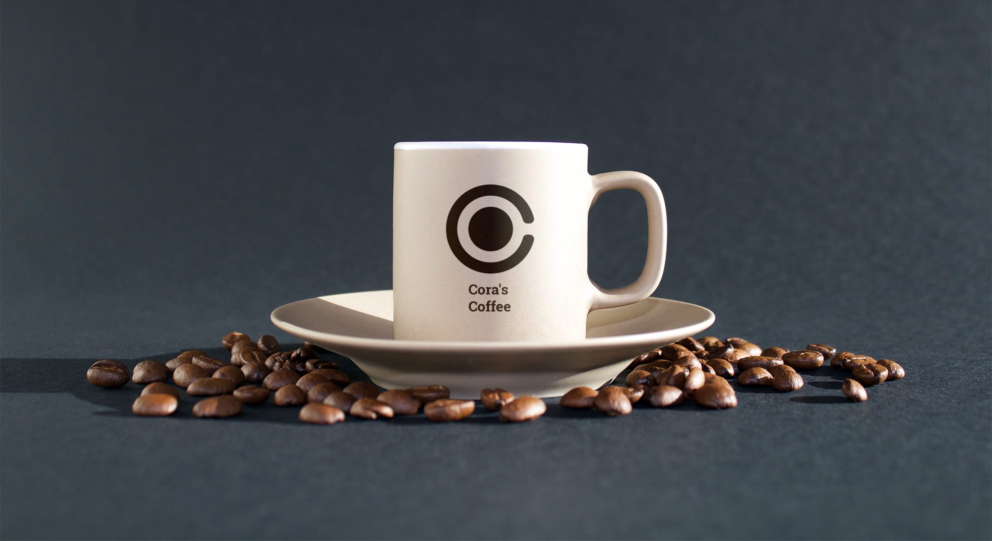


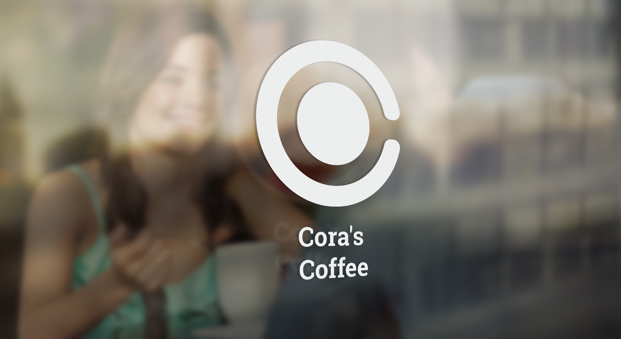
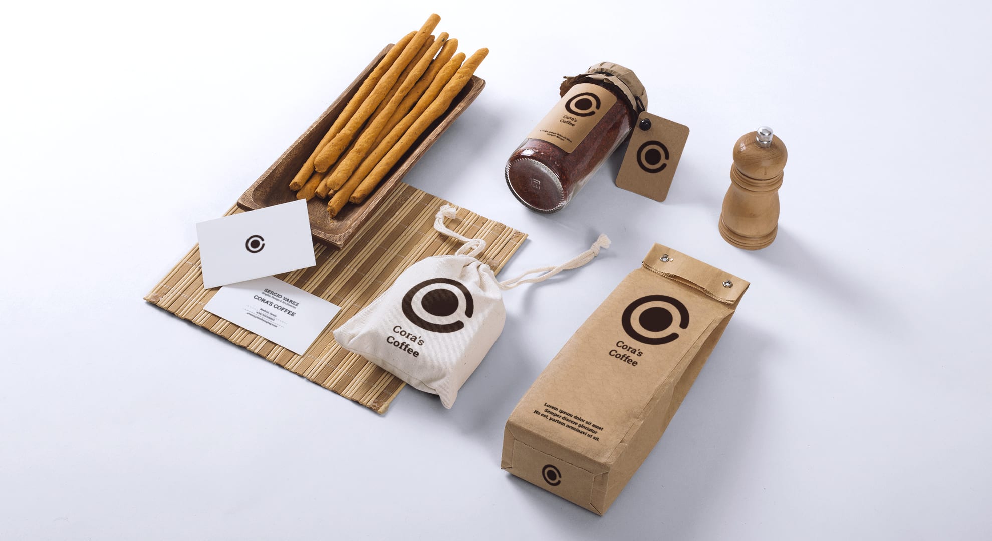
Cora´s Coffee is a cozy, familiar and imaginary cafe in the center of a romantic city like Budapest or Prague.
His design is based in the join of the two first letter of his two words, ie C and O. The O is showing as a black circle inside of the C, so that negative space creates the feeling you're watching a cup of coffee viewed from above, where the O will be the black coffee inside of the white cup. I wanted to express this idea in the most simple way.


0 comments
Log in or join for Free to comment