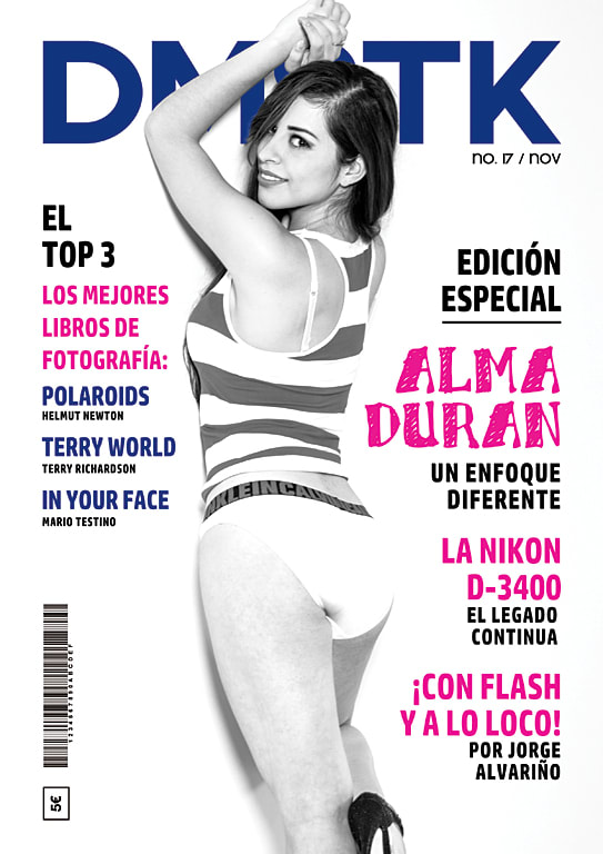
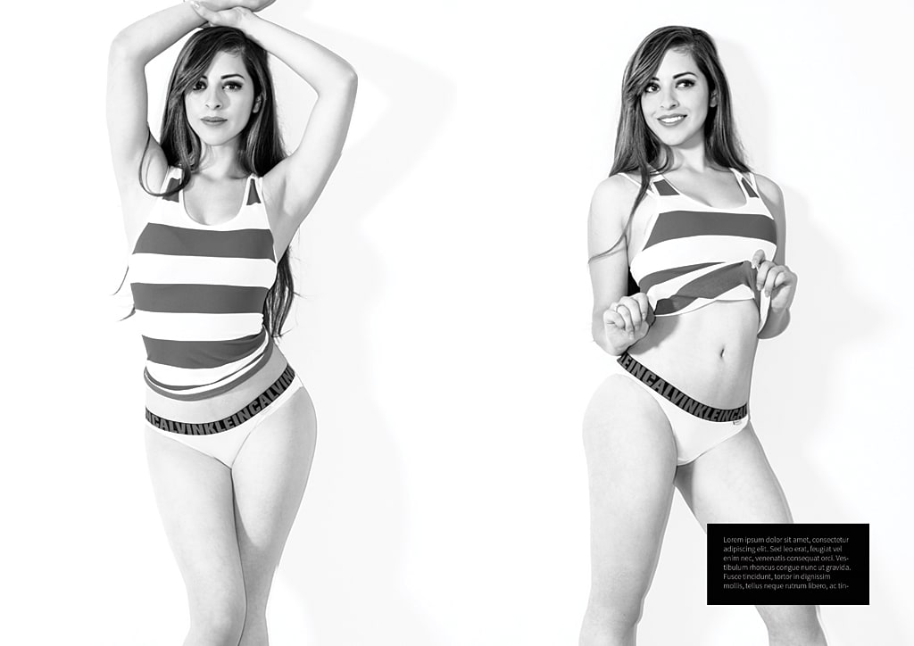
Cover.- The photo is overexposed, especially in the white tones of the clothes. You would have to recover that information because it is something that greatly disfavors the image. I don't like the reframing by cutting the fingers at the top, it seems that the fingers are amputated. I would open that cut a little to finish seeing the fingers, or else I would close the cut more, but now it is in an intermediate point that deteriorates the photo. The treatment of the legs is not good either, there are spots of blush all over the leg. This should be smoothed out a bit, either with makeup or with post-production work. Be careful with makeup in this type of photo! You always tend to take great care of your face and abandon your legs, arms and torso. I like the black and white you have given it, maybe I would like it better with the tighter blacks and the lower whites.
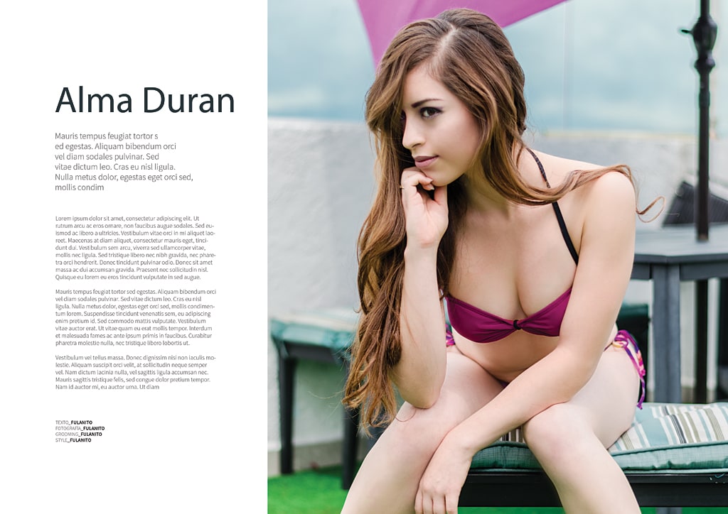
Page 1.- The posture does not favor the model and the skin treatment is too strong. I like that you blur the background to separate the model, although in this case there are too many things that mislead (purple awning, table, column ...). The skin tone is also not as flattering as the one in the photo below.
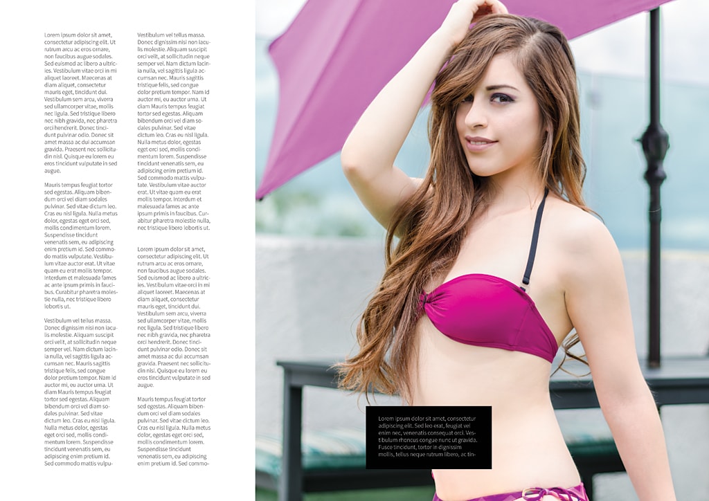
Page 2.- This photo is pretty good. Color, light gesture of the model. All good. Perhaps the green of the sofa is too intense and the rough background is not the most appropriate. But I'ts not bad.
Page 3.- We return to all the problems on page 1. Skin tone, background, the posture is not as successful as in the previous one and in general it looks paler.
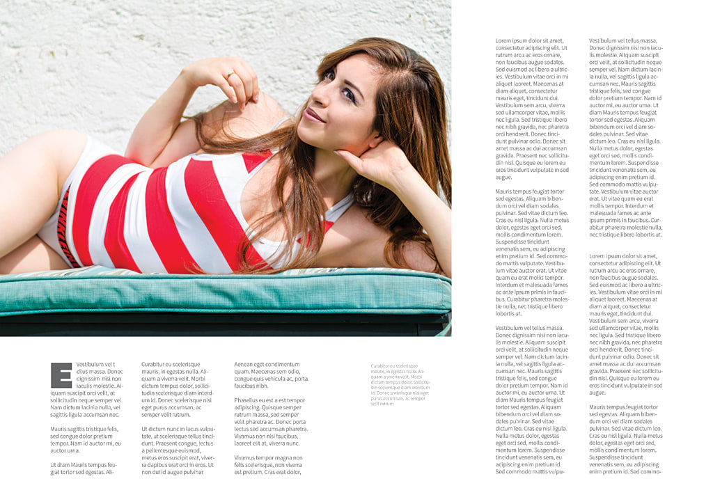
Page 4.- About the treatment the same as on the cover. More contrast, deeper blacks, softer whites. Be careful with the retouching, on the left arm and left leg you have some cuts in the middle of the arm resulting from a clone or something that is not well finished.
The second photo is without a doubt the best photo of the publisher. For my better cover than the one you have chosen.
In short, keep an eye on treatment, contrast and color. You also have to look at the complete speech of all the photos, the two color photos of that terrace are totally out of the universe of the cover. Also be careful with those recuandres a la Testino, that in some cases you are left half.
In truth, as I mentioned in the forum, I had already taken other Domestika courses and you are the first to give me feedback on the work done, and I am very excited about that and very grateful.
I have already analyzed your observations and some of them are very accurate:
-You are right, I lack skin treatment on the cover, and yes, the black and white treatment did not convince me.
-In the remaining photographs I have doubts, the skin treatment is practically null, I only use it under the eyes, I do not understand why you mention an excess? and the blur is due to the shallow depth of field that the f / 1.8 that I used gave me.
-Regarding the skin tone, I suppose it is a matter of taste; I always try to leave it at that point [visita mi Instagram :-)].
-The framing, completely true ... I had already read Mellado and according to what he mentions in his book "you have to let the photo breathe" and I agree, but Testino is one of my great references and I wanted to take a risk.
-I have already reviewed the final photos and it is not a cloning error (I do not use it) it is a chromatic aberration that turned gray with the development and I hoped you could give me some advice for the shadows that the model's nose generated, I did not like them not at all.


2 comments
jorge_alvarino
Teacher PlusRegards @kifkey
Thank you for sharing your work with us.
I will comment on details of each of the photos:
Cover.- The photo is overexposed, especially in the white tones of the clothes. You would have to recover that information because it is something that greatly disfavors the image. I don't like the reframing by cutting the fingers at the top, it seems that the fingers are amputated. I would open that cut a little to finish seeing the fingers, or else I would close the cut more, but now it is in an intermediate point that deteriorates the photo. The treatment of the legs is not good either, there are spots of blush all over the leg. This should be smoothed out a bit, either with makeup or with post-production work. Be careful with makeup in this type of photo! You always tend to take great care of your face and abandon your legs, arms and torso. I like the black and white you have given it, maybe I would like it better with the tighter blacks and the lower whites.
Page 1.- The posture does not favor the model and the skin treatment is too strong. I like that you blur the background to separate the model, although in this case there are too many things that mislead (purple awning, table, column ...). The skin tone is also not as flattering as the one in the photo below.
Page 2.- This photo is pretty good. Color, light gesture of the model. All good. Perhaps the green of the sofa is too intense and the rough background is not the most appropriate. But I'ts not bad.
Page 3.- We return to all the problems on page 1. Skin tone, background, the posture is not as successful as in the previous one and in general it looks paler.
Page 4.- About the treatment the same as on the cover. More contrast, deeper blacks, softer whites. Be careful with the retouching, on the left arm and left leg you have some cuts in the middle of the arm resulting from a clone or something that is not well finished.
The second photo is without a doubt the best photo of the publisher. For my better cover than the one you have chosen.
In short, keep an eye on treatment, contrast and color. You also have to look at the complete speech of all the photos, the two color photos of that terrace are totally out of the universe of the cover. Also be careful with those recuandres a la Testino, that in some cases you are left half.
Greetings and continue taking photos!
George
See original
Hide original
everaldo_map
Thanks for the comments @jalvarinophoto :-)
In truth, as I mentioned in the forum, I had already taken other Domestika courses and you are the first to give me feedback on the work done, and I am very excited about that and very grateful.
I have already analyzed your observations and some of them are very accurate:
-You are right, I lack skin treatment on the cover, and yes, the black and white treatment did not convince me.
-In the remaining photographs I have doubts, the skin treatment is practically null, I only use it under the eyes, I do not understand why you mention an excess? and the blur is due to the shallow depth of field that the f / 1.8 that I used gave me.
-Regarding the skin tone, I suppose it is a matter of taste; I always try to leave it at that point [visita mi Instagram :-)].
-The framing, completely true ... I had already read Mellado and according to what he mentions in his book "you have to let the photo breathe" and I agree, but Testino is one of my great references and I wanted to take a risk.
-I have already reviewed the final photos and it is not a cloning error (I do not use it) it is a chromatic aberration that turned gray with the development and I hoped you could give me some advice for the shadows that the model's nose generated, I did not like them not at all.
Greetings from Mexico!
See original
Hide original
Log in or join for Free to comment