Hi @haizeita
It is very nice!
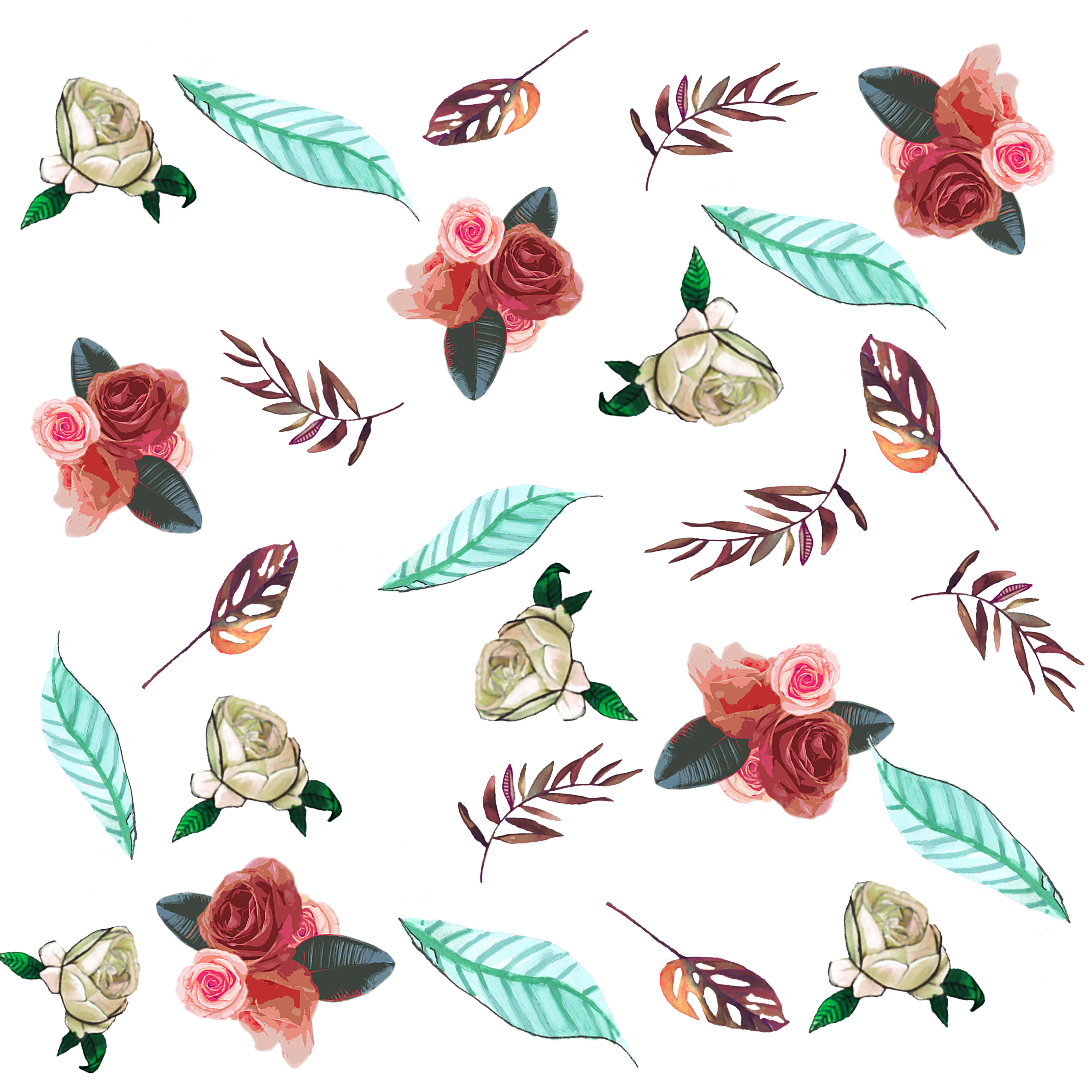
I tell you a couple of things to improve it, the green leaves break too much, that is, on the one hand they are very large compared to the rest of the elements (they are larger than a bouquet of flowers) and also the color, it makes too much contrast, yes it goes out of the color gamut.
I would try to make them smaller and darken them a bit, making it a green that fits into the color of the rest of the illustration.
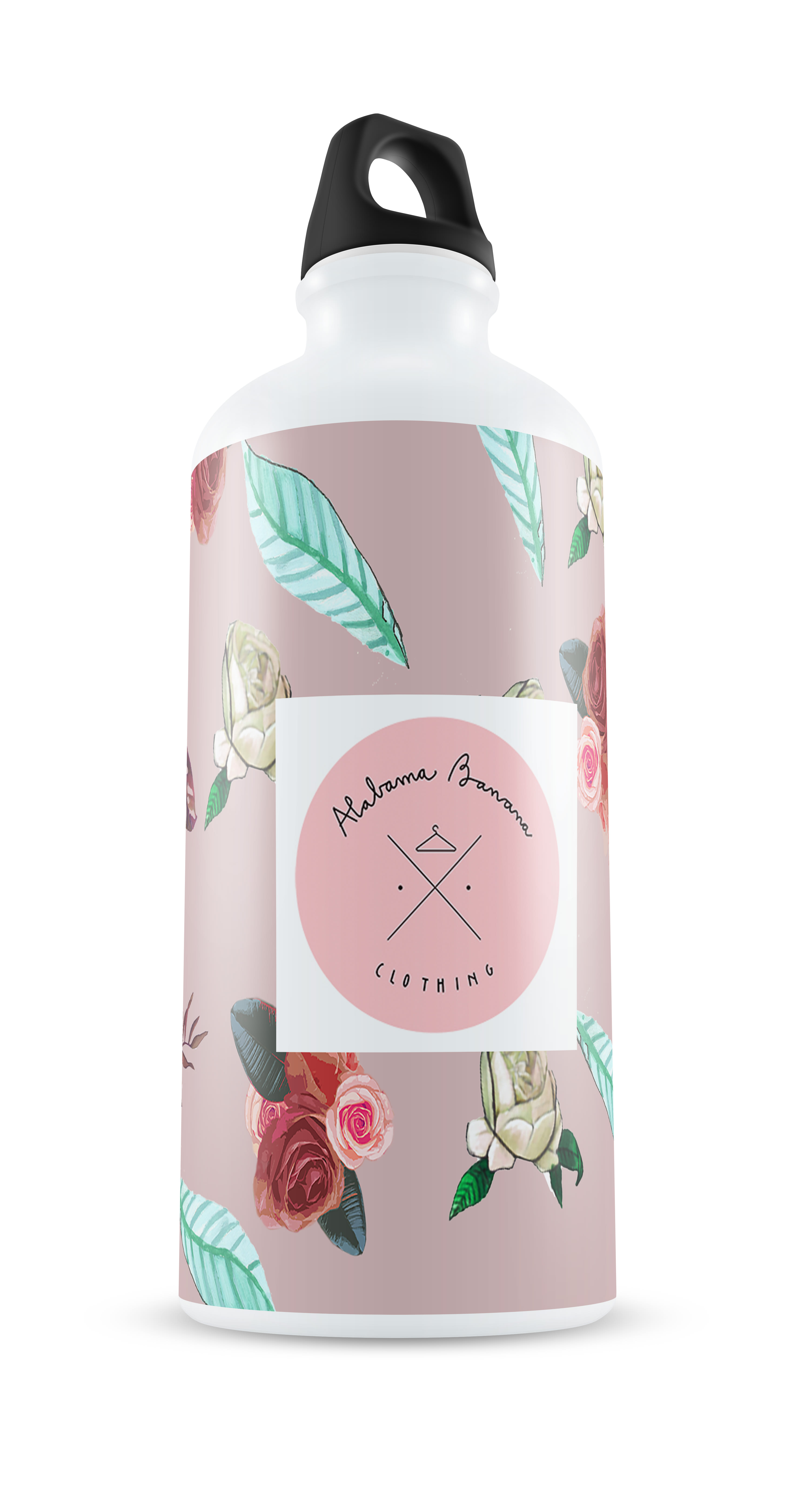
Very nice logo too! but better without the white square, if the logo is a circle it would be better for you if it were like that on the products.
They are a couple of details that will improve the project a lot. I congratulate you!
and I hope you have learned and enjoyed the course.


2 comments
moniquilla
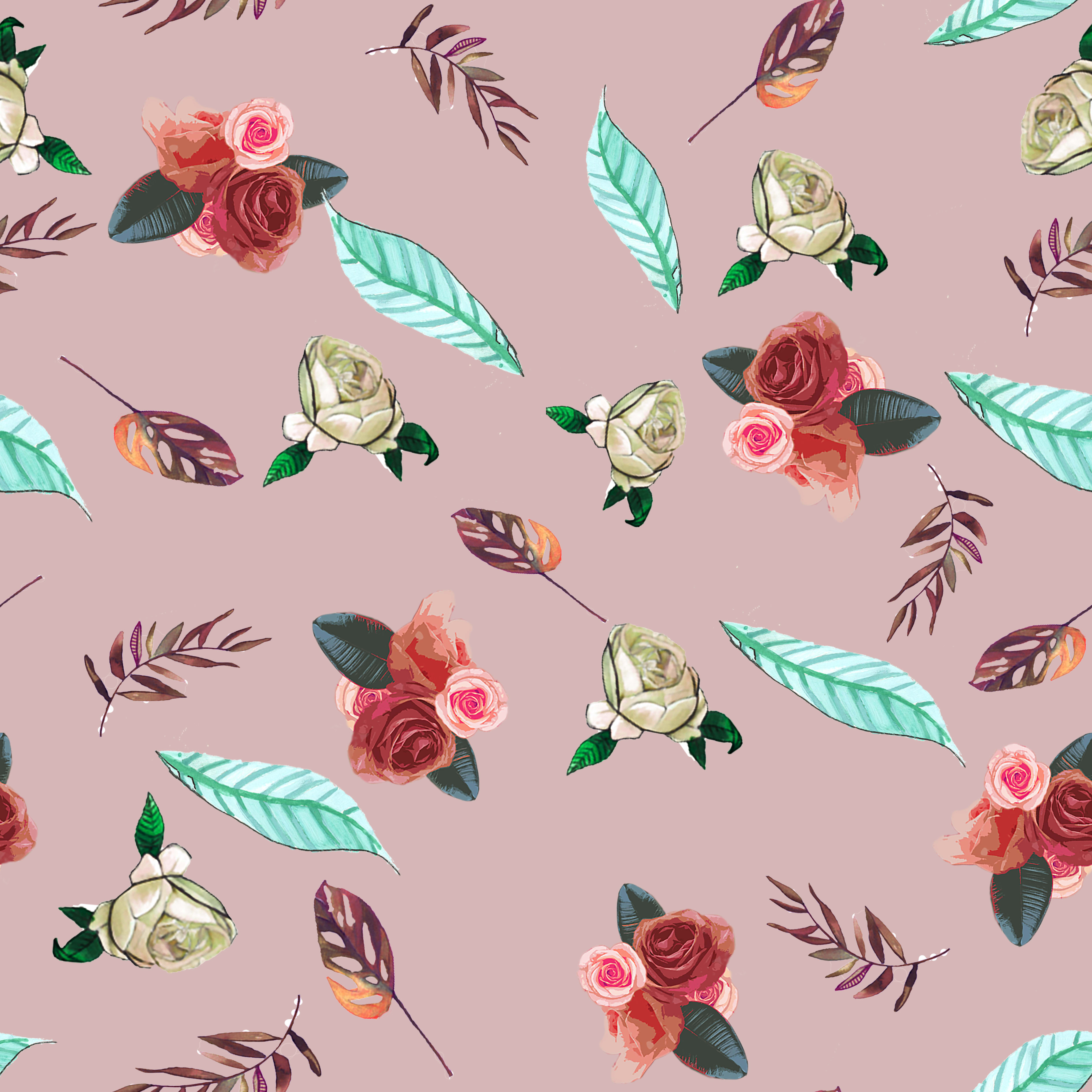
Teacher PlusHi @haizeita
It is very nice!
I tell you a couple of things to improve it, the green leaves break too much, that is, on the one hand they are very large compared to the rest of the elements (they are larger than a bouquet of flowers) and also the color, it makes too much contrast, yes it goes out of the color gamut.
I would try to make them smaller and darken them a bit, making it a green that fits into the color of the rest of the illustration.
Very nice logo too! but better without the white square, if the logo is a circle it would be better for you if it were like that on the products.
They are a couple of details that will improve the project a lot. I congratulate you!
and I hope you have learned and enjoyed the course.
A greeting!
See original
Hide original
haizeita
Thank you for your comment! I'll try it as you say, I really liked the course and I'm still doing prints
See original
Hide original
Log in or join for Free to comment