


Course project
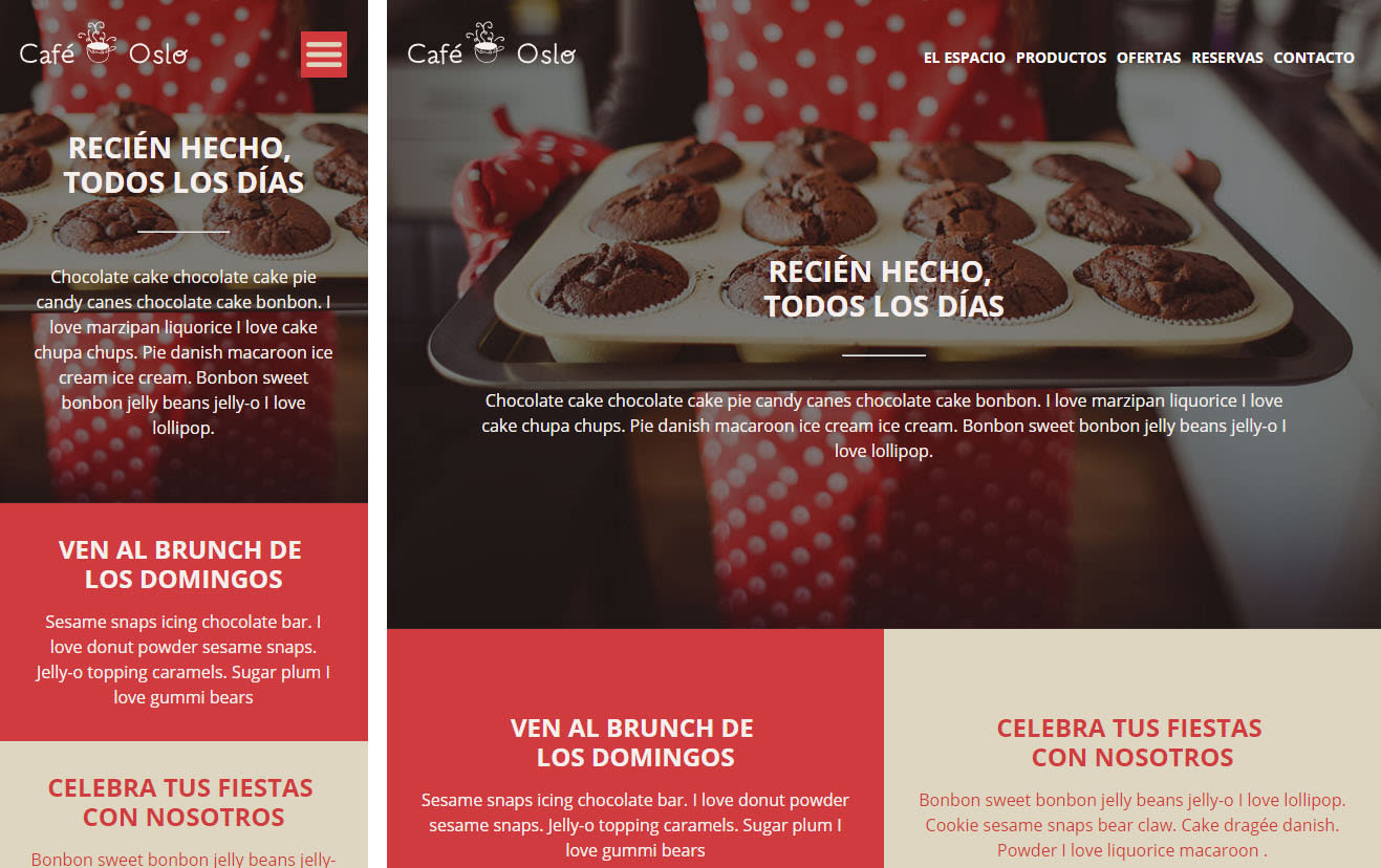
Mi Proyecto Web Responsive Café Oslo
by Sandra Mora Ayala @sandra_mora
- 227
- 0
- 2
Hola Javier
Me ha gustado mucho el curso. Este es mi proyecto final, te dejó aquí el enlace con los archivos. Si pudieras echarles un ojo y hacerme alguna corrección, estaría genial.
https://drive.google.com/file/d/0B1yKtI6VPhTyeHEtQnZQUVNaMWs/view?usp=sharing
Muchas gracias y un saludo,
Sandra Mora
www.sandramora.com


2 comments
htmlboy
Teacher Plus@sandra_mora Very good! At the design level it is very well resolved. At the code level, some details that I have seen:
- I see you use a "traditional" DOCTYPE ( <!DOCTYPE html PUBLIC "-//W3C//DTD XHTML 1.0 Transitional//EN" "http://www.w3.org/TR/xhtml1/DTD/xhtml1-transitional.dtd"> ), which I assume the code editor has suggested. Although it is not incorrect, it is enough to put the "abbreviated" (<!DOCTYPE html> ).
- In the head, on the line <meta name="viewport" content="initial-scale=1.0, width = devicewidth "> missing a dash (width = device-width).
- I see that in several lines of CSS, in elements that are block, you force a width of 100%. Technically, if they are block elements, their natural behavior is to occupy 100% and they do not need to be forced. However, if not forcing them gives you problems, it could be because you are not cleaning the floats well, with a container that has overflow: hidden or the clearfix technique.
Greetings and thank you very much for taking the course and for your comments! :-)
See original
Hide original
Sandra Mora
I have already corrected it and have used the clearfix technique to avoid having to force the widths.
Thank you for your comments. Cheers!!
See original
Hide original
Log in or join for Free to comment