


Mi Proyecto del curso Matte Painting: creando mundos fotorrealistas
by David Brat @david_brat
- 210
- 2
- 3
Hola compañeros y compañeras!
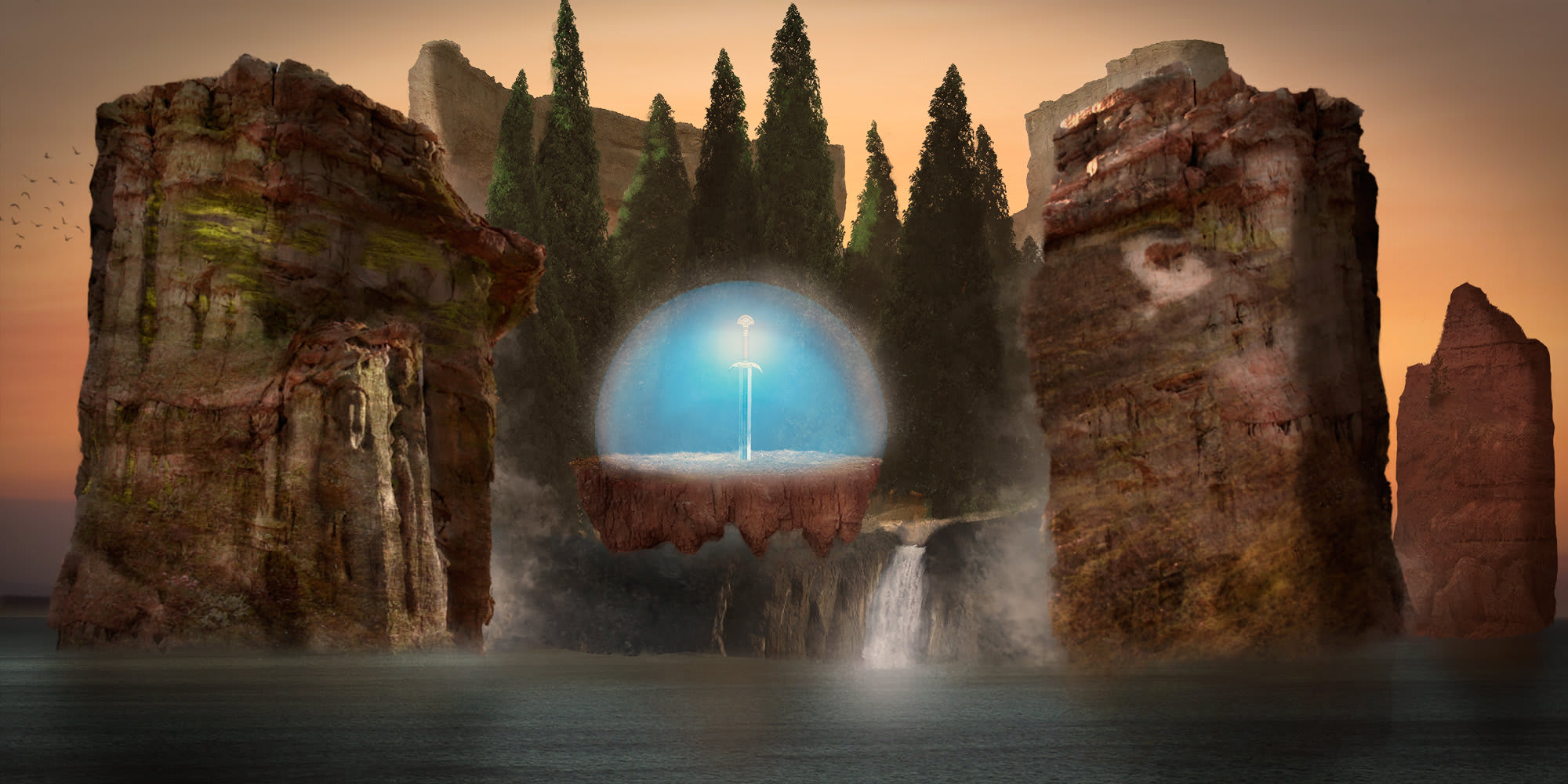
Comparto con todos mi proyecto del Curso Matte Painting. Me gustaría escuchar vuestras opiniones y comentarios para saber qué cosas puedo mejorar de la imagen. Tengo una duda principal: el color de la bóveda mágica en el centro. Realmente debería estar impregnada del color ambiente de la escena, tonos cálidos (he sacado pruebas así) pero me gusta mucho el contraste que consigue el azul con el resto de la escena cálida.
Decir que soy daltónico y el tema de los colores me resulta difícil de trabajar, los tonos, los ajustes, etc.
Tengo otra duda para @carlesmarsal, podrías indicarme si hay algún truco particular para trabajar imágenes 3D dentro de Photoshop e integrarlas en un Matte Painting? En mis próximas creaciones me gustaría probar.
Espero vuestro feedback para mejorar!!
Muchas gracias y abrazos.
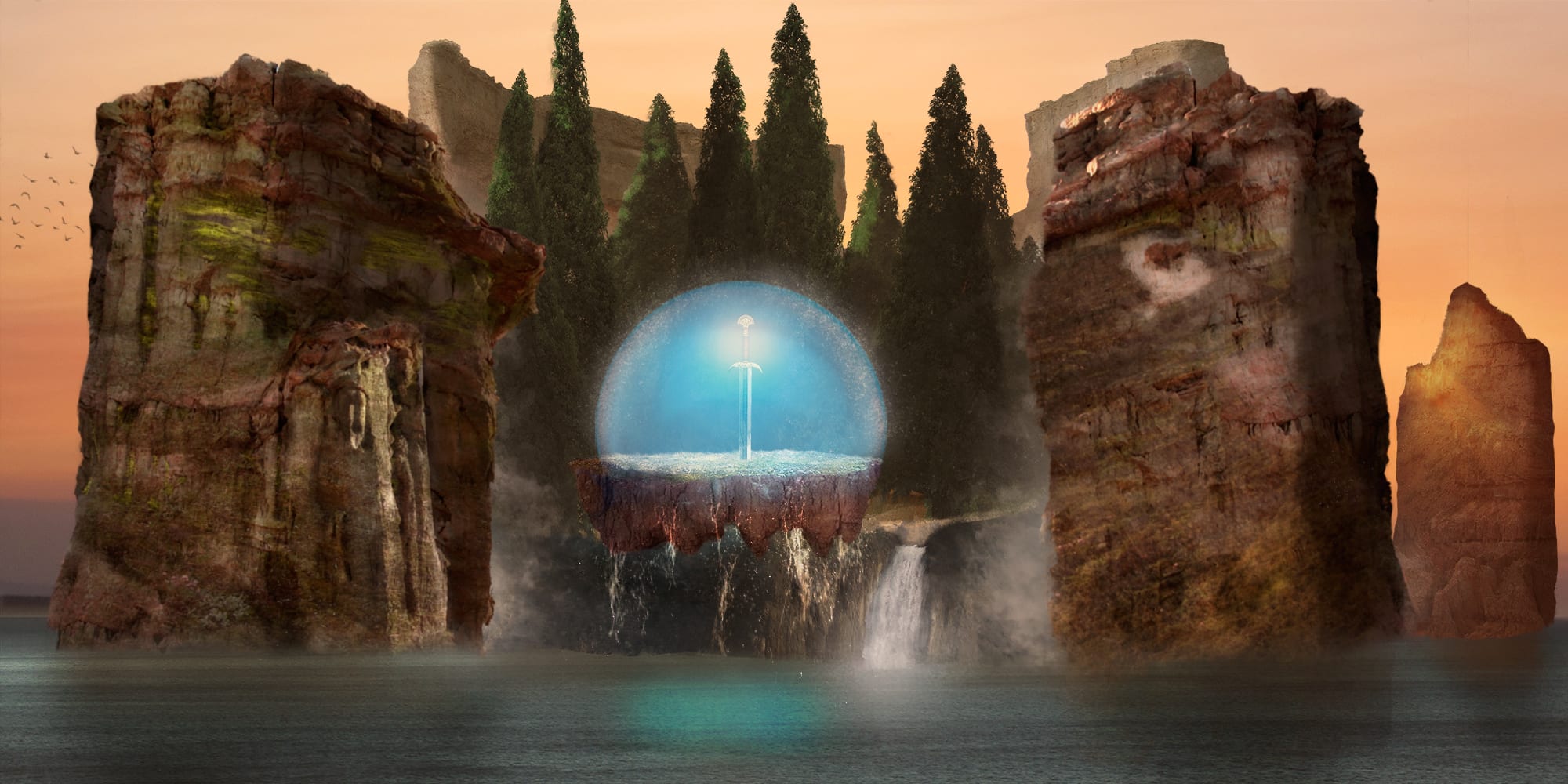
He realizado esas interesantes correcciones!
Qué os parece?


3 comments
carlesmarsal
Teacher PlusCongratulations! You have there two important light sources, the one that generates the light behind the rocks and the one that generates the vault. The blue should permeate the nearby rocks with its light, not even a bit. And you should put the reflection in the water to give it more realism. and a golden light on the rock on the right, with some reflections in the most exposed parts would be perfect. Keep in mind that behind the rock there is a very powerful focus, its strength should be noticed at some point!
See original
Hide original
David Brat
Thank you so much for your opinions!!
Raúl, I think it's a great idea. I put it into practice.
I take note of your advice Carles and I get to it!
A hug!!
See original
Hide original
David Brat
Hi Carlos!
A quick question: in Cache levels and segment size in Photoshop, which option do you recommend?
Tall and Thin or Big and Flat?
Thanks a lot!
See original
Hide original
Log in or join for Free to comment