


Course project
Mi Book personal
by Edgar Folque Ventura @efolque
- 288
- 2
- 2

Buenas noches a todos,
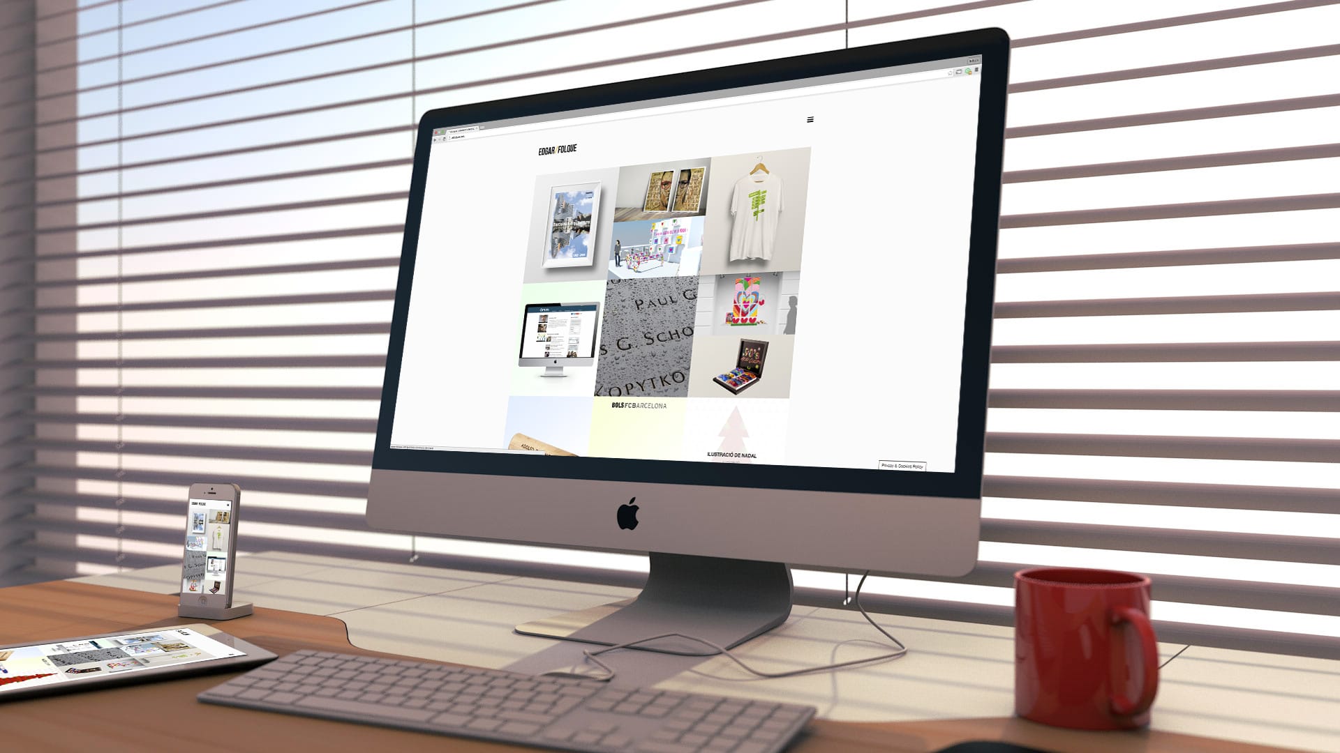
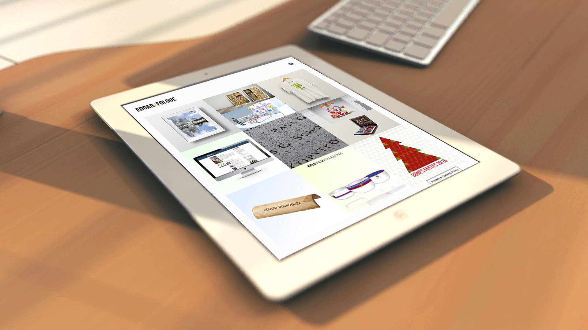
En mi caso he hecho un portafolio con mis trabajos profesionales. Se puede visitar en la siguiente página web : www.efolque.cat.
Me gustaría saber en que aspectos la podrida mejorar y que te parece.
Saludos a todos.


2 comments
pelluz
Staff PlusOkay @efolque to see what @jordiubanell . Some comments:
+ The images are a bit pixelated and dull at least on my screens (Macbook, iPhone 6)
+ Navigation has puzzled me a bit, but surely it is a matter of taste. Abusing navigation effects always scares me.
+ I find it strange that you repeat the navigation in the footer in a style that at least for me does not fit with the rest.
+ The cookie alert is huge, the message that remains: "Privacy & Cookies Policy" I feel it is excessive.[/list]
Congratulations on completing the course.
See original
Hide original
jordiubanell
Teacher PlusHello Edgar @enfolque and thank you Tony @pelluz for your comments,
I agree on all points and add some more.
+ Dull images, I imagine you mean the ones we have higher on this page where there is some darkness and blur. Perhaps what does not quite fit me is the color of the wood, it is very dark and has a lot of color with which it takes center stage, perhaps I would opt for a more grayish or neutral color or a lighter color. The first image, the sky could be more blue, it gives me the feeling that the sun is going to blind us because of the backlight situation and it does not highlight the page itself, which is the objective. Blurs are dangerous because the screen is always fully in focus, it would still prove that the closest part and up to a point are in focus and what is further away is blurred ... or if it is more credible blur, better without.
* Agree that in this case maybe I would use a menu with visible options (at least in the desktop version) to facilitate navigation. I would also appreciate the use of lower case (or only the initial capital letter) in the menu to improve readability, capital letters are very indigestible (also in the headlines of the page).
+ Agree that the footer menu is not necessary, I would remove it.
+ Yes, cookies could be more discreet.
+ A more general note, I would try to review the texts, perhaps with someone you trust who writes well will help you have another point of view and you can refine them more.
+ The item "Marques" of the menu, initially it is not understood very well, perhaps "Clients" or another option could work better
+ In Qui sóc (watch out that accent porta;) the lines of text are very long, maybe it would be better to make a narrower column so that it can be read better, a width of about 75 characters more or less is usually recommended there are different opinions on the subject. Centering the texts does not help reading either, so I advise you to align to the left (check it all over the web).
Edgar I also want to congratulate you for finishing the course, I hope you liked it !!
A reveure !!
Jordi
See original
Hide original
Log in or join for Free to comment