


Variación Interanual del Empleo en España: ¿Qué sectores/ocupaciones han creado/destruido empleo?
by dtropon @dtropon
- 445
- 5
- 6
Hola,
En primer lugar, dar la enhorabuena la web domestika por esta iniciativa de ofertar cursos online de temática tan creativa, y a Víctor Pascual por el curso, una introducción muy interesante a la visualización de datos.
Yo he preparado una visualización con datos procedentes de la Encuesta de Población Activa. Soy economista, y he hecho el curso para intentar crear visualizaciones de datos (que normalmente consideramos "aburridos") un poco más interesantes.
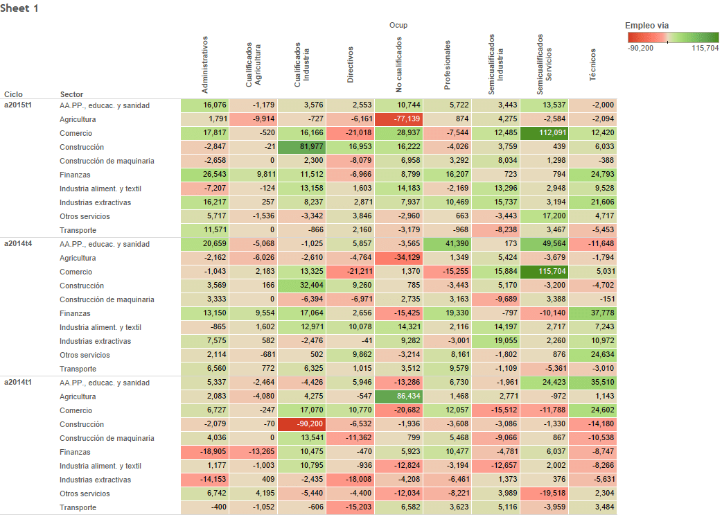
La tabla muestra la variación interanual del número de empleados en España, diferenciando el sector económico, y dentro de éste, el nivel de ocupación. Gracias al diseño del gráfico, se puede apreciar, de un simple vistazo, el comportamiento del empleo en este último año.
Parece que son sólo un par de tipos de ocupación, y en determinados sectores económicos, los que está liderando la creación de empleo neto en España en el último año: los trabajadores semicualificados del sector servicios dentro del sector del comercio y la hostelería (aquí no habría efecto estacional, porque son variaciones interanuales); y algo los trabajadores cualificados de la industria.
Además, a diferencia de lo que vemos en 2014-T1, parece que en 2005-T1 hay más crecimiento de empleo de forma "generalizada" (visualmente, muchas celdas en verde).
Y desde la perspectiva de la destrucción de empleo, parece que los trabajadores no cualificados en el sector agrícola son los más afectados.
En fin, corto el rollo ya, que me estoy aburriendo hasta yo escribiendo esto.
Un saludo,
David
6 comments
victorpascual
Teacher Plus@dtropon , I find it very interesting! I also like to see other projects that go beyond what was initially proposed.
Before continuing, thank you very much for the congratulations. I would appreciate it if you could leave an evaluation of the course for other potential students to sign up. ;-)
As far as your visualization is concerned, what is above the heatmap does not load.
About the heatmap (or table with colors), it is a type of visualization that I love. It's simple, we can all do it, and it gives much more information than the flat table without colors.
Two very important things to keep in mind:
1. It is important to consider how we normalize the data. We can normalize them at the table level, that is, convert everything to percentage values, z-scores, or something similar; normalize at the row level, or normalize at the column level. Depending on how we do this normalization, users can misinterpret the data. With what you have to be very careful. In your case, all the data have the same scale, so everything looks good
2. There are studies that show that color does not help us see differences between data as well. In other words, to be able to compare a set of values well, it is always better to use bars or lines. Something that could be done is to display a line or bar graph when the mouse is placed on a row or column. Thus, the heatmap gives us the general visualization, and the other graph helps us to see the differences between the values well.
Congratulations!
See original
Hide original
dtropon
Hi @victorpascual ,
Ok, I have already evaluated the course.
Thanks for the feedback. In fact, I wanted to comment on a couple of doubts that have arisen while I was making the graph:
1) As this graphic is designed (a table of values that contains the cells in colors according to the value of each cell), I would like to know if it is possible to add in each of the three panels (specific to each of the quarters shown: 2015-Q1, 2014-Q4 and 2014-Q1) one row and one column of additional values. Specifically, I would like the row to show the values of the variation in the level of employment specific to each level of occupation (regardless of the economic sector); and in a similar way, that the additional column shows the values of the variation in the level of employment specific to each economic sector (regardless of the level of occupation). By doing this, what I want is to compare the variations in employment in each of the cells with the variation in employment in each level of occupation / economic sector.
2) Regarding what you tell me in your comments "Something that could be done is to show a graph of lines or bars when the mouse is placed in a row or a column", it is a fabulous idea! Can this be done in this public version of Tableau? Could you indicate to me, at least roughly, how I could do this?
3) And finally, if I wanted to insert the graphics on a website (made for example, in wordpress), the link of the graphic that I put in the wordpress would always take me to the Tableau page where I have the graphic inserted? or is there any way that the graph can be viewed and analyzed interactively (other than a pdf or an image) directly on the personal web where I want to insert it?
Thanks a lot! and a gretting,
David
PS: It's true, it doesn't load the Tableau chart. But the link to my chart on the Tableau web doesn't work either? I'm going to put it back, see if it loads like this
See original
Hide original
victorpascual
Teacher PlusHi @dtropon ,
1) I can't quite understand what you are telling me. Can you make a hand drawing and share the photo to give me an example?
2) It is relatively easy to do. You will have to create a second visualization with the bar or line graph with the data you want, put the two visualizations in a Dashboard (it is one of the tabs below the Tableau screen where you can add the different visualizations that you have created ), and then add an "Action" to a graph that filters the data for the second. They explain it pretty well here: http://kb.tableau.com/articles/knowledgebase/combining-sheet-links-and-dashboards
3) No, you can embed the graphic on your website or blog by copying the HTML code that Tableau provides. Look at this image: [img]https://drive.google.com/file/d/0B6BTo-gHwQBbOE9CaENMaGQtY1E/view?usp=sharing[/img]
See original
Hide original
dtropon
Hi @victorpascual ,
First of all, sorry for the delay in answering, but I'm trying to finish my thesis and I don't even have time to breathe.
Regarding point 1) that you told me (4 months ago, uf), I have already made the sketch that you asked me to clarify my doubt. What I don't know is how to share the image around here for you to see. Please tell me how to do it and I will give you the image with the drawing of the rows and columns that I would like to add to my heatmap.
And regarding point 2), thank you very much for the contribution. I'm going to look at the tutorial and I'll tell you if I have doubts.
Thanks a lot!!
David
See original
Hide original
dtropon
Ah, one thing that I forgot to tell you @victorpascual ,
I think I remember reading in the comments with other students of this data visualization course, the idea of starting a new course in the future in which you would teach the scraping techniques that you mention in one of the modules of this course. A course on scraping data from the web would be a great idea. I have been a bit out of the game this time and I do not know if a course of this type has finally been activated in Domestika, and of course, if the course is carried out, you can count on me as a student.
A greeting!!
David
See original
Hide original
victorpascual
Teacher PlusThanks for the support and for the proposal David ( @dtropon )!
At the moment there is nothing closed, but we hope we can carry it out!
a greeting
See original
Hide original
Log in or join for Free to comment