

Course project
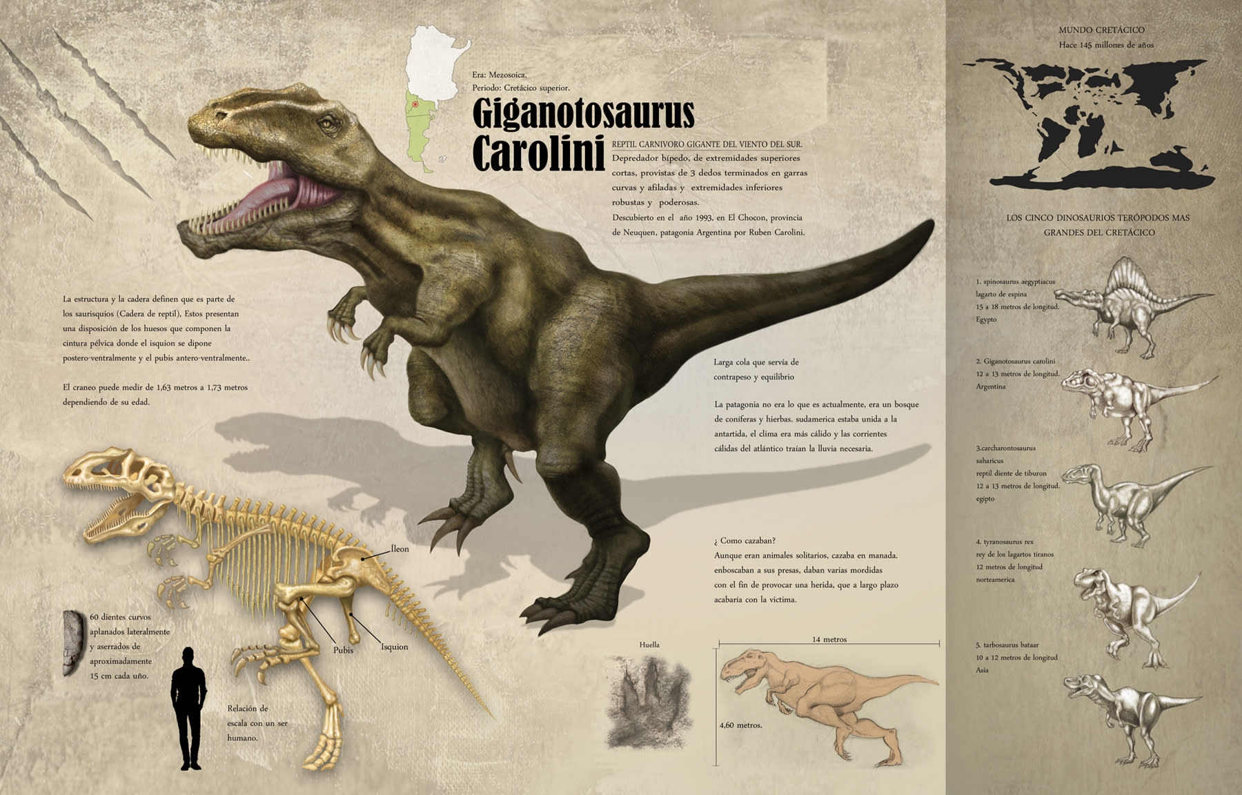
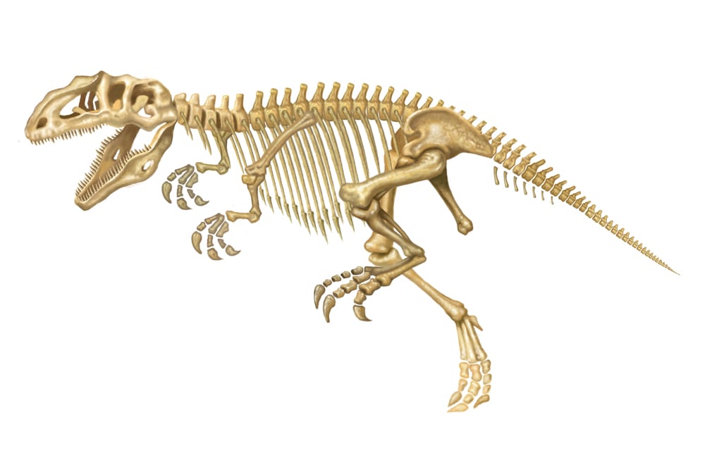
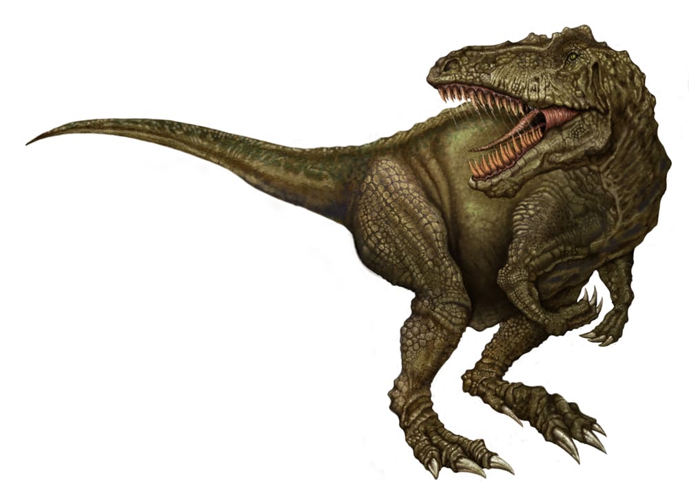
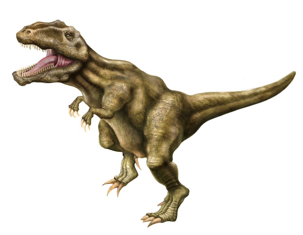
Giganotosaurus carolini
by Sebastián Martín @senimartin
- 2780
- 21
- 7
Hola, que tal Fernando. Después de un par de idas y vueltas, quedo terminada la infografia.
Disfrute mucho del curso. Espero tu respuesta.
Saludos!


Hola, que tal Fernando. Después de un par de idas y vueltas, quedo terminada la infografia.
Disfrute mucho del curso. Espero tu respuesta.
Saludos!


7 comments
fernandobaptista
Teacher PlusHello Sebastian! The dinosaur graphic is very good! A great topic. You have been very interesting and the information is great. I tell you some idea that can improve your graph a bit. The textures and colors are very successful and the drawing of the dinosaur too.
I send you the ideas made with Photoshop.
I would make the main figure a little bigger and redistribute the title, leaving it more isolated. You can put the map as a detail at the beginning and join it with the Cretaceous data.
Something that will make your graphics more professional is to differentiate main and secondary elements, hierarchize them using another type of drawing, simple line, I have placed one to give you the idea.
You could also darken the top and get some dramatic highlights on the head, so it would be more dramatic.
Perhaps the shadow stands out too much, I would try to soften it so that it does not distract you from the other elements.
On the typography, if you use lower case instead of upper case, you will see something more harmonious and almost as a rule try to align the text boxes to the left, it will look more organized.
I hope you continue making graphics and that you like the course, do not hesitate to ask me what you want.
Cheers!
See original
Hide original
fernandobaptista
Teacher PlusHello Sebastian, since you won't let me upload images, I send you my personal email and I send it to you from there, write me and I'll reply.
fbaptist @ngs .org
Greetings.
See original
Hide original
senimartin
Hello Fernando, thanks for the return, right now I get to work on the changes and I send you my email.
Cheers!
See original
Hide original
senimartin
How about Fernando, well here I leave you the infographic with the modifications you sent me. It has really changed a lot and I am very satisfied. I wait your answer.
Cheers!
See original
Hide original
xion81
Looks great!
Congratulations!
See original
Hide original
senimartin
Thank you very much xion81! Cheers!
See original
Hide original
senimartin
Well Fernando, I just finished with the infographic, with all the changes you sent me. As always very satisfied. hug!
See original
Hide original
Log in or join for Free to comment