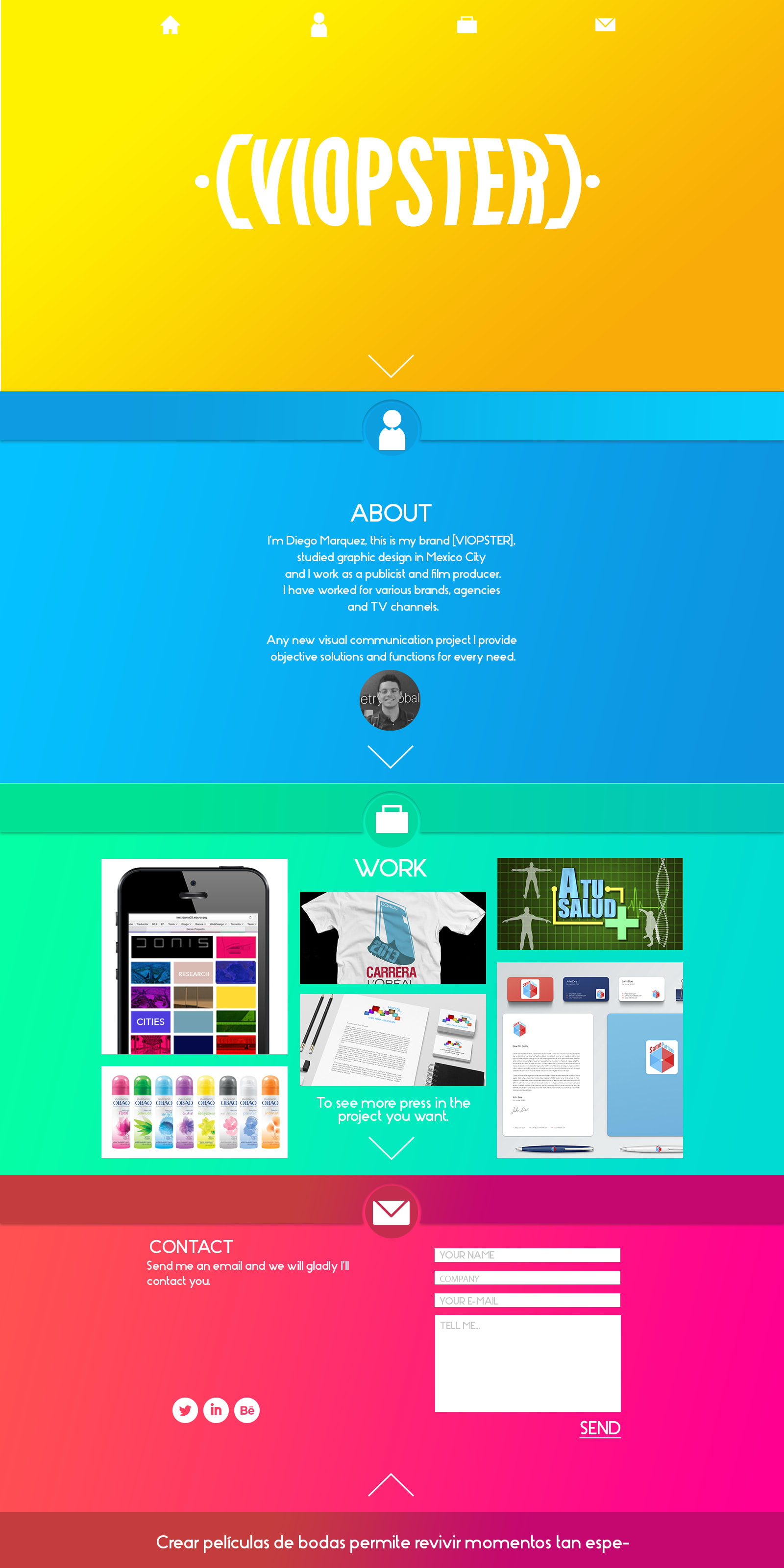
Very good @sheeldon55 , I find it interesting that you used different colors to classify each section. Just one detail to take into account: be careful with gray fonts on a background like magenta, it is very difficult to read (contact section, the last image you present).
Hello!
If in fact with respect to the magenta background and gray text, I agree, it is not read, it still has details to correct, if you can see it has false text, the color of that field must be white, etc.
All this I am seeing with my programmer who also suggests things to me when programming the page.
The site still has bugs that are being fixed.
Thank you!!


2 comments
fad
Teacher PlusVery good @sheeldon55 , I find it interesting that you used different colors to classify each section. Just one detail to take into account: be careful with gray fonts on a background like magenta, it is very difficult to read (contact section, the last image you present).
See original
Hide original
sheeldon55
Hello!
If in fact with respect to the magenta background and gray text, I agree, it is not read, it still has details to correct, if you can see it has false text, the color of that field must be white, etc.
All this I am seeing with my programmer who also suggests things to me when programming the page.
The site still has bugs that are being fixed.
Thank you!!
See original
Hide original
Log in or join for Free to comment