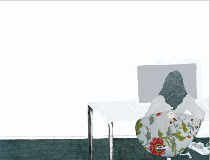
I like the first (does it have a photo?) and the third, especially the textures and the location in the plane of the objects, the colors are also very good;)
@s thanks to @s for the comments, and for the possible Toxic-Picnic purchase, I can wait for you to fill up, I'm not in a hurry :)
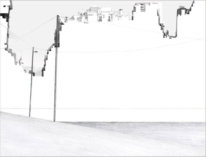
And yes, Sofi has a photo, the profile of the "horizon" is cut from a photo of the Gran Vía in Madrid ...


11 comments
rafaesteve
Fuck! I like them a lot !!
Great!
See original
Hide original
Rafa Bertone
very handsome!!!
See original
Hide original
Barrilete
I love your style!
See original
Hide original
mamecreativebeans
Subtle, very good, I like it!
See original
Hide original
Silvio Díaz
Teacher Plus"Less is More" also works for illustration. Great
See original
Hide original
Toxic-Picnic
What a cool style, the first one is amazing, if I had money I would buy it for you! :)
See original
Hide original
Sofi Martina
I like the first (does it have a photo?) and the third, especially the textures and the location in the plane of the objects, the colors are also very good;)
See original
Hide original
Virginia Pedrero
@s thanks to @s for the comments, and for the possible Toxic-Picnic purchase, I can wait for you to fill up, I'm not in a hurry :)
And yes, Sofi has a photo, the profile of the "horizon" is cut from a photo of the Gran Vía in Madrid ...
See original
Hide original
iratxemunain
what a beautiful and delicate job! beautiful!
See original
Hide original
Jon Gorroño
Pluswhat delicacy
See original
Hide original
Rafael Jaramillo
Great first.
See original
Hide original
Log in or join for Free to comment