


SOOS
by EDUARDO MEDINA @eduardo_medina
- 899
- 21
- 6
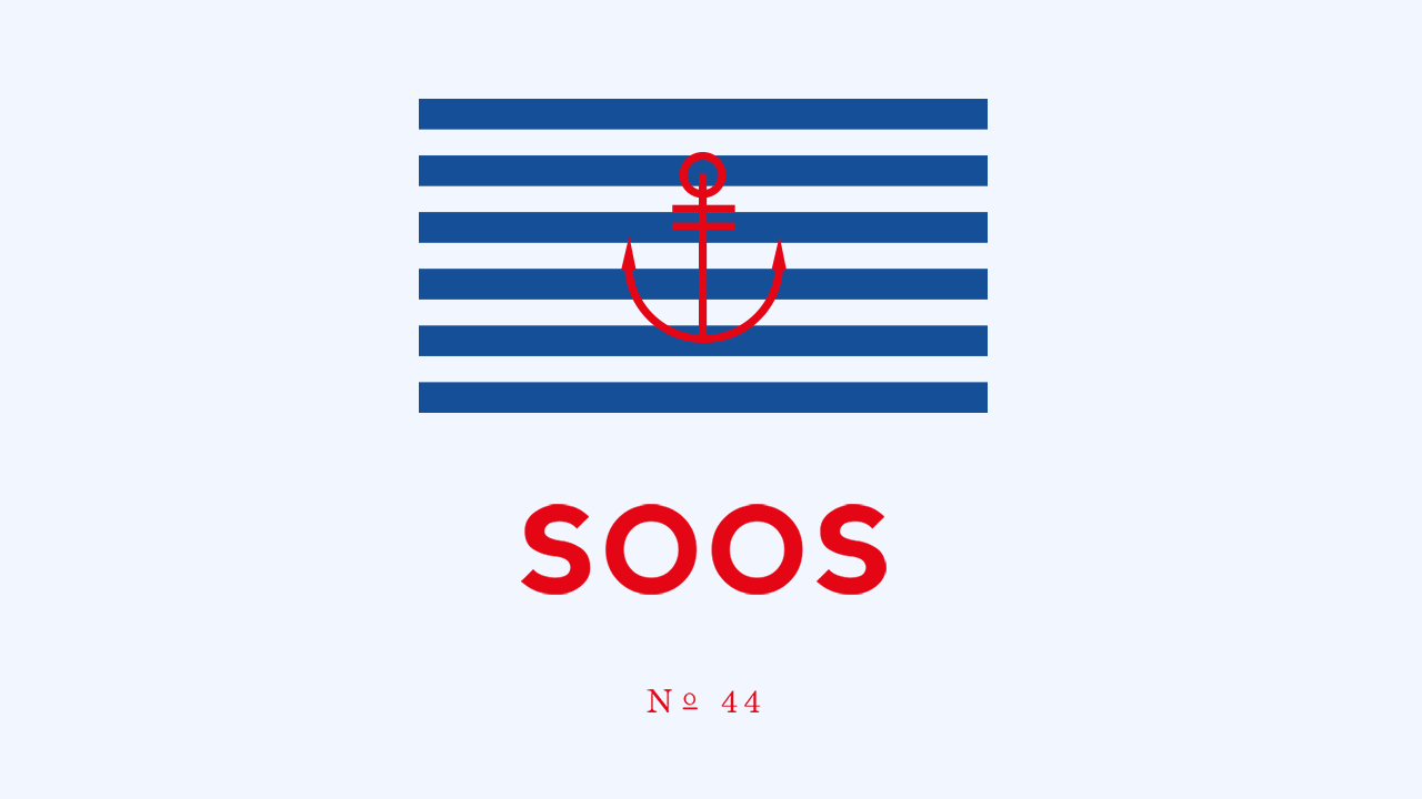
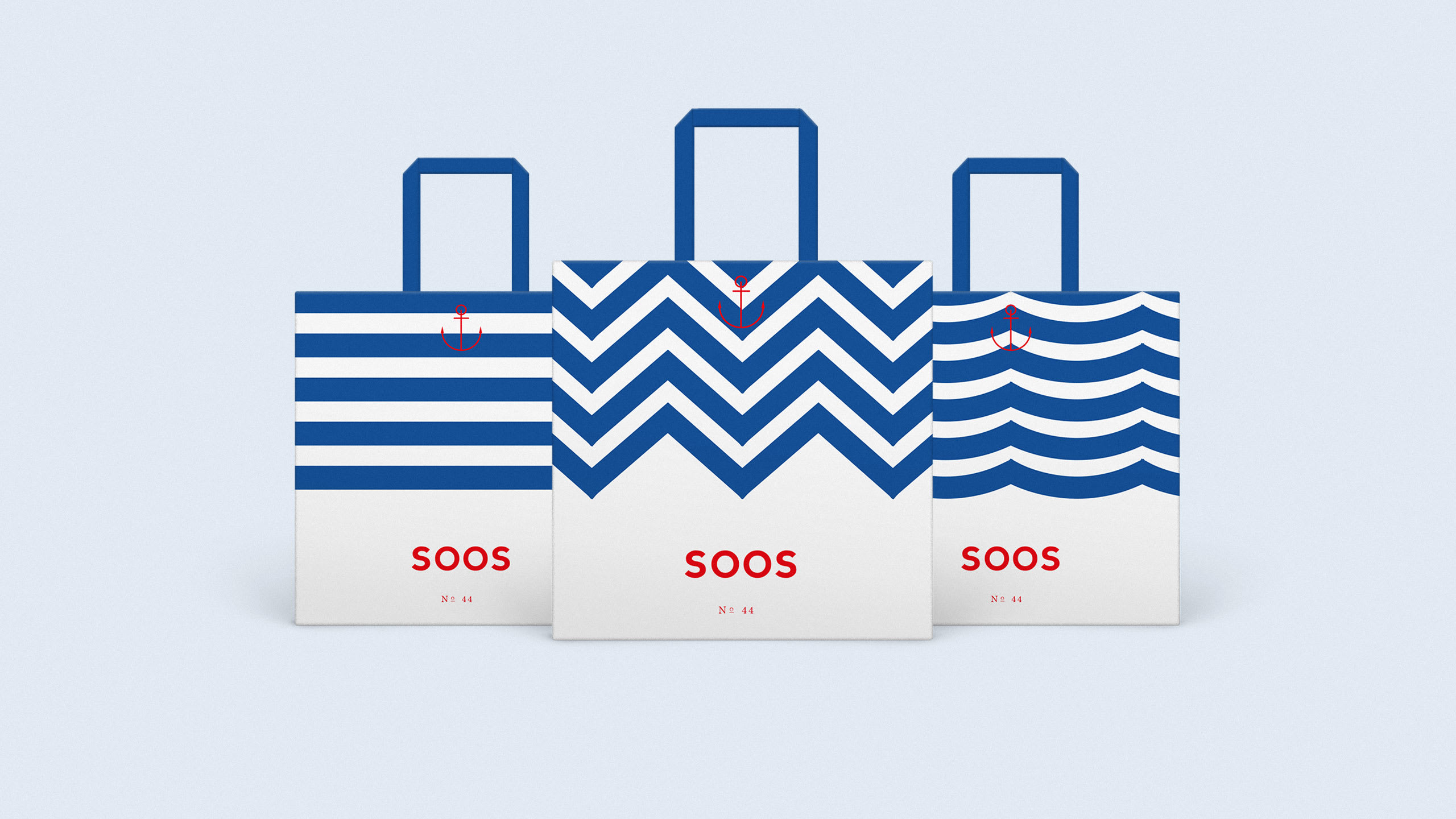
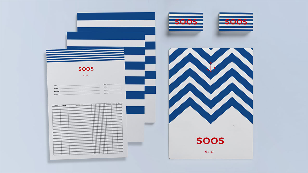
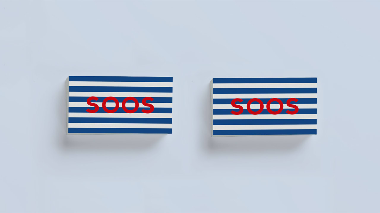
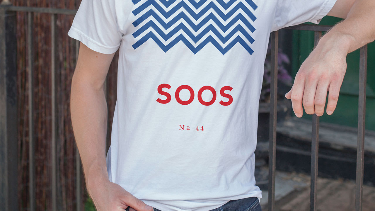
Diseño de la marca y desarrollo de los elementos corporativos para la empresa de distribución y producción textil SOOS.
Identity design and brand applications for SOOS clothing company.
Diseño de la marca y desarrollo de los elementos corporativos para la empresa de distribución y producción textil SOOS.
Identity design and brand applications for SOOS clothing company.


6 comments
malenapeich
The combination of red, white and blue that you have made seems great to me. The design of bags, order sheets and folders has been very elegant and striking. But I do have to tell you, if you allow me my personal opinion as a designer, that on the cards, the red letters SOOS on the blue and white striped background, is very "dizzy". The sensation is that your eyes make you chirivitas when trying to read it. Maybe I would keep the design line that you used on the bags on the cards. It would be clearer.
Sincerely
See original
Hide original
albertoojeda
Beautiful
See original
Hide original
malacostra
nice!
Eduardo Medina
Thank you!!
See original
Hide original
Edgar.Garcia
What a good job, simple and beautiful.
See original
Hide original
arøs
Great! I love the linear pattern, very versatile!
See original
Hide original
Log in or join for Free to comment