Thank you very much for sharing your final work with all of us. Let's see it:
The publisher is fine as a whole, except for the last photo that suddenly we put a makeup and an attitude in the model that breaks with the continuity of the rest of the photos. It is not that it is wrong, but I would remove that from the editorial for being very out of the roll of the rest of the photos.
Viewing them photo by photo:
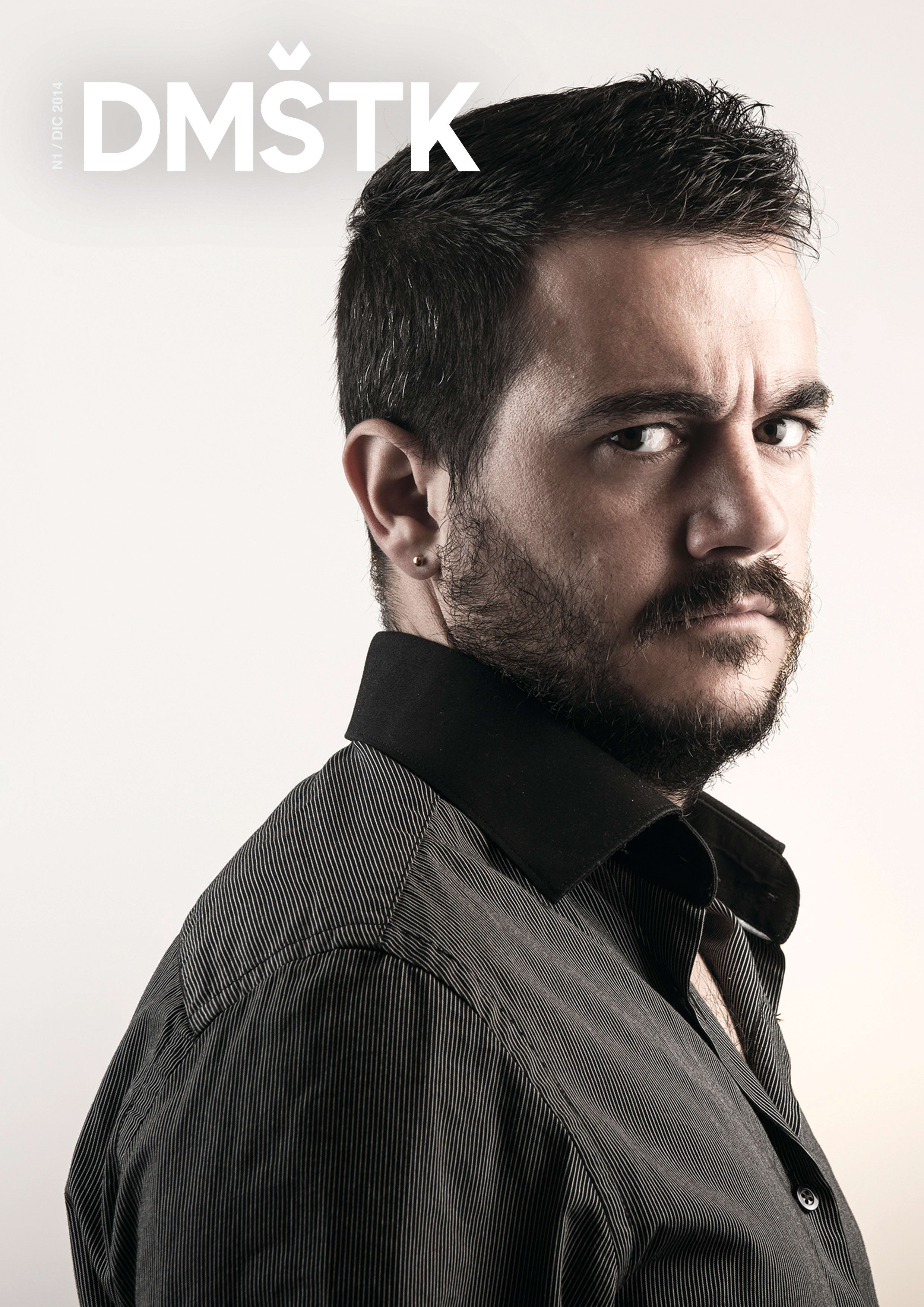
Cover page
Be careful with striped shirts, it depends on your camera, the light you use and where the photos are seen can make a terrible moiré. In this case, it does it by zones and it is something that bothers me a lot.
The position of the model is a bit forced, maybe a little more than three quarters in favor of the camera would be better. there is some grain and point of light on the cheek that we could correct, nothing serious. The light is not bad, but I miss more brightness in the eyes, which are a little dark. The right part of his face is slightly overexposed, it would improve by lowering it a little to have detail in that area.
The colorimetry is cool, and since you have put the lights, except for what I told you about the brightness in the eye, it is very good. Bravo!
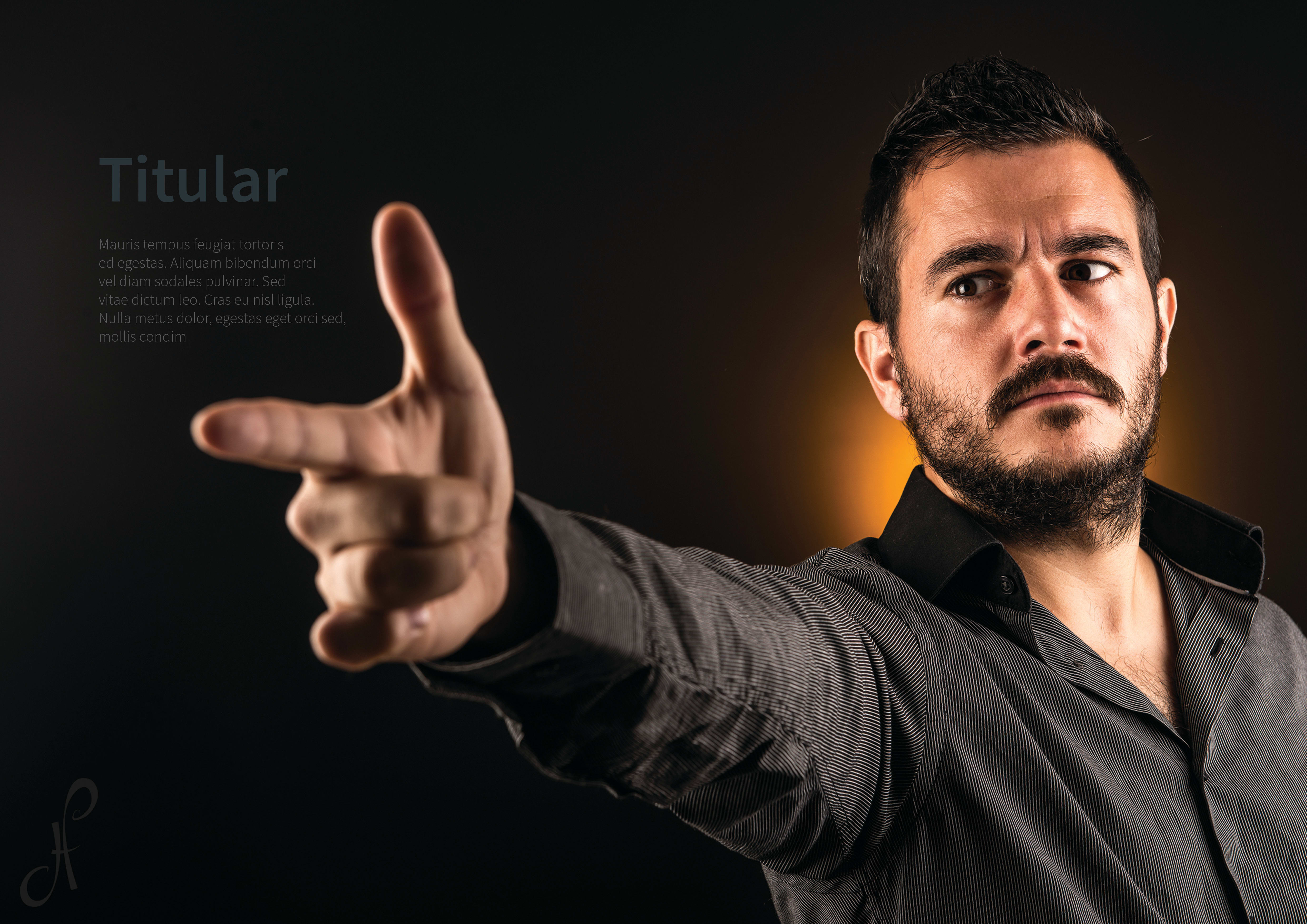
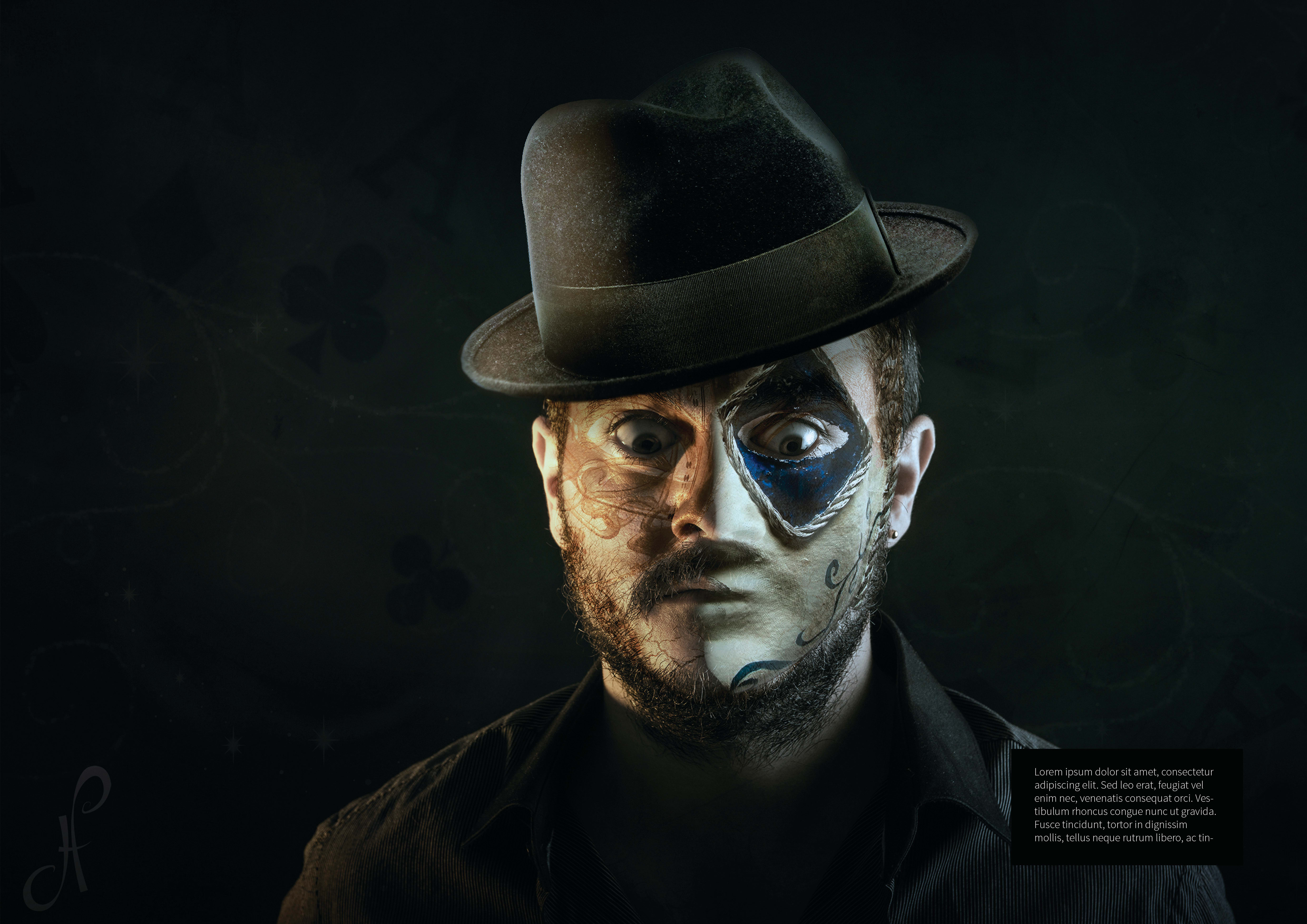
1st PHOTO
As a double page, the framing is not bad. Again, the lights are well set, with cons and detail on the face. We have the same flaw as in the cover photo, the glitter of the eyes. Even in this case we have a flash in one eye and not in the other. You could fix it by cloning that glow to the left eye and then it wouldn't have that "one-eyed" feeling. The lights would be better more balanced, the left side of the face has more light than the right and maybe I lack a little more detail in the hair, or against it so that it cuts well and does not blend as much with the background.
I like the yellow flash in the background, maybe a little bigger would be better, but in any case it is a good idea that gives a very cool touch to the photo.
We have an excess of red saturation in the face, and there is a very big difference in tone between the skin of the hand and the face.
The model is cool in attitude and position.
Very good this photo too!
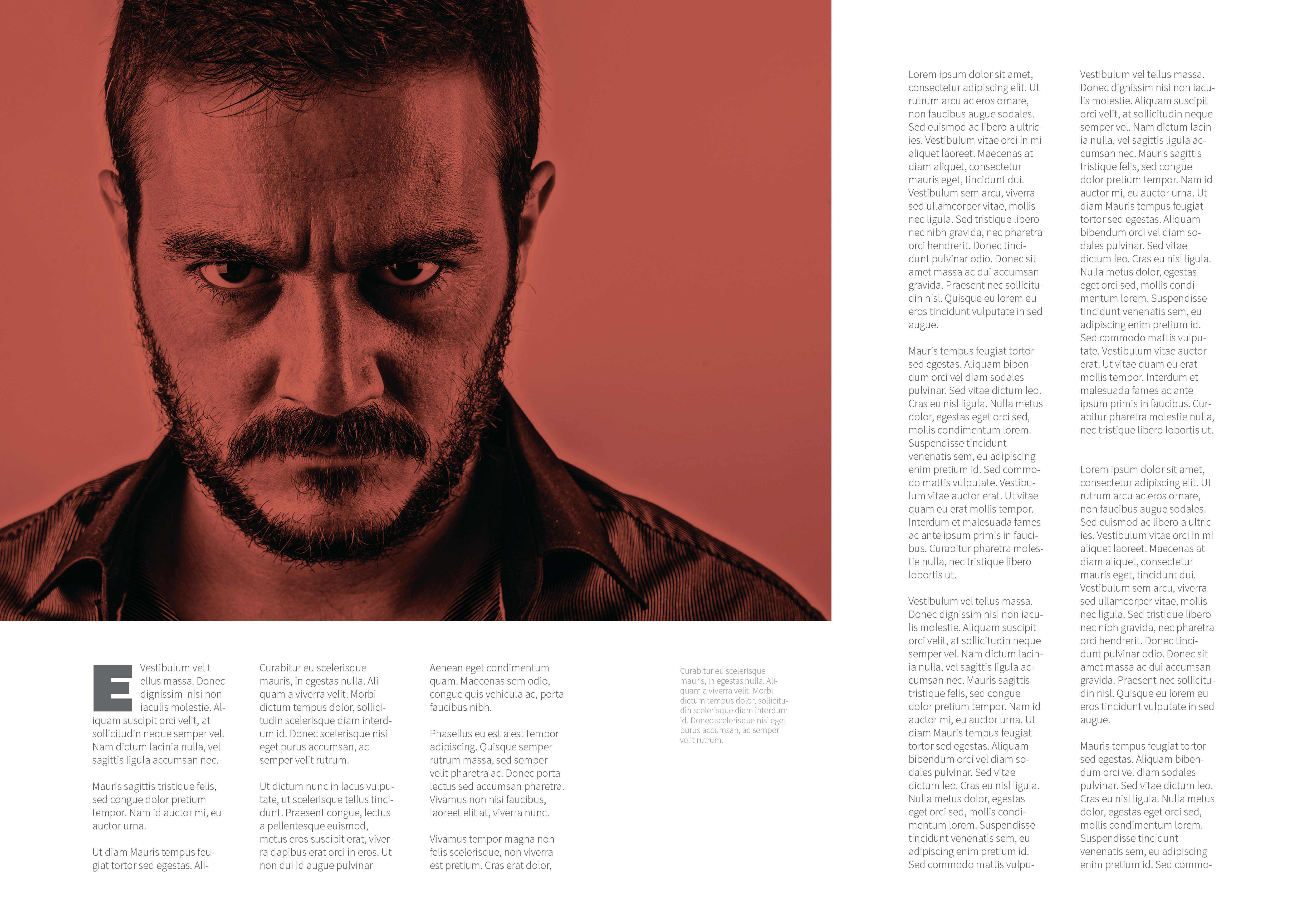
3rd Photo
Free version of Leiva's photo. I like everything. Maybe a little more detail and less black, but I'll buy you the proposal.
In these photos, watch the hair, which is very cool in the front and suddenly flattens, it would have been cooler if it continued to spike up to the crown. On the crown there is a hair that we call "antennas". An easy solution can be found by cloning the bottom and cutting it a little.
We are photographers, makeup artists, hairdressers, stylists ... a bit of everything! hehe
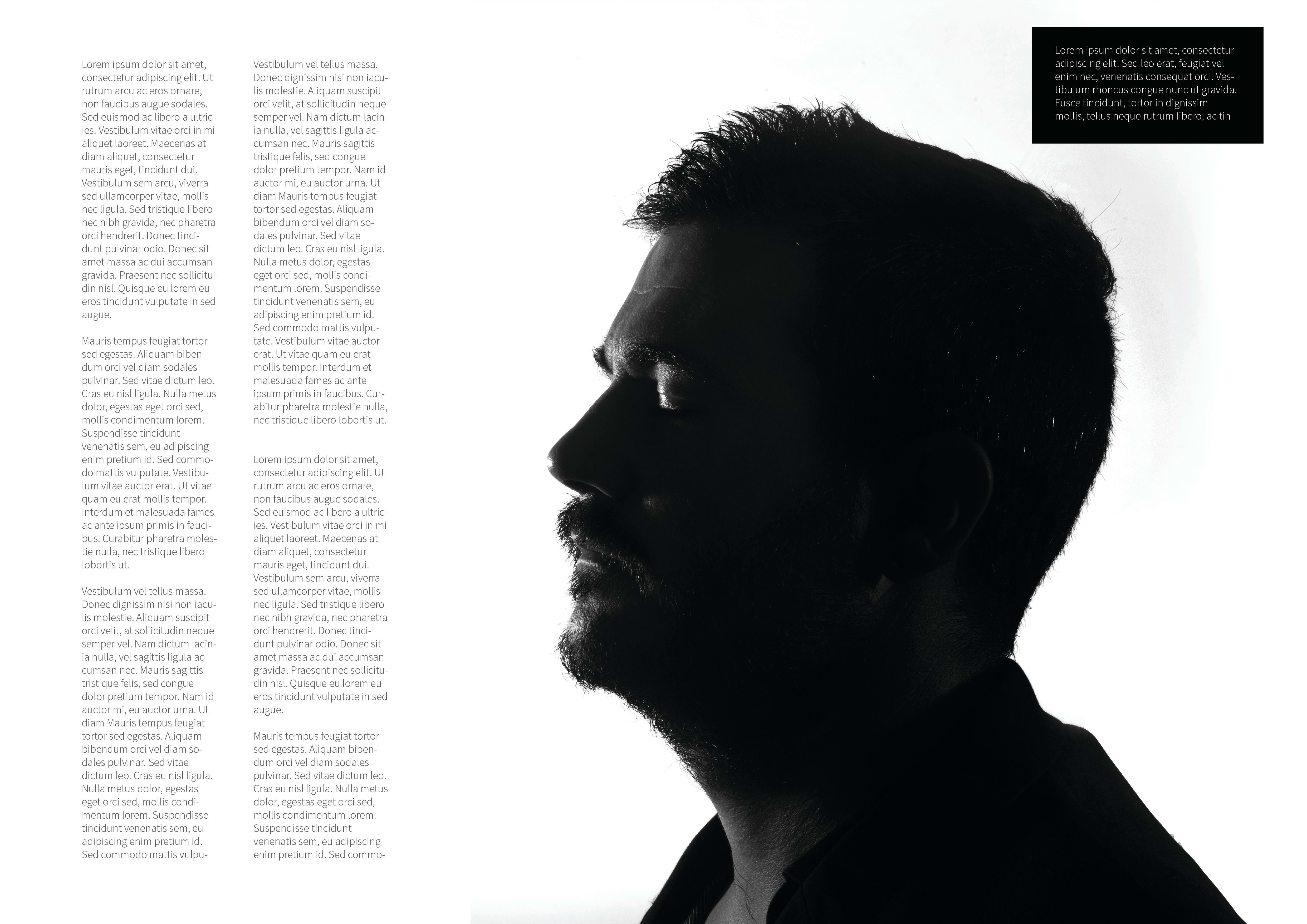
4th I LOVE IT
All good! Of the photos that you have taken for the course that I like the most. The turning, the developing, all very well. How do you know that I like movies! In this case, I would be careful with that halo that comes out in the silhouette, better outside so that everything is cleaner. BRAVISIMO! (Why don't you make a 2.0 version of the cover with this photo? I'd love to see it and I'm sure more than one too ...)
5th photo
This photo is the one I like the least within the editorial. It totally goes out of the style marked in the previous photos. The thing about the eyes happens again when lighting and both the post-post treatment and the style of the entire image I like much less than the rest. I would remove it from the publisher.
In short, a very good job with slight adjustments that you could do to finish the job and leave it at 10.


3 comments
jorge_alvarino
Teacher PlusHi @hurgo :
Thank you very much for sharing your final work with all of us. Let's see it:
The publisher is fine as a whole, except for the last photo that suddenly we put a makeup and an attitude in the model that breaks with the continuity of the rest of the photos. It is not that it is wrong, but I would remove that from the editorial for being very out of the roll of the rest of the photos.
Viewing them photo by photo:
Cover page
Be careful with striped shirts, it depends on your camera, the light you use and where the photos are seen can make a terrible moiré. In this case, it does it by zones and it is something that bothers me a lot.
The position of the model is a bit forced, maybe a little more than three quarters in favor of the camera would be better. there is some grain and point of light on the cheek that we could correct, nothing serious. The light is not bad, but I miss more brightness in the eyes, which are a little dark. The right part of his face is slightly overexposed, it would improve by lowering it a little to have detail in that area.
The colorimetry is cool, and since you have put the lights, except for what I told you about the brightness in the eye, it is very good. Bravo!
1st PHOTO
As a double page, the framing is not bad. Again, the lights are well set, with cons and detail on the face. We have the same flaw as in the cover photo, the glitter of the eyes. Even in this case we have a flash in one eye and not in the other. You could fix it by cloning that glow to the left eye and then it wouldn't have that "one-eyed" feeling. The lights would be better more balanced, the left side of the face has more light than the right and maybe I lack a little more detail in the hair, or against it so that it cuts well and does not blend as much with the background.
I like the yellow flash in the background, maybe a little bigger would be better, but in any case it is a good idea that gives a very cool touch to the photo.
We have an excess of red saturation in the face, and there is a very big difference in tone between the skin of the hand and the face.
The model is cool in attitude and position.
Very good this photo too!
3rd Photo
Free version of Leiva's photo. I like everything. Maybe a little more detail and less black, but I'll buy you the proposal.
In these photos, watch the hair, which is very cool in the front and suddenly flattens, it would have been cooler if it continued to spike up to the crown. On the crown there is a hair that we call "antennas". An easy solution can be found by cloning the bottom and cutting it a little.
We are photographers, makeup artists, hairdressers, stylists ... a bit of everything! hehe
4th I LOVE IT
All good! Of the photos that you have taken for the course that I like the most. The turning, the developing, all very well. How do you know that I like movies! In this case, I would be careful with that halo that comes out in the silhouette, better outside so that everything is cleaner. BRAVISIMO! (Why don't you make a 2.0 version of the cover with this photo? I'd love to see it and I'm sure more than one too ...)
5th photo
This photo is the one I like the least within the editorial. It totally goes out of the style marked in the previous photos. The thing about the eyes happens again when lighting and both the post-post treatment and the style of the entire image I like much less than the rest. I would remove it from the publisher.
In short, a very good job with slight adjustments that you could do to finish the job and leave it at 10.
See original
Hide original
microbians
Staff@jalvarinophoto tips!
See original
Hide original
hugopuente
@jalvarinophoto thanks for commenting,
I hope to learn from mistakes! hehe
The truth has been very useful to me.
See original
Hide original
Log in or join for Free to comment