


Jamm, identidad gráfica para la Asociación de Músicos de Jazz de Cataluña
by Edu Torres @edu_torres
- 2693
- 84
- 22
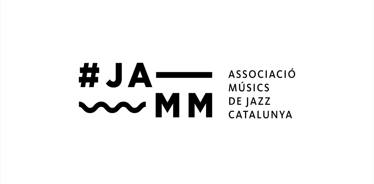
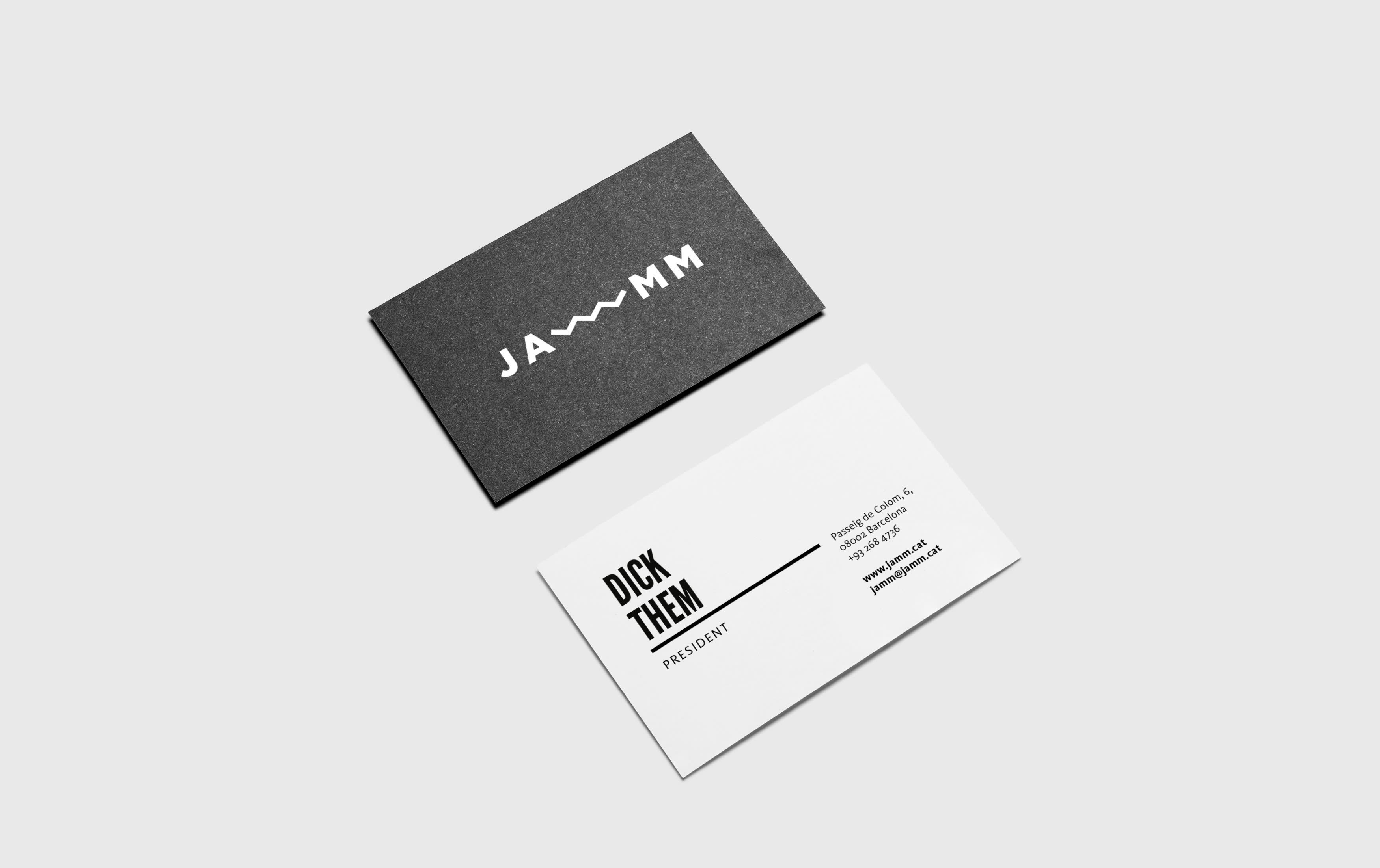
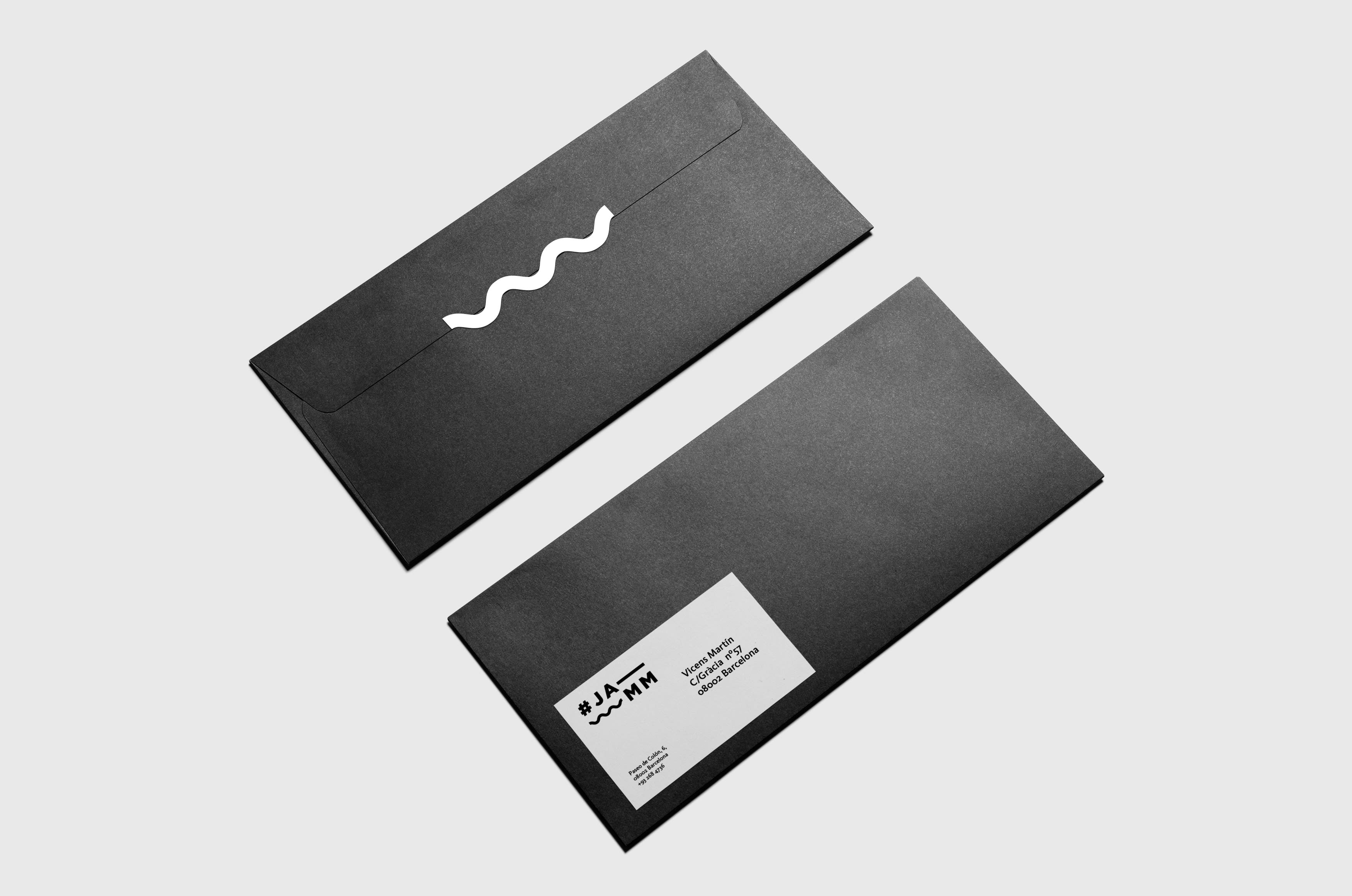
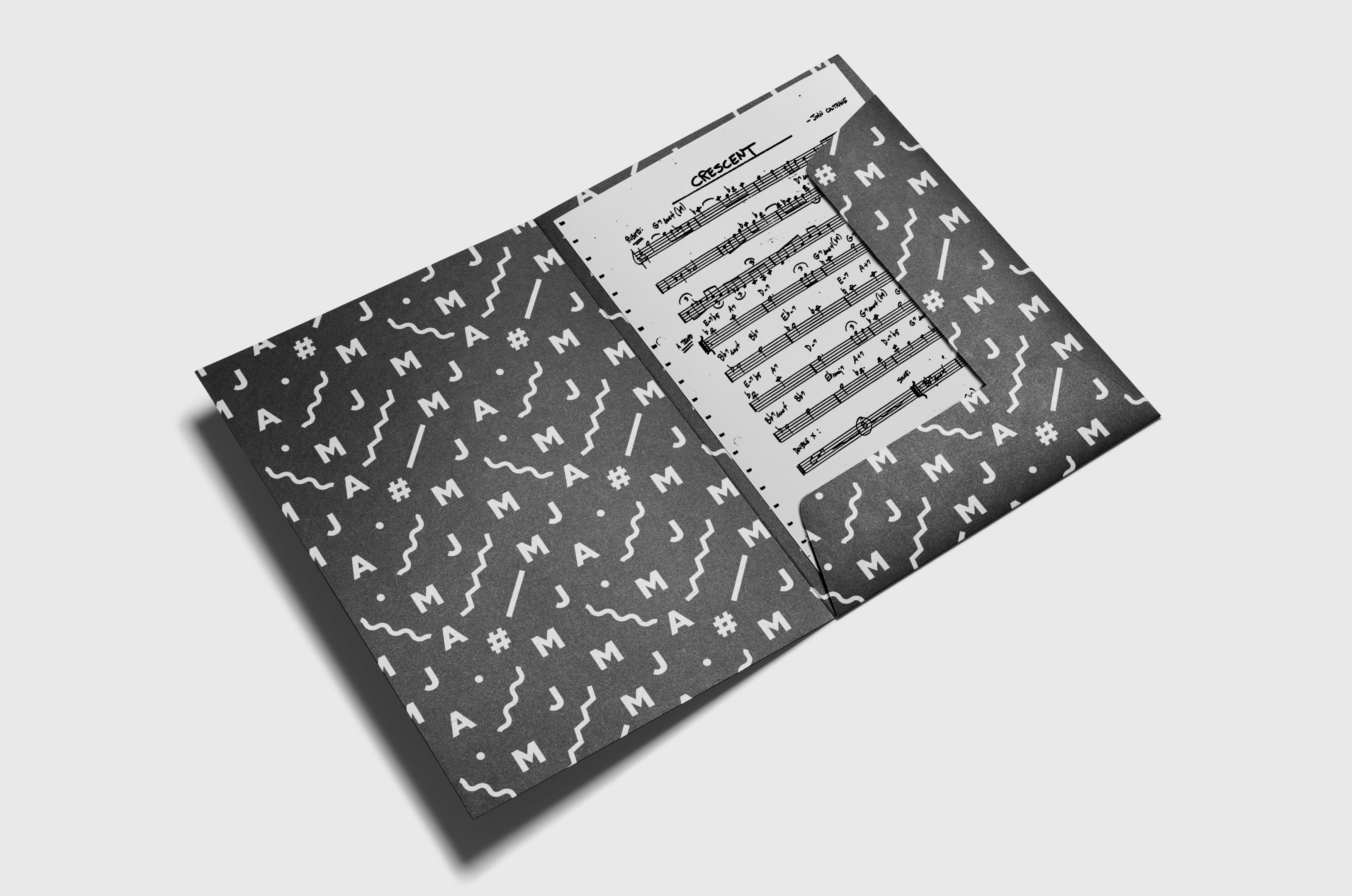
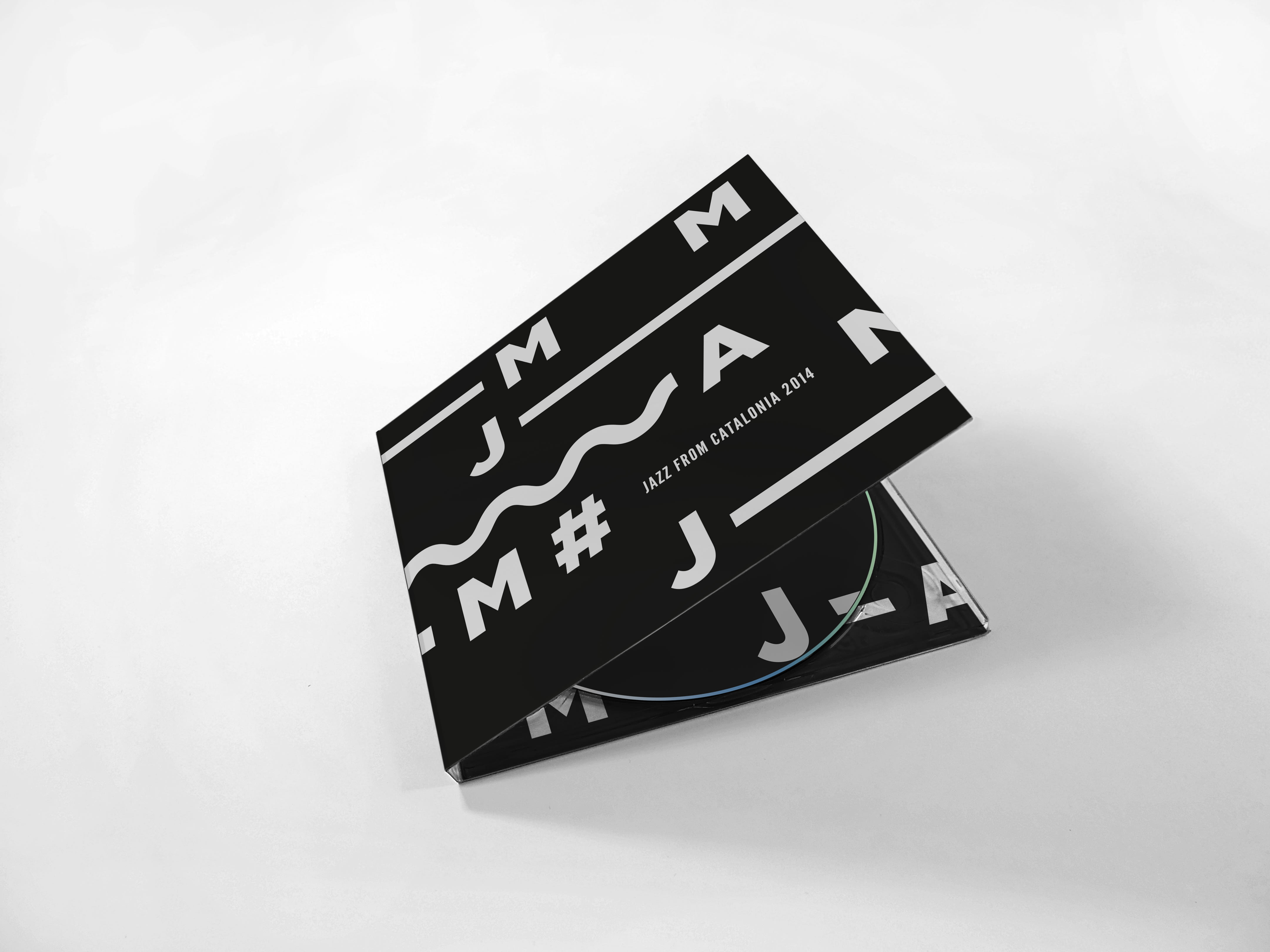
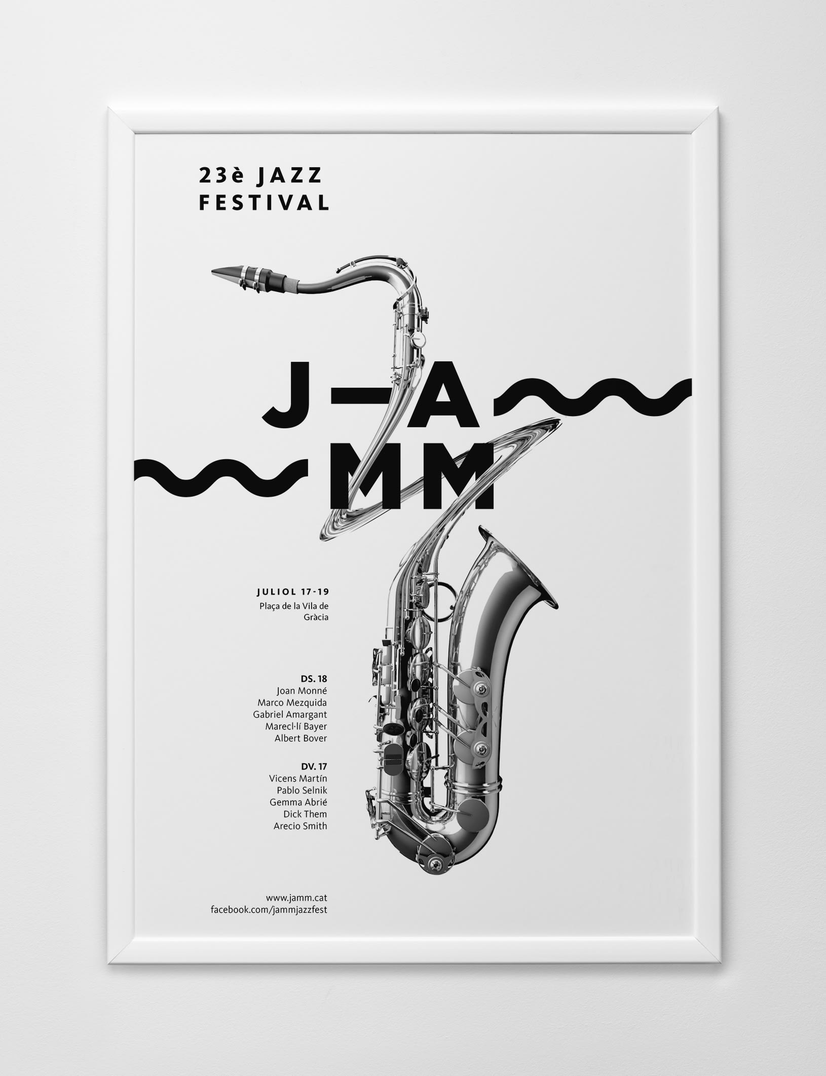
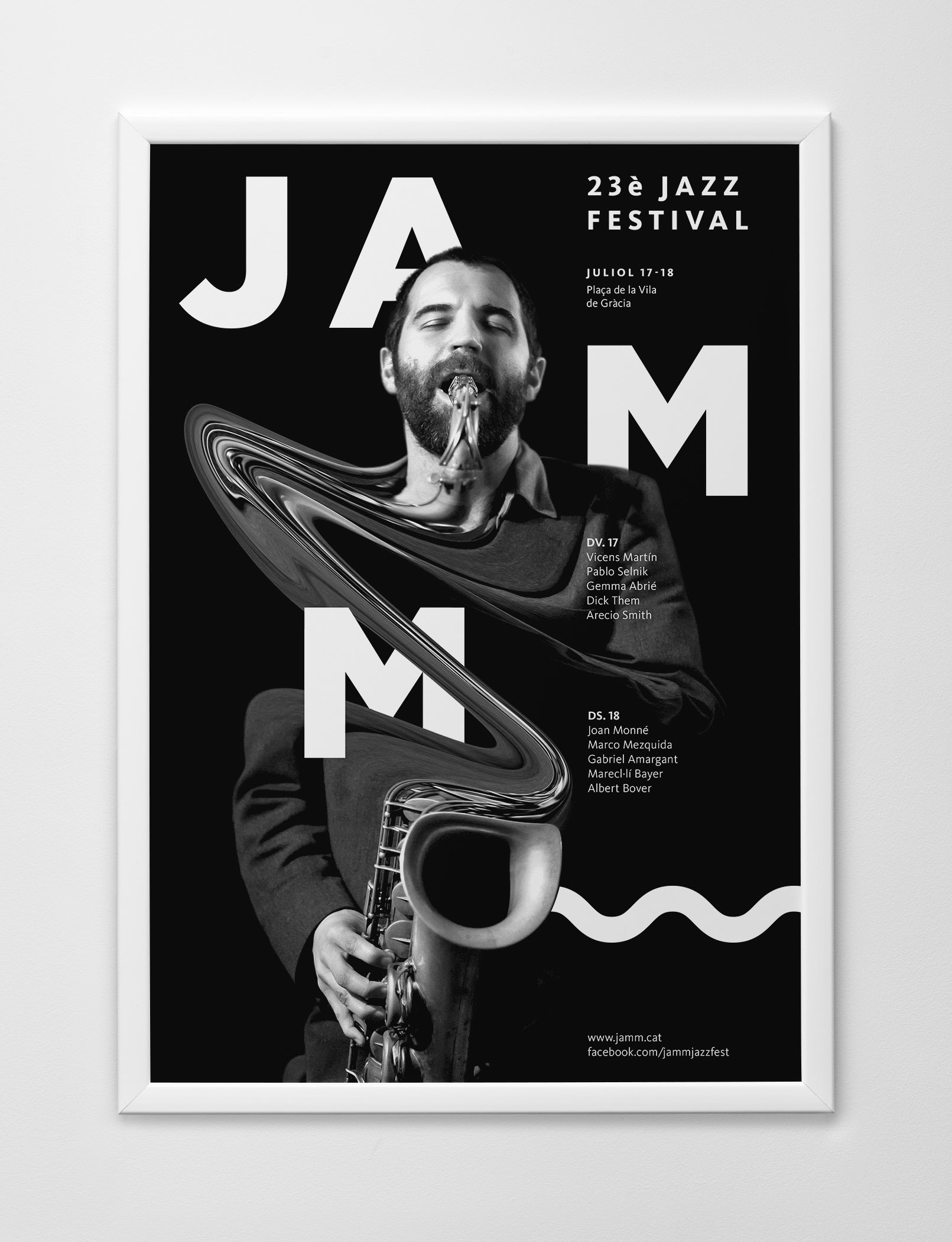
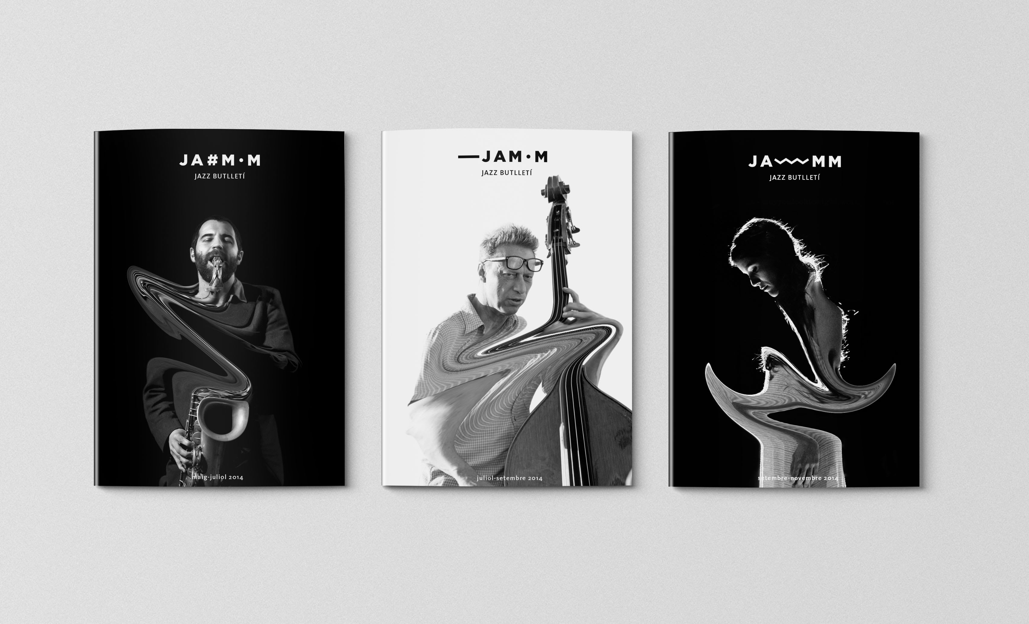
Identidad para la Asociación de Músicos de Jazz de Cataluña: Jamm. Esta asociación es una entidad cultural, democrática y de carácter sindical creada con la finalidad de agrupar a los músicos profesionales de jazz para conseguir mejoras culturales, sociales y económicas.
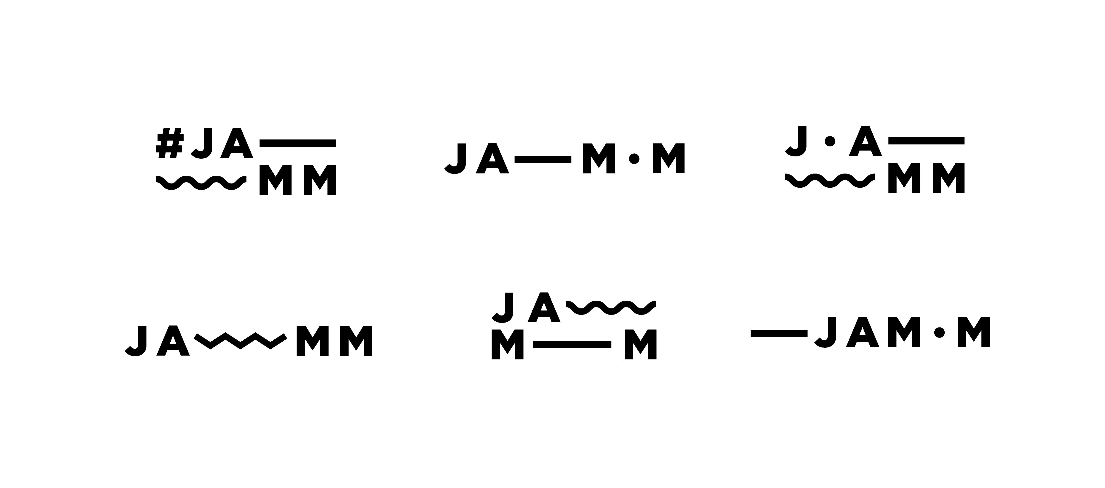
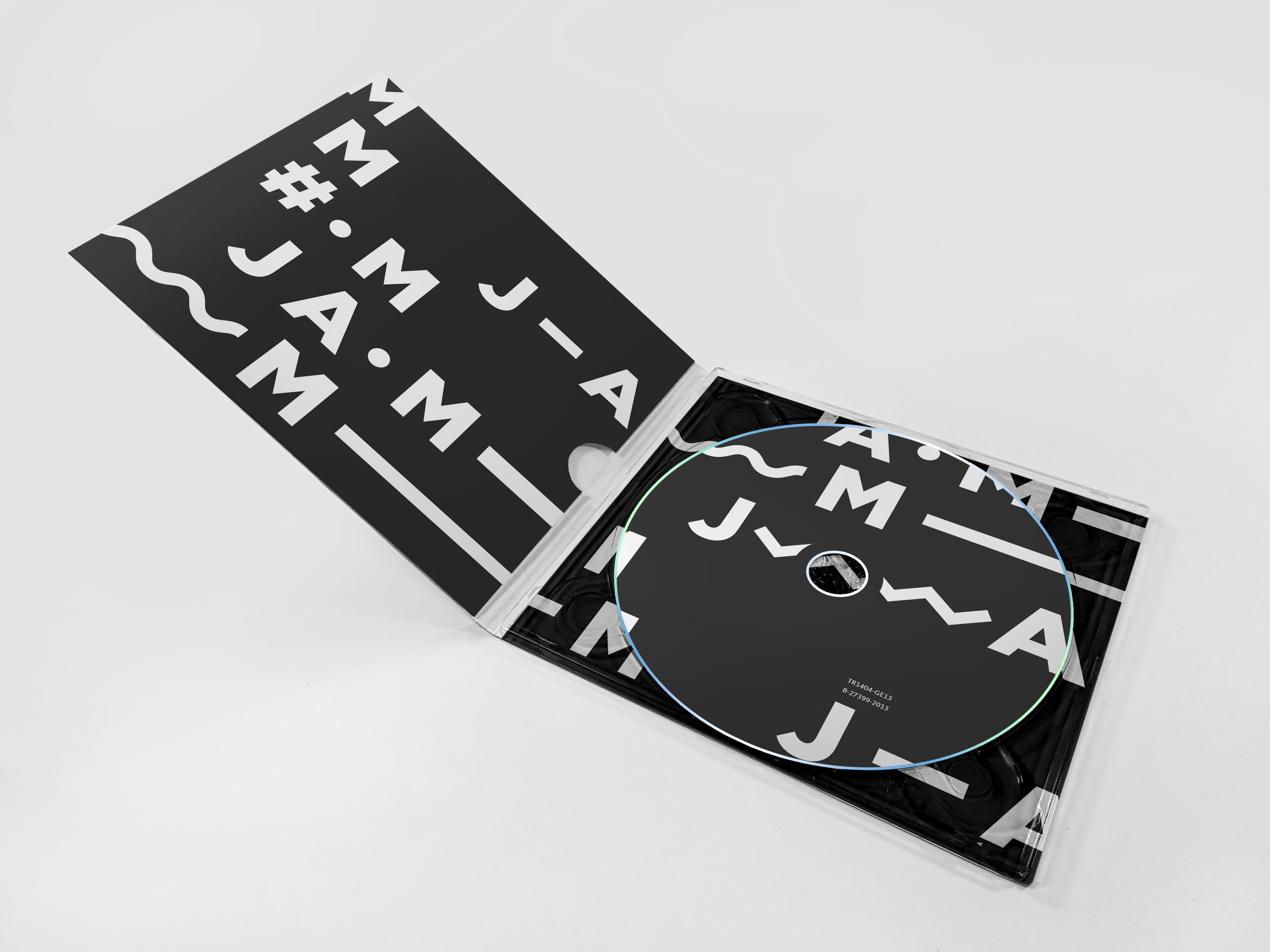
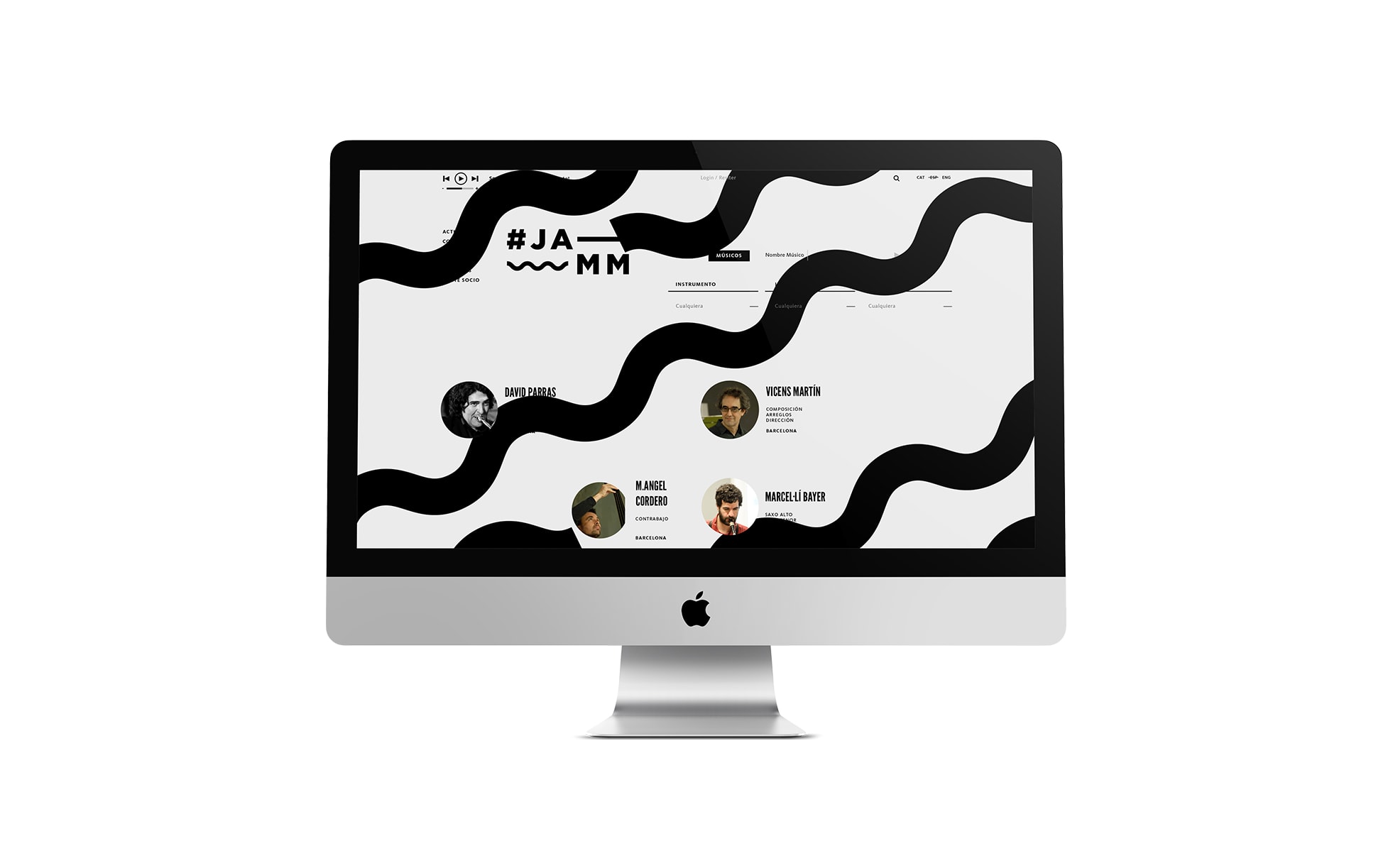
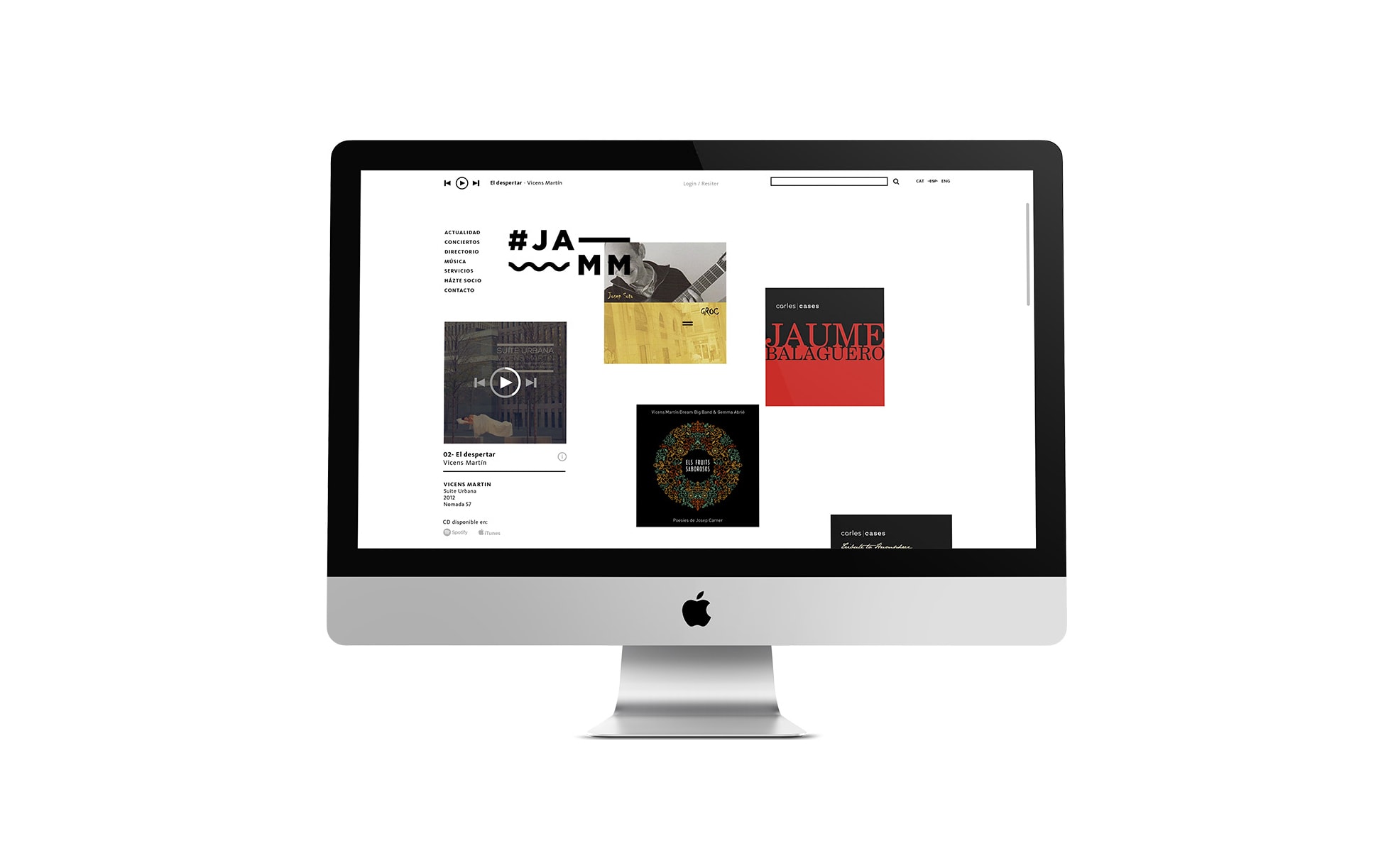
Tomando como punto de partida el concepto de la improvisación, se crea todo un entorno donde la versátil gráfica hace del conjunto una big band sinfónica y comunicativa. Elementos gráficos extraídos de las notaciones musicales juegan a improvisar alterando la posición de la tipografía, generando así un logotipo cambiante que va mutando en cada aplicación.
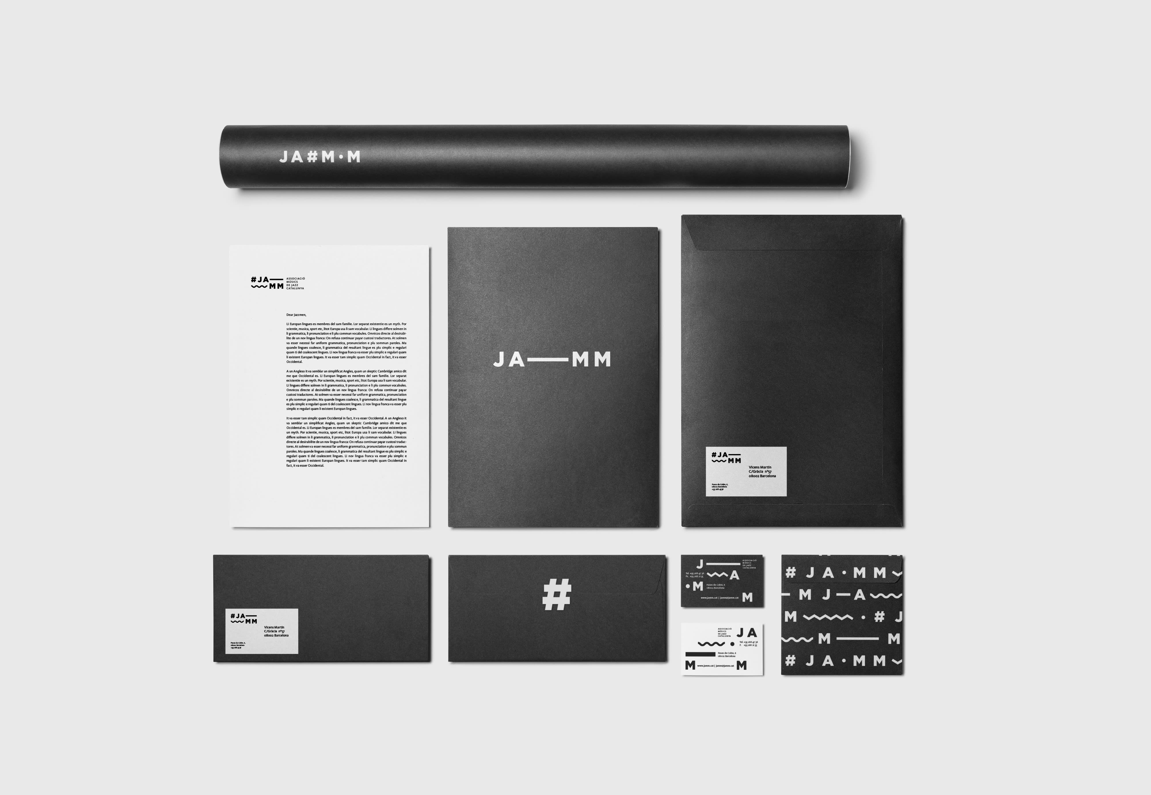
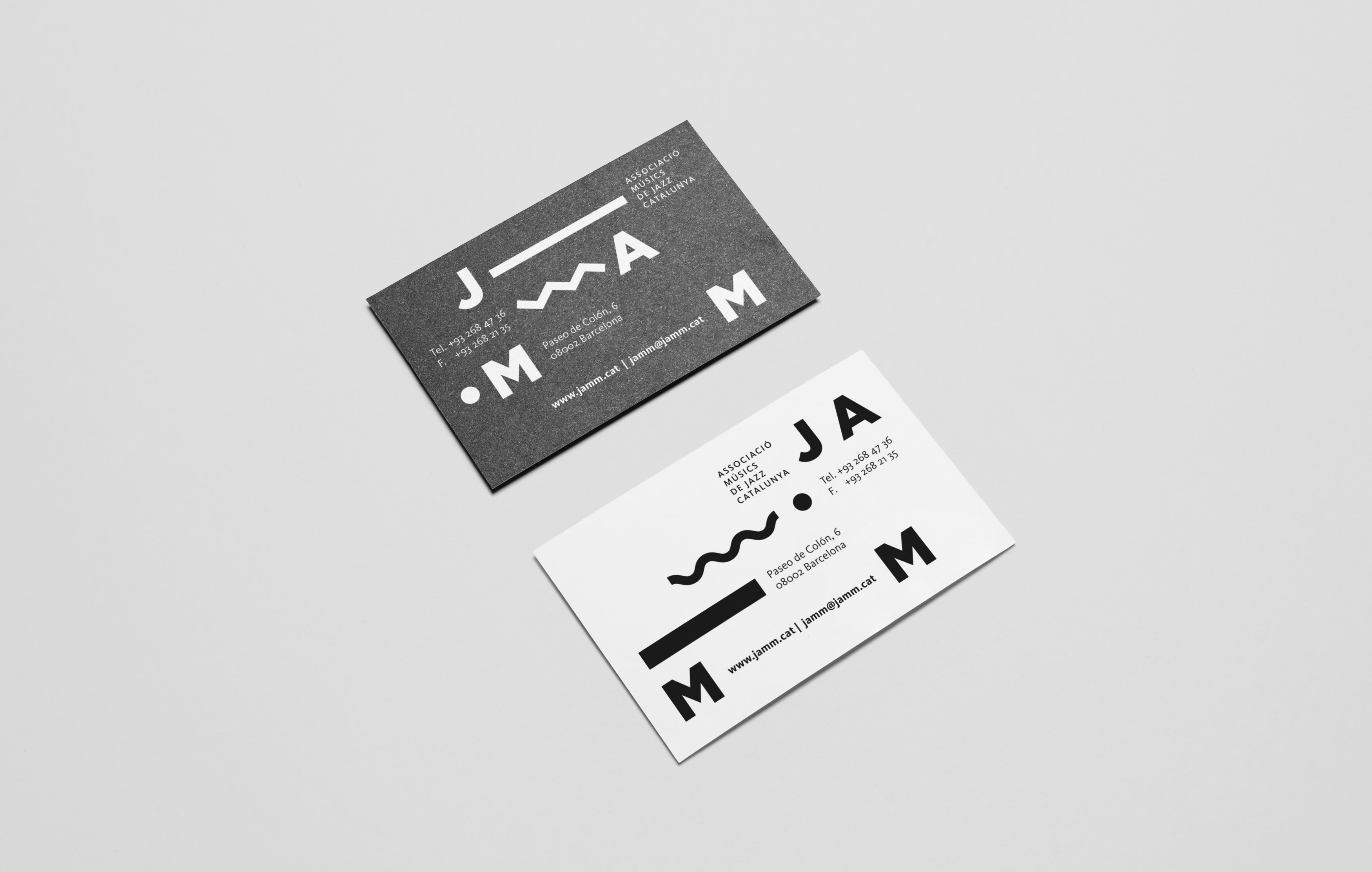
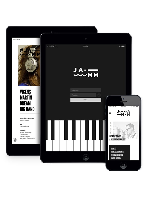
Bajo las mismas premisas se han diseñado las piezas de papelería, carteles promocionales de los conciertos, un cd recopilatorio anual, la página web y la aplicación móvil.


22 comments
thewoork
The project is very cool, congratulations! The web looks very good. Can you see it online?
See original
Hide original
edu_torres
Hi @thewoorkco , thank you for your comment! Well it seems that in the end the web will not end up seeing the light, a pity ...
See original
Hide original
susanamd87
This project goes to my favorites without hesitation !! :) I love it!! All the graphic applications using the signs and the letters of the logo, in black and white that for the association, which do not usually spend a lot, do very well. When I need to do some work for college and I hope that in the not too distant future for another site, I will look at my favorites for inspiration and this work is inspiring: D
See original
Hide original
nel.losoy
PlusYeh Edu great work, you have surpassed yourself! Too bad the web really looked very good, let's see if in the future lol Great! really! We are seeing each other ...
See original
Hide original
edu_torres
@susanamd87 I'm glad the project can be useful as a reference;) @nellosoy Thank you! a hug!
See original
Hide original
enesymas
I would like to know what you think of my work! I admire yours
https://www.domestika.org/es/projects/126244-amazon-redesign-concept
See original
Hide original
andrearques
DMSTK 17Great job, the concept is brutal and you have nailed it in all the applications. Congratulations Edu! A pity about the web!
See original
Hide original
812studio
What a pleasure !!!! I love it :)
See original
Hide original
albertoojeda
Very original Edu
See original
Hide original
edu_torres
@enesymas @andrearques @ochodeldoce @albertoojeda Thank you all !!
See original
Hide original
crea.agency
Well ... this project is what I define as designing for designers and not for users. I wonder if the standard citizen who sees one of these supports will be able to unravel the sense of so much disorder before he misses the bus or That he gets a stroke from so much looking for meaning in this "morse design". Of course, at least it is original, now, precisely because it is so original it ends up being ineffective. I hope that the comical acidity of my reasoning has not hurt your sensitivity. .
See original
Hide original
edu_torres
@crea .agency I appreciate your comment, really, but I do not share it.
1. Do not forget that the project is for an Association of jazz musicians, so they are very specific users, not standard. Ah well, the posters are more aimed at the public (also quite specific, jazz is unfortunately not a mass musical genre) but in that case the info as you see is quite orderly, all well aligned in a vertical, I would not like I cause no one any stroke.
2. I don't know what your visual culture is, but if this seems messy and indecipherable to you, I recommend that you do some research and see what is currently being done, or better yet, look at what was already being done about 100 years ago. Not to mention the specific graphics of jazz, amply varied and eclectic. Take a look at the legendary Reid Miles covers for Blue Note, you sure like them.
3. I believe that the designer should try to contribute, whenever possible, because as you well know, not all projects are the same, nor do all clients lend themselves to it. Depending on the nature of the project, a somewhat different vision than usual can be provided. In addition, the project is a final degree project, as stated in the tab on the right, and in this I do hope you agree with me, that universities are here to do something as interesting as EXPERIENCE.
And finally, your comment honestly, it does not seem to me neither acid nor comical, rather unsubstantiated. It is evident that not everyone can like the project, nor do I pretend it, so I respect that you may not like it, that you do not understand it or that you see it as a mere aesthetic exercise, but I find the less risky that you label it as ineffective . By the way, do you like jazz?
See original
Hide original
misshope
Edu seems to me an excellent composition exercise, with a lot of style and strength if it turns out to be a tremendous vacui horror. Sober colors that give strength and base to an excellent job with typography.
Of course I keep it as an incredible reference and a shame about the web.
From my sincere point of view, your work has a lot of quality and I very much agree with your argument without getting involved. I am also studying and luckily I have received teachers who encourage me to experiment and create forms, colors, textures, new compositions with work, new supports, materials ... and that currently my field is interior design (to summarize it freedom without budgets to be able to get the best out of each student and to express their qualities). If we didn't start to let go of boring rigidity (as long as we heed some basic design rules but unleash the possibilities) we would never move forward and we would never do anything new ... it would be wildly monotonous and uninteresting ... like a One day a teacher commented ... it is absurd that we rebuild with classical orders ... each current with its time ... soak up and learn from them but evolving and not stagnating because that does not make sense and is a mistake. So congratulations! =) A huge greeting!
See original
Hide original
Me and the beat
it's amazing
See original
Hide original
davidderamon
Teacher Pluspimp pimp pimp pimp!
Congratulations @eduardo_torres
It really has all the earmarks of a jam and the logo animation .... brutal!
See original
Hide original
ricardoperaltadesign
A well-defined job, and very clean execution. Congratulations
See original
Hide original
edu_torres
Thank you very much to all! @david-de-ramon a luxury coming from a master like you, merci! ; )
See original
Hide original
edusaenz
Well, I like it a lot, it seems very original and all applications have a common thread.
Congratulations.
See original
Hide original
TommyGD
Good job!! Congratulations!!
See original
Hide original
gracegarcia
molaa
See original
Hide original
Log in or join for Free to comment