Another interesting theme. The photos are generally well lit, the problem I see more in the selection of the frames and backgrounds.
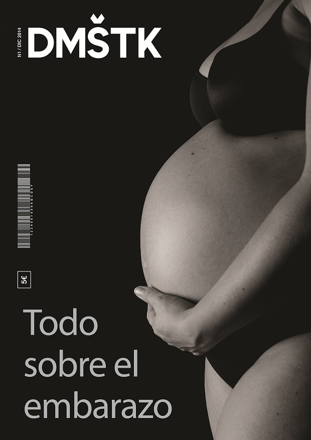
Cover is correct. Good lighting although perhaps I would have closed the frame more on the mother's belly, but as you present it is fine.
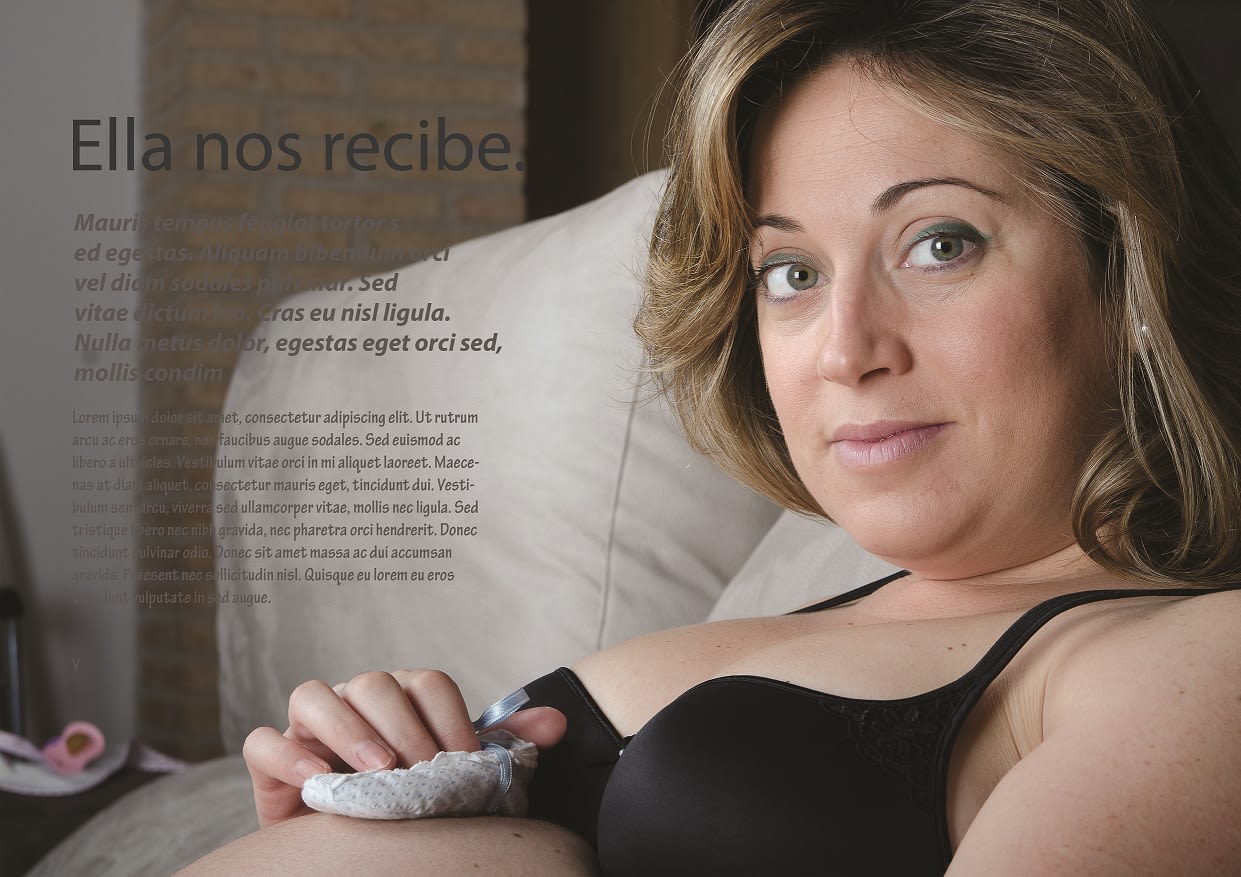
First photo. Well lighting again, although the background is a bit messy. You could have tried two things, either blur it much more so that it was more out of focus, or you could have removed that cushion and leave the brick background that seems cooler than that huge white mass that the cushion makes. It takes away the strength of the mother's face.
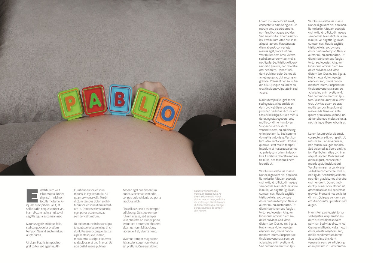
Second photo. The bottom would be better a clean. A wall or something that did not have that huge scratch just at the height of the gut and the letters. If you could have avoided the hand, the photo would also be cleaner. Maybe only with the gut and the lyrics would be more impressive, don't you think?
Third picture. It looks a lot like the cover. Normally in editorials a photo is not usually repeated indoors, perhaps one that is more different from the cover would be better.
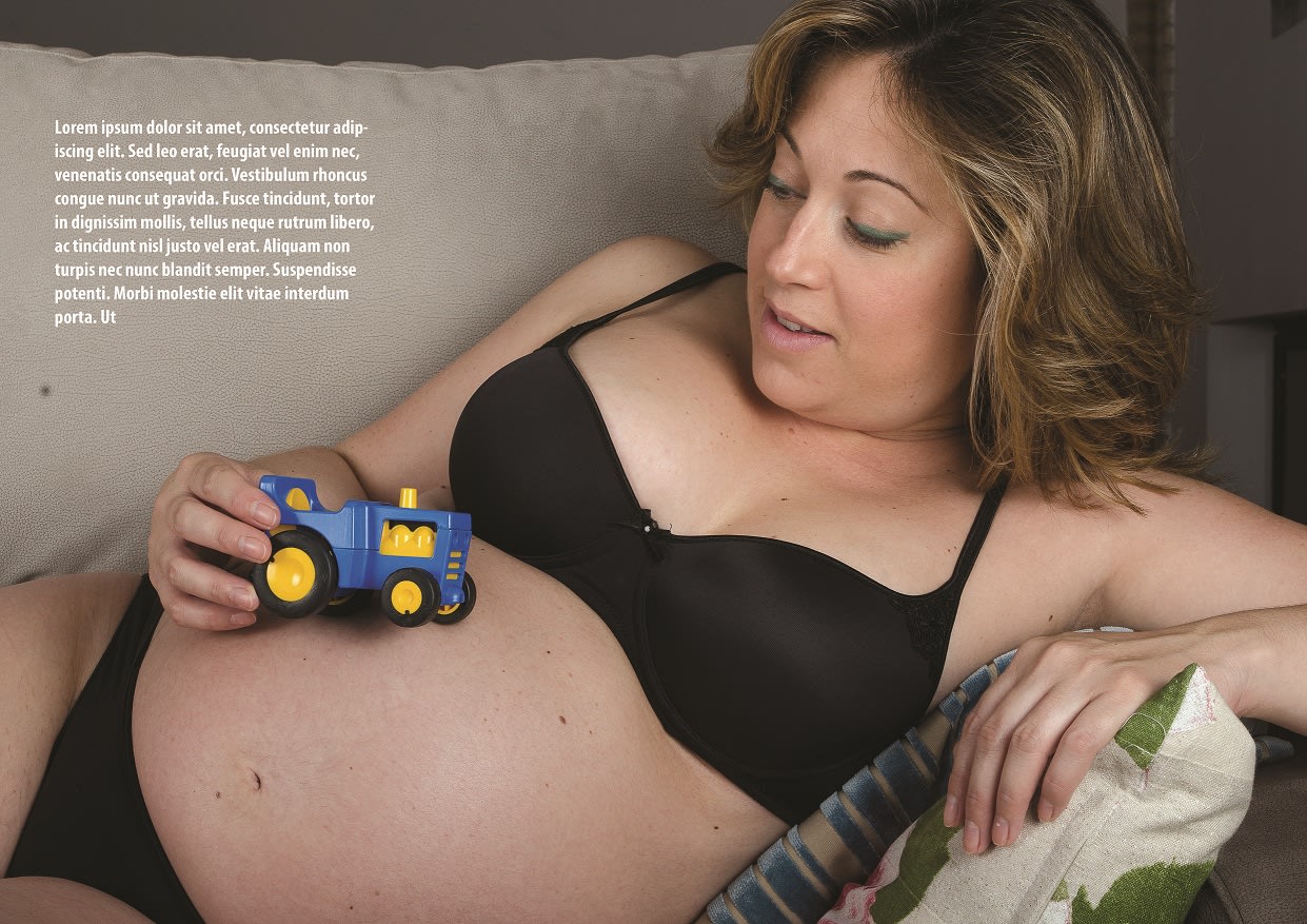
Fourth photo. Here the funds fail you again. The green cushion, the background cushion, that upper left corner that seems to be escaping the photo. Also the posture of the mother is perhaps a bit forced, in sofas you have to be careful when sitting or laying people down so that they do not give the feeling that they are sunk in the sofa. In this case you have put a couple of cushions, but there is still a forced feeling on the shoulders and neck.
The photos are well lit, and the raws are well treated, I think that in this case you master the technique for this type of photos, and what you need is to take more into account what surrounds your subject in the final composition of the photo. .
Congratulations on the final result. The cover is cool and despite these compositional things that I am telling you, the photos are fine in the absence of those details to make them better.
Hello, thanks for your comments Jorge, the issue of funds I have to take care of more, since they have told me in several photos. It will be one thing to keep in mind for next time. Thank you very much and I will try to improve with what the course has given me.


2 comments
jorge_alvarino
Teacher PlusHello @mco1980 !
Another interesting theme. The photos are generally well lit, the problem I see more in the selection of the frames and backgrounds.
Cover is correct. Good lighting although perhaps I would have closed the frame more on the mother's belly, but as you present it is fine.
First photo. Well lighting again, although the background is a bit messy. You could have tried two things, either blur it much more so that it was more out of focus, or you could have removed that cushion and leave the brick background that seems cooler than that huge white mass that the cushion makes. It takes away the strength of the mother's face.
Second photo. The bottom would be better a clean. A wall or something that did not have that huge scratch just at the height of the gut and the letters. If you could have avoided the hand, the photo would also be cleaner. Maybe only with the gut and the lyrics would be more impressive, don't you think?
Third picture. It looks a lot like the cover. Normally in editorials a photo is not usually repeated indoors, perhaps one that is more different from the cover would be better.
Fourth photo. Here the funds fail you again. The green cushion, the background cushion, that upper left corner that seems to be escaping the photo. Also the posture of the mother is perhaps a bit forced, in sofas you have to be careful when sitting or laying people down so that they do not give the feeling that they are sunk in the sofa. In this case you have put a couple of cushions, but there is still a forced feeling on the shoulders and neck.
The photos are well lit, and the raws are well treated, I think that in this case you master the technique for this type of photos, and what you need is to take more into account what surrounds your subject in the final composition of the photo. .
Congratulations on the final result. The cover is cool and despite these compositional things that I am telling you, the photos are fine in the absence of those details to make them better.
Cheers!
George
See original
Hide original
mco1980
Hello, thanks for your comments Jorge, the issue of funds I have to take care of more, since they have told me in several photos. It will be one thing to keep in mind for next time. Thank you very much and I will try to improve with what the course has given me.
See original
Hide original
Log in or join for Free to comment