


Autoescola Ferrer
by Bisgràfic @bisgrafic
- 802
- 15
- 4
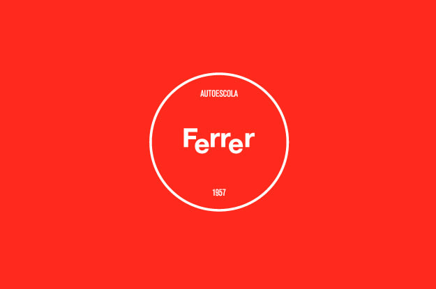
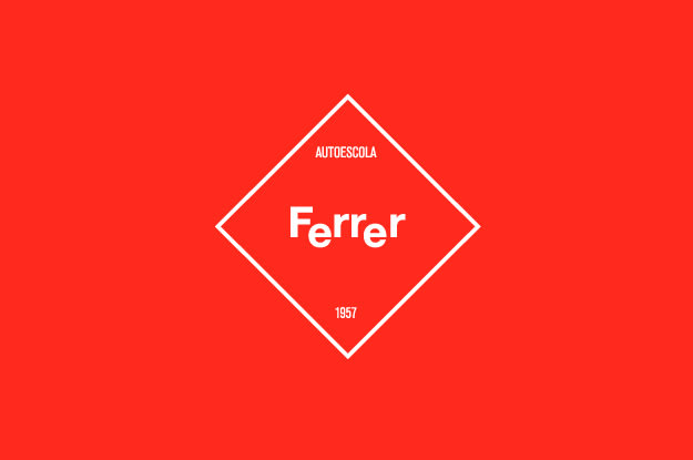
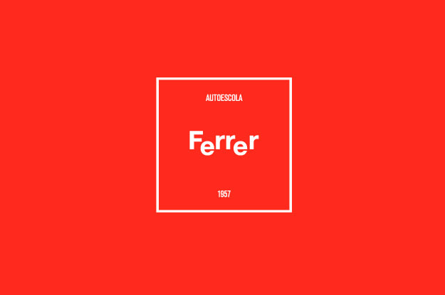
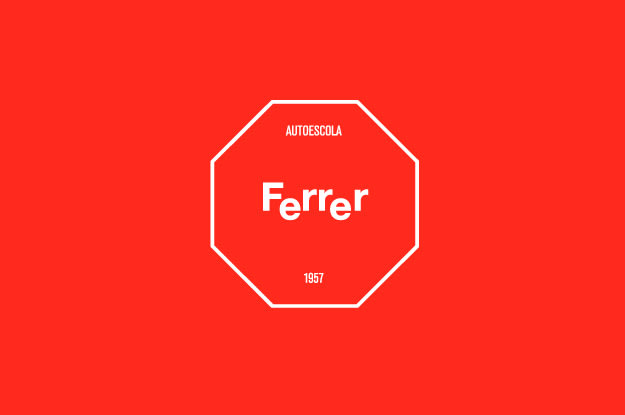
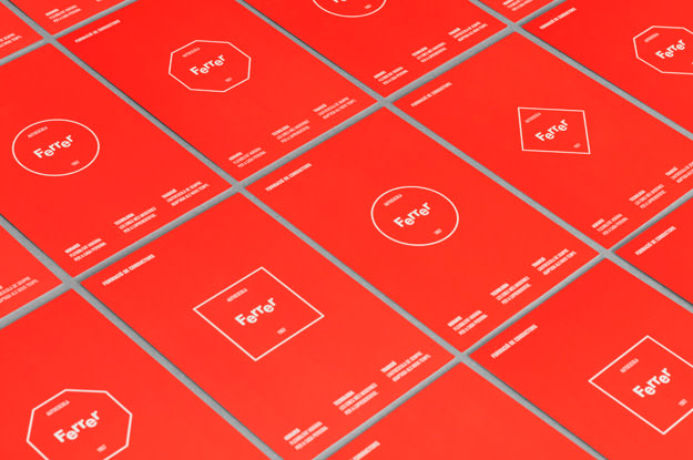

Logotipo para una autoescuela. El desplazamiento de las dos letras E le aporta movimiento. Se dinamiza aplicándolo dentro de las formas redonda, triangular, cuadrada y octogonal de las diferentes señales de tráfico.


4 comments
nueve_estudio
+++
rubenferlo
Teacher PlusI like!
See original
Hide original
Julio Reija
Very good reasoning about the visual possibilities of the name.
I love how they have taken advantage of the forms, naturally oriented in the same direction, of the efe and the r's, without forcing the typography at all, with a lot of cleanliness and that genius of finding what was before everyone's nose but nobody else had seen before ...
See original
Hide original
james80
Teacher PlusI like! Very simple and strong.
See original
Hide original
Log in or join for Free to comment