Fonts: Build your Word
Reading and readability
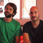
A course by Glíglifo , Graphic designers specialized in typefaces
Design a font with the double pencil technique
- Spanish with subtitles in English
- 96% positive reviews (51)
- 1156 students
About the video: Reading and readability
Overview
“The ultimate goal of typography is the care of these two aspects. We show you how.”
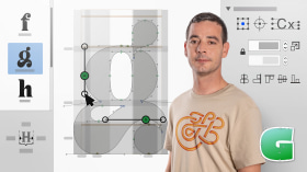
In this video lesson Glíglifo addresses the topic: Reading and readability, which is part of the Domestika online course: Fonts: Build your Word. Design a font with the double pencil technique.
Partial transcription of the video
“[Piano playing] After watching the first videos of this unit what we do reminder are the relationship between geometric shapes and the letter Optical adjustments optical laws cheat math we have seen some examples some techniques that we can follow when it comes to space the typography, to space the letter. And now we are going to finish this unit touching the readability issue a bit and some aspects that touch or greatly influence readability Let's start talking about ink traps What are the ink traps? Ink traps are as we can see here are the points that come into contact two strokes, And if...”
This transcript is automatically generated, so it may contain mistakes.
Course summary for: Fonts: Build your Word
-
Category
Calligraphy & Typography -
Software
Adobe Illustrator, Glyphs -
Areas
Graphic Design, Typography, Typography Design
Damià Rotger Miró, (Ferreries, Menorca, 1981) is a graphic designer specialized in typography design. Their types can be purchased at the independent digital foundry Ductile . Diploma in Graphic Design in Palma de Mallorca, postgraduate in Corporate Identity in Elisava (Universitat Pompeu Fabra) and Typography «from the creation of the Letter to the Maquetación» in Eina (Autonomous University of Barcelona). He is a professor of typography and editorial design at the Edib school in Palma de Mallorca, organizer of Glíglifo, member of Lletraferits, teaches workshops and conferences on typography and editorial design throughout Spain, is a pioneer in the teaching of typography in the Balearic Islands and is a founding partner of the Dúctil study. He has been a jury in different competitions and his works have been awarded and exhibited all over the world.
-
Pedro Arilla (Ejea de los Caballeros, Zaragoza, 1984). Graphic designer specialized in typography design. Their types can be purchased in the independent digital foundry pedroarilla.com . Diploma in Graphic Design by the Higher School of Design of Aragón, author and speaker of the blog and podcast on typography Don [url=http://donserifa.com/] , member of ATypI (Association Typographique Internationale), Some tough guys and Lletraferits, organizer of Glíglifo, disseminator of typography through articles in blogs and magazines and workshops and conferences throughout Spain, speaker of the podcast on design Losing the forms and founding partner of Detalier estudio creativo.
- 96% positive reviews (51)
- 1156 students
- 18 lessons (2h 8m)
- 8 additional resources (5 files)
- Online and at your own pace
- Available on the app
- Audio: Spanish
- Spanish, English, Portuguese
- Level: Beginner
- Unlimited access forever
