Corporate Typography
From lead to pixel
A course by Bauertypes , Branding and identity / Art direction / Graphic design
Joined May 2016
Lean to choose and implement suitable typography for coherent and efficient business communication
- Spanish with subtitles in English
- 97% positive reviews (64)
- 990 students
About the video: From lead to pixel
Overview
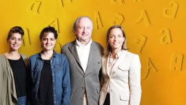
“Vivian Hartmann will tell us how Bauertypes has been reinvented after the era of lead, adapting to a new era and specializing in typographic advice. ”
In this video lesson Bauertypes addresses the topic: From lead to pixel, which is part of the Domestika online course: Corporate Typography. Lean to choose and implement suitable typography for coherent and efficient business communication.
Partial transcription of the video
“[Music] Hello everyone! I'm Vivian Hartmann, daughter of Wolfgang Hartmann, represent the fourth generation of the Bauertypes family business, and in this course we're going to present all the change that assumed Bauer Types from lead to digital and adaptation to new technologies. In the year 2000, when I started working on Bauer Types, in fact, I already found a giant step done by my father, Wolfgang: and it was that our typographies, own, had already been digitized. However I came across a big challenge and a big responsibility, because the market had radically changed. although before th...”
This transcript is automatically generated, so it may contain mistakes.
Course summary for: Corporate Typography
-
Category
Calligraphy & Typography -
Software
Adobe Illustrator, Adobe InDesign -
Areas
Graphic Design, Typography
A course by Bauertypes
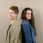
Natalia Weber Antón (Zurich, 1988) is a graphic designer and typographic consultant. The shapes of the letters fascinate him since he learned to write his name. He lived in Switzerland until he was 19 years old, when he moved to Spain (where his mother was born) to study Graphic Design and discovered his passion for editorial design.
He learned to take advantage of his concerns in his first professional experiences where he put into practice his knowledge in the execution of a newspaper and other editorial projects.
His fascination with the letters led him in 2014 to take the Master in Advanced Typography of Eina, crowning the year with a scholarship that allowed him to attend the ATypI in Barcelona. That same year he had the opportunity to design an alphabet for the facade of the Sagrada Familia in Barcelona when he worked for Enric Jardí.
Then, a new typographic stage began working for Bauertypes being immersed in the world of letters in a deeper way, always understanding the typography from the perspective of the figure of the graphic designer, his vocational profession.
Laura Asensio (Valladolid, 1982) is a creative director and graphic designer.
He studied Advertising Graphics in Salamanca and, independently, many courses and monographs by the great professionals of lettering, design and illustration.
In the last ten years he has worked for different studios and agencies in projects of corporate image creation, graphic communication and editorial design, combining strategy and artistic sensitivity.
This restless mind develops in 2006 the Melopasopipa brand, a world of characters created and made by herself that reflect her most fun and optimistic side. With this project he participates in various fairs and exhibitions, he even creates his own online store and works for brands such as Adidas Original or Vodafone.
A tireless freelance, he enjoys sharing his projects with other designers and complements his creativity by working hand in hand with other disciplines such as photography or decoration.
She is passionate about typography and has Bauertypes as one of her favorite clients for which she works in communication, strategy and network management.
- 97% positive reviews (64)
- 990 students
- 21 lessons (3h 2m)
- 16 additional resources (3 files)
- Online and at your own pace
- Available on the app
- Audio: Spanish
- Spanish, English, Portuguese
- Level: Beginner
- Unlimited access forever
