


Creating a Magazine Cover with Illustrated Type
Birgit Palma shares her process for creating a magazine cover in her latest Domestika Live
Birgit Palma (@birgitpalma) is an Austrian illustrator and lettering expert based in Barcelona who’s been freelancing for the best part of the last decade. She’s worked on projects for major clients, including Adidas, Adobe, Diesel, Hyundai, and Coca-Cola.
After revealing that she shares her birthday with Hugh Hefner (April 9th, in case you were curious!) and that she used to love playing Counter-Strike and headbanging to heavy metal, Birgit shares her top tips for combining illustration and typography in her latest Domestika Live. Before showing us how to create illustrated modular typography from scratch, Birgit shares her process behind creating a cover for the magazine, Yorokobu.
1. Unhappy accidents are part of the process
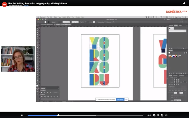
After being commissioned to create the cover, Birgit decided she would create modular lettering. In her first proposal, the three letter “O”s lined up vertically. This was a complete accident, and Birgit knew immediately that she wouldn’t be able to use this design. “Either you find the perfect solution to the accident, and that makes your piece unique, or you accept ‘OK, it’s not working’, and you throw the design away,” says Birgit.
2. Your type illustration must be readable
Birgit tried out different solutions. First, unifying the three letter “O”s into one large “O.” However, she saw immediately that this new design wasn’t readable. “You have to keep in mind that it must be readable. [With this design], that is not possible. I tend to do letterings that are a little bit harder to read because I think it’s nice that the people have to stop [to read it]. But sometimes it’s just too much, and this one was not working,” says Birgit.
3. Take inspiration from the word itself
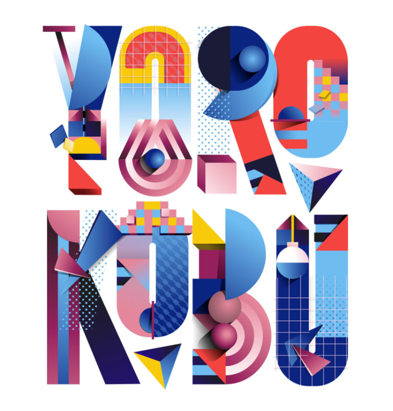
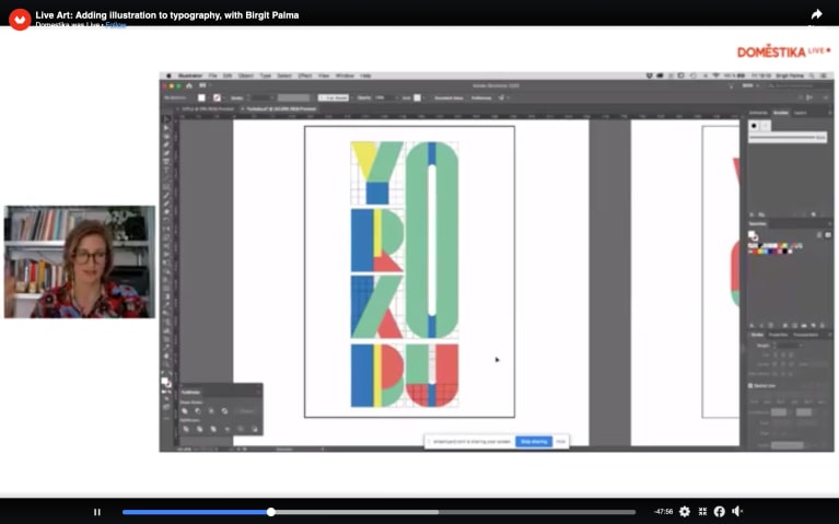
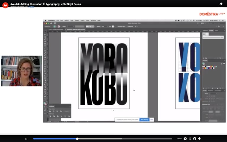
“Yorokobu” means being happy in Japanese. “It was an emotion I wanted to [express through] the typography. For me, being happy is being in movement and dancing.” So, for Birgit’s next proposal, she made a modular type and added movement. In the end, Birgit says that when she looked back on the new text, she liked it, but she didn’t fall in love with it. She also created a proposal that visually expressed the opposite of happy: sad. “I thought I could try a yin and yang approach,” she says. For this proposal, Birgit created an optical illusion in monochrome black.
4. Don’t be afraid to break up geometric design
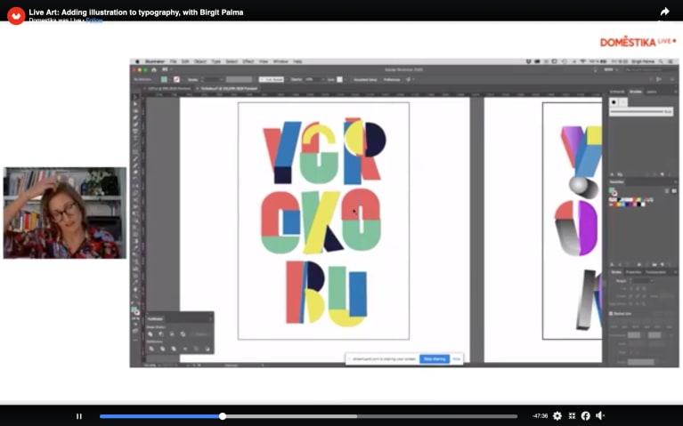
Birgit’s next proposal is an adapted version of the optical illusion; however, she feels that it is “too square,” and the letters lack movement. Birgit drew inspiration from a poster for the Bauhaus for her next proposal. She experimented with fun shapes similar to those featured on the poster and played with the sizes of individual letters to break up the text. She decides to make two of the “O”s smaller than the rest of the letters, creating the illusion that they are suspended in the air.
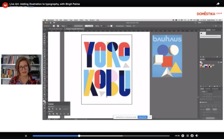
5. Filling the letters with illustrations
Once the shapes of the letters were final, now it was time to illustrate them. Birgit gathered reference images of the Bauhaus and the Memphis Group–an Italian design and architecture collective active in the 80s. Birgit began to rebuild the cover from scratch, incorporating shapes and textures from her reference images until arriving at the final design.

In the rest of her Domestika Live, Birgit shows you how to create illustrated modular typography from scratch.
You may also like:
–Type Illustration: Transform Your Inspiration
–Brush Pen Tutorial: Basic Strokes of the Letters
–6 Books to Inspire Graphic Designers


0 comments