How the Olympics Helped Popularize Pictograms
The Olympics played a major role on the development of this design element, from stick figures to bathroom signs
Go to any swimming pool in the world and you'll probably be able to "read" some of the signs, even if you don't speak the local language. Maybe one tells you not to dive, another warns you to be careful not to slip, and yet another signals where you can go take a shower once you've finished your laps.
But how is it possible that you can understand all of these messages, without ever reading a single word? The answer is simple: pictograms. And the fact that you can understand them so instantly is, in large part, thanks to the Olympic Games.

So, what are pictograms?
Pictograms are simple illustrations that represent a word or idea, using an image, rather than writing, to express something concrete. Often used in wayfinding, they help people navigate spaces, finding everything from a bathroom to a cafeteria without having to worry about anything getting lost in translation.
What do the Olympics have to do with bathroom signs?
While the stick figure man and woman we recognize today weren’t debuted at the Olympic Games, we do have the Games to thank for helping to popularize these kinds of pictograms across the world.
Olympic sports pictograms were first introduced on a major scale at the Tokyo 1964 Games, out of a practical need to visually communicate with an international group of athletes and spectators. Increasing globalization, and the fact that few of the international delegations could speak Japanese, created the need for an elegant design solution that could bridge language and cultural divides.
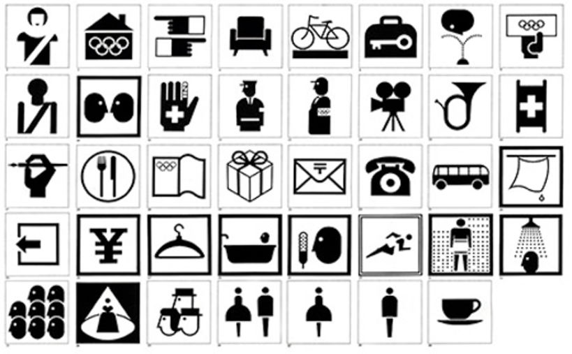
This wasn’t the first time the Olympics used illustrations to communicate to an international audience. Previous efforts can be seen in Games such as Stockholm (1912) and Paris (1924), but these illustrations tended to be complicated and weren’t able to clearly communicate in the way that Tokyo’s 1968 pictograms could.
By literally putting pictograms on an international stage during a time of increasing globalization, the Olympics helped to codify certain visual elements, creating an internationally understood visual language that many delegations carried home with them, and that designers across the world began to use as a reference when creating signs and wayfinding in their own countries.
Why aren’t the Tokyo 1964 pictograms still used today?
Looking at the pictograms created for the 1964 Tokyo Games, you’ll probably notice they don’t quite match the pictograms we often see today. In fact, they don’t even match the pictograms being used for the 2020 Tokyo Games.
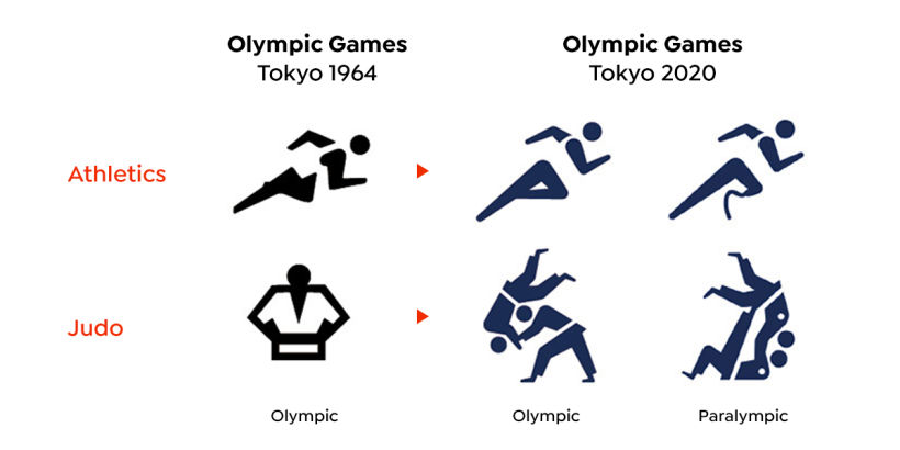
So why reinvent the wheel? Especially when that “wheel” is supposed to be something everyone can instantly understand and agree on?
For each edition of the Olympics, beyond design and branding exercises like creating a logo and mascot, designers are also challenged to create a fresh take on existing pictograms. That’s because, though pictograms are simple illustrations, within these simple images there’s the potential to communicate more than just simple concepts.
How have different Games used pictograms to communicate?
Using pictograms as part of the visual identity of each Games, designers must create unique imagery that communicates something specific about the identity of a specific edition of the Games while also keeping their designs simple enough that they can be quickly and internationally understood.
By looking at some notable examples from history, we can see how designers have tackled this challenge and helped to popularize the pictograms we now find all around us.
1968 Summer Olympics in Mexico City
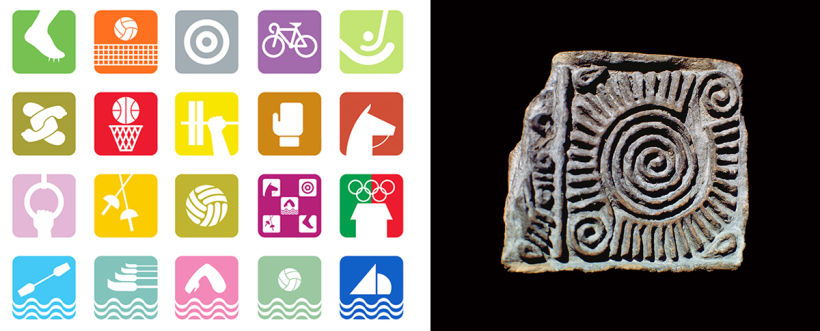
The Mexico Games have become almost as famous for their graphic identity as for the athleticism they celebrated, with designer Lance Wyman creating one of the earliest and most successful examples of a flexible visual identity for the Games. This graphic identity has gone on to challenge future designers to create memorable and flexible identities for Olympic events, and has also had a major influence in the larger world of design and branding.
If you take a quick look at the pictograms that Wyman produced, it isn’t difficult to understand what sport they signal, but they don’t quite look like the pictograms we see today. Instead of showing full figures, they take inspiration from pre-Hispanic glyphs, using only part of an athlete’s body or equipment.
1972 Summer Olympics in Munich
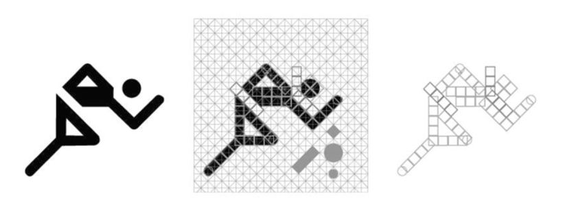
German designer Olt Aicher is credited by many for revolutionizing pictogram design, introducing a series of full body, simple stick figures constructed on angles of 45° or 90° who have served as the basis for many of the pictograms we see today.
Aicher’s work helped define the medium and his influence can be seen in the pictograms designed for many of the following Games.
1992 Summer Olympics in Barcelona
Using brushstrokes and breaking away from the geometric standard set by Aicher, these pictograms display characters in movement. By reducing figures to their head, arms, and legs, the torso is left as negative space.

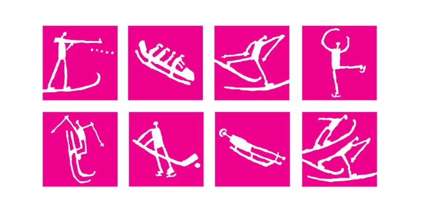
1994 Winter Olympics in Lillehammer
Based on Norwegian rock carvings, including one 4,000 year-old representation of a person on skis, these pictograms have become a case study for how the medium can not only communicate practical information to an international audience, but also reflect local history and heritage.
2000 Summer Olympics in Sydney
Using the boomerang as the base for its silhouettes, these pictograms were intended to pay homage not just to these traditional hunting tools, but also to Australian Aboriginal culture.
Using just dots and lines to suggest a head and arms, they’re an example of how designers can break away from the traditional stick figure formula without sacrificing readability.

2012 Summer Olympics in London
For the London Games, designers came up with two sets of pictograms: a more “traditional” version with simple silhouettes as well as a “dynamic” version featuring two colors and action lines inspired by the map of the London Underground.
Beyond being used as part of wayfinding during the event, they were also used to lead the advertising campaign promoting Ticketing for the Games - showcasing how pictograms can be used as flexible design elements not just to communicate a specific message, but also as part of larger branding.

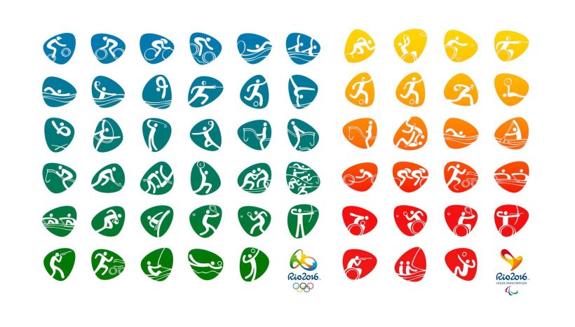
2016 Summer Olympics in Rio
Using a distinctive pebble-shaped frame, inspired by the iconic "Pão de Açúcar" hill, the silhouettes of the figures are formed based on characters from the original typography of Rio 2016, with their fluid lines adding a sense of movement and flexibility to each image.
With each new edition of the Olympic Games, athletes, as well as designers, are challenged to find new ways to reach an even higher level of excellence.
So the next time you tune in to the Olympics, keep an eye out for all of the design elements, like pictograms, that can be easy to take for granted. Because even in the most practical piece of design, a designer’s creativity is always shining through.


+0 Kommentare