


NO MONEY NO HONEY - Logo + Identity
por Mapy D.H. @mapydh
- 132
- 2
- 0
NO MONEY NO HONEY is a group of visual and street artists based in Madrid.
They take part in many and varied art events: exhibitions, art fairs, art markets and live street art jam sessions.
The members of the group come from many professional different fields: graphic designers, engravers, illustrators, visual artists, writers, and tattoo artists.
But especially they always join together to mess with huge wood canvases and walls, where they mix their skills and a wide range of techniques such as: collage, stencils, graffiti, drawing, transfers and silkscreen.
The place where they usually meet is literally covered in paint, its walls are a mess of characters, phrases and tags and its floor is full of splatters and large drops of spray and acrylic paint.
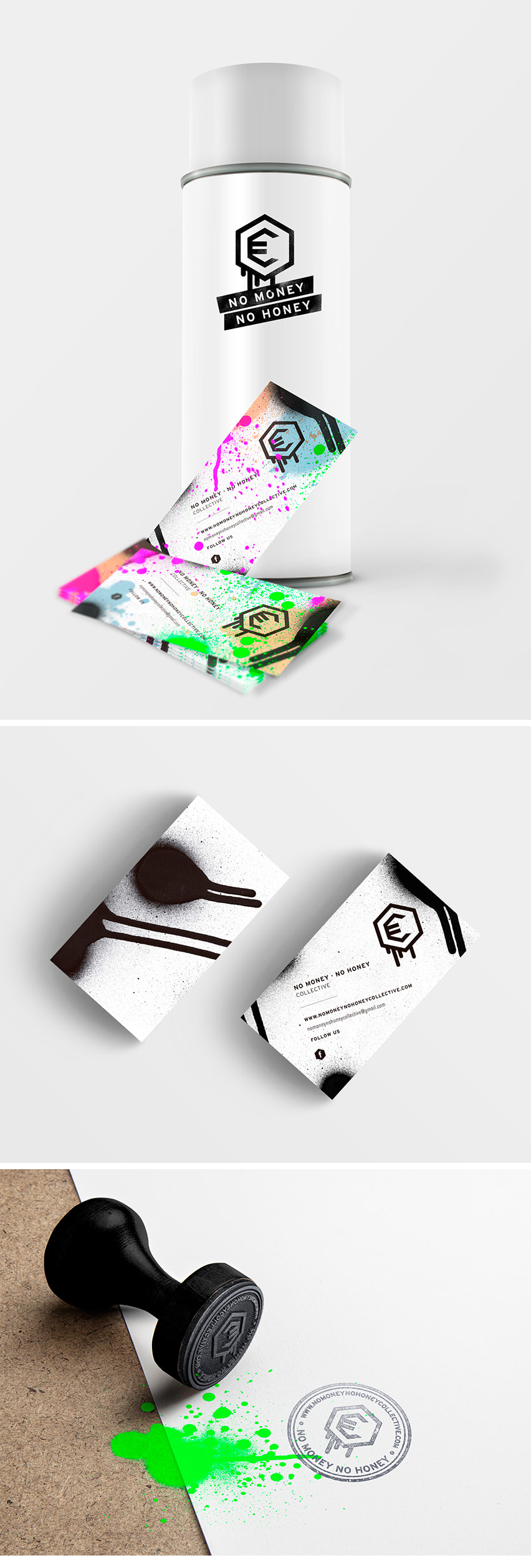
I made their identity inspired by this chaotic mass of color drips and its logo is straightforwardly based in two basic elements that come to mind when thinking about "honey" and "money": an hexagon (hive) and the Euro symbol "€".
It is a low cost identity therefore, brand is monochromatic - to reduce the printing costs - and applied over different surfaces by means of stamps, stencils, stickers etc.
The business cards are conceived to become unique pieces of art because they get splattered at their studio while the group works in their pieces.
-------------------------------------------------------------------------------
NO MONEY NO HONEY es un grupo de artistas visuales y street artists con sede en Madrid.
Toman parte en muchos y variados eventos de arte: exposiciones, ferias de arte, mercados de arte y sesiones arte en vivo.
Los miembros del grupo provienen de muchos ámbitos profesionales diferentes: diseñadores gráficos, ilustradores, grabadores, artistas visuales, escritores y artistas del tatuaje etc.
Pero sobre todo que siempre se unen para crear sobre enormes soportes de madera y muros, donde se mezclan sus habilidades, estilos y una amplia gama de técnicas tales como: collage, stencils, pintura, dibujo, transferencias y serigrafía.
El lugar donde se reúnen generalmente está literalmente cubierto de pintura, sus paredes son un lío de personajes, frases y firmas y su suelo está lleno de salpicaduras y grandes gotas de spray y la pintura acrílica.
Hice su identidad inspirado por esta masa caótica de gotas de color y su logotipo se basa forma directa en dos elementos básicos que vienen a la mente cuando se piensa en "miel" y "dinero": un hexágono (colmena) y el euro símbolo "€".
Es una identidad de bajo coste, por lo tanto, la marca es monocromática - para reducir los costes de impresión - y se aplica sobre diferentes superficies por medio de sellos, plantillas, pegatinas, etc.
Las tarjetas de visita son concebidos para convertirse en piezas de arte únicas porque inevitablemente son salpicadas en su estudio, mientras que el grupo trabaja en sus piezas.


0 comentarios
Entra o únete Gratis para comentar