


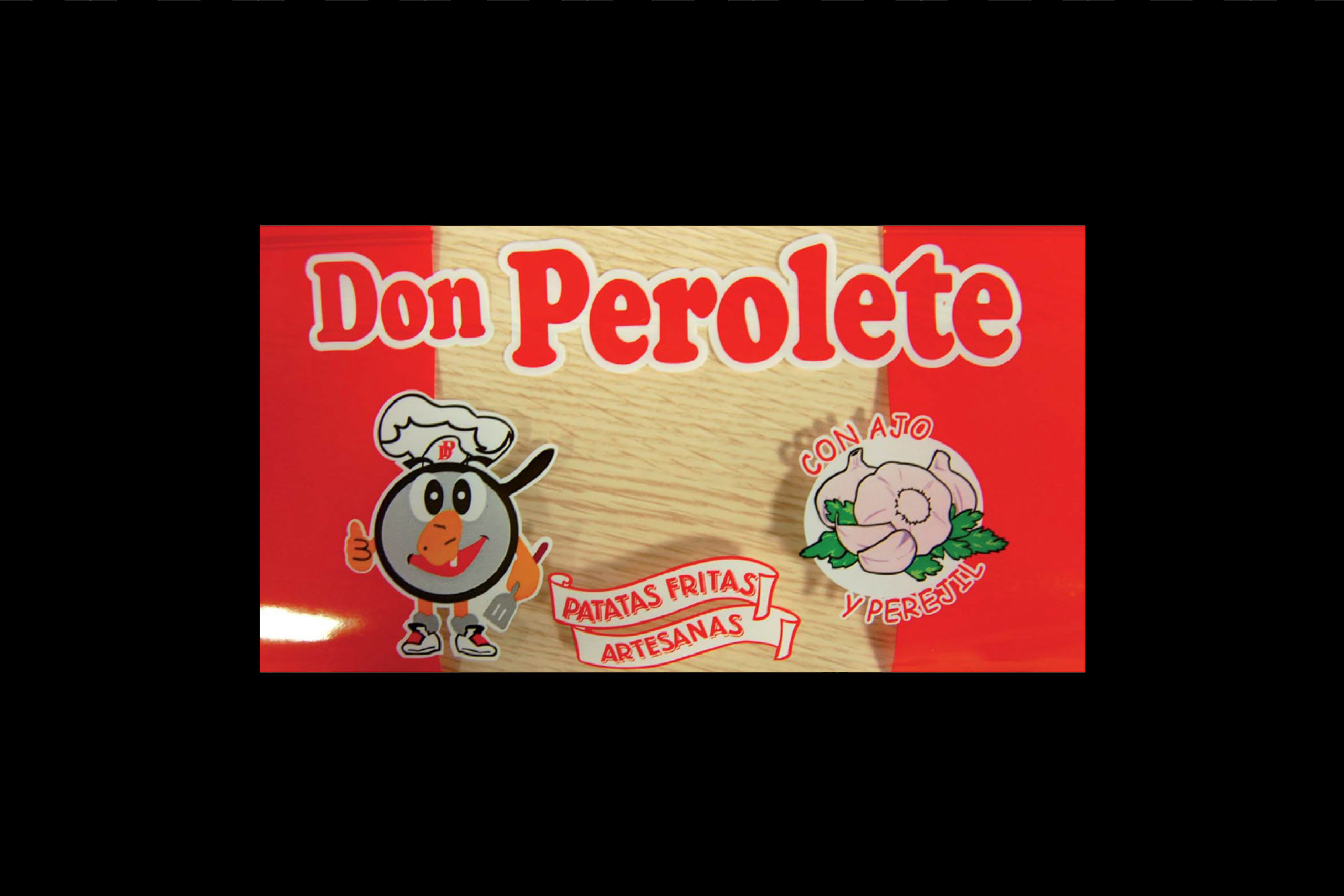
Don Perolete
por Salvartes Design @salvartesdesign
- 1020
- 28
- 13
Don Perolete
Photography Javier Gavill
2014
Esp | Brief y objetivos
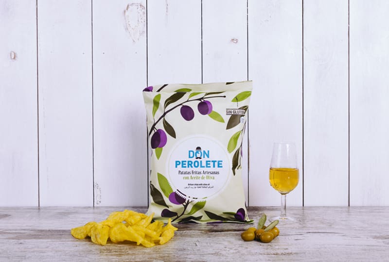
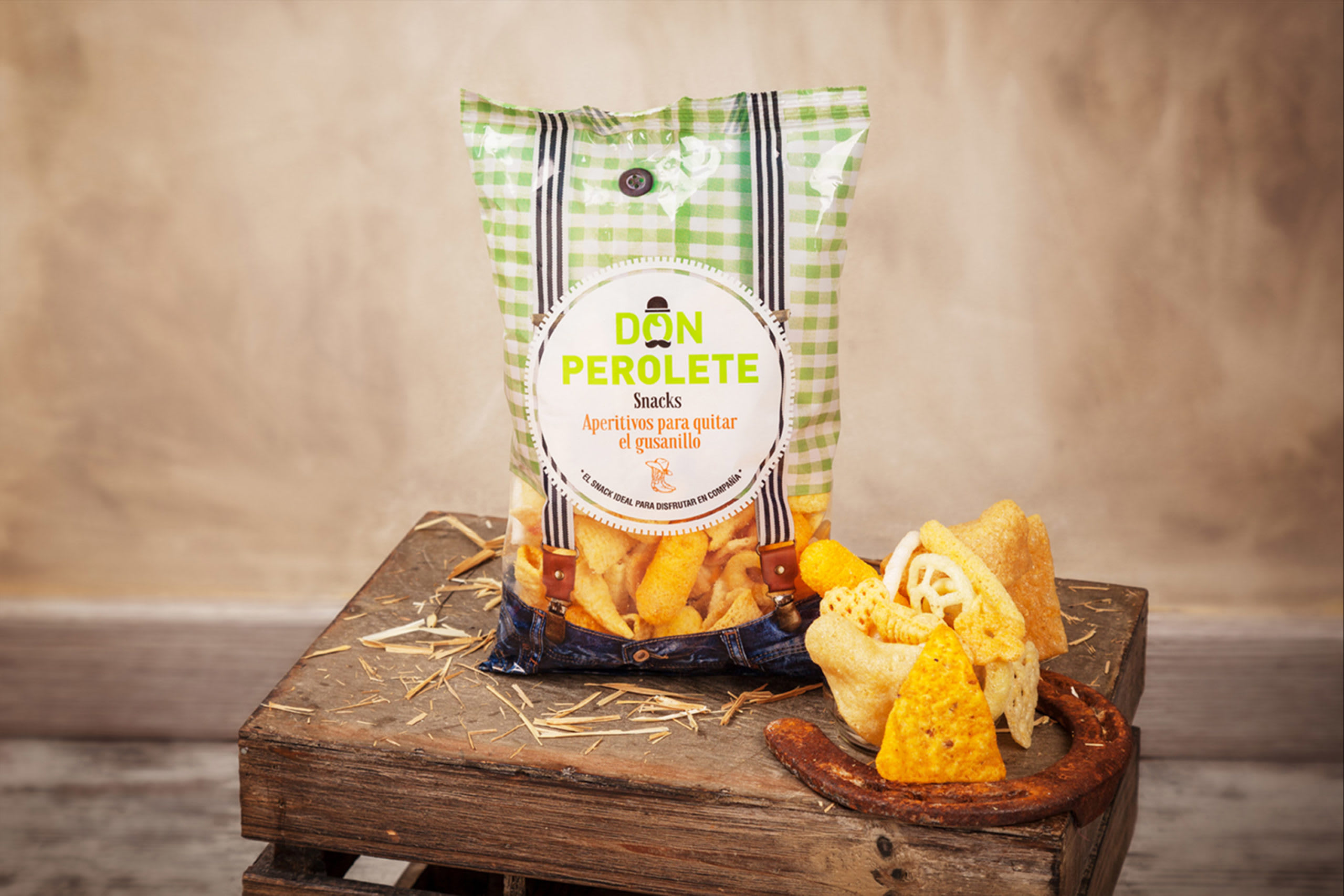
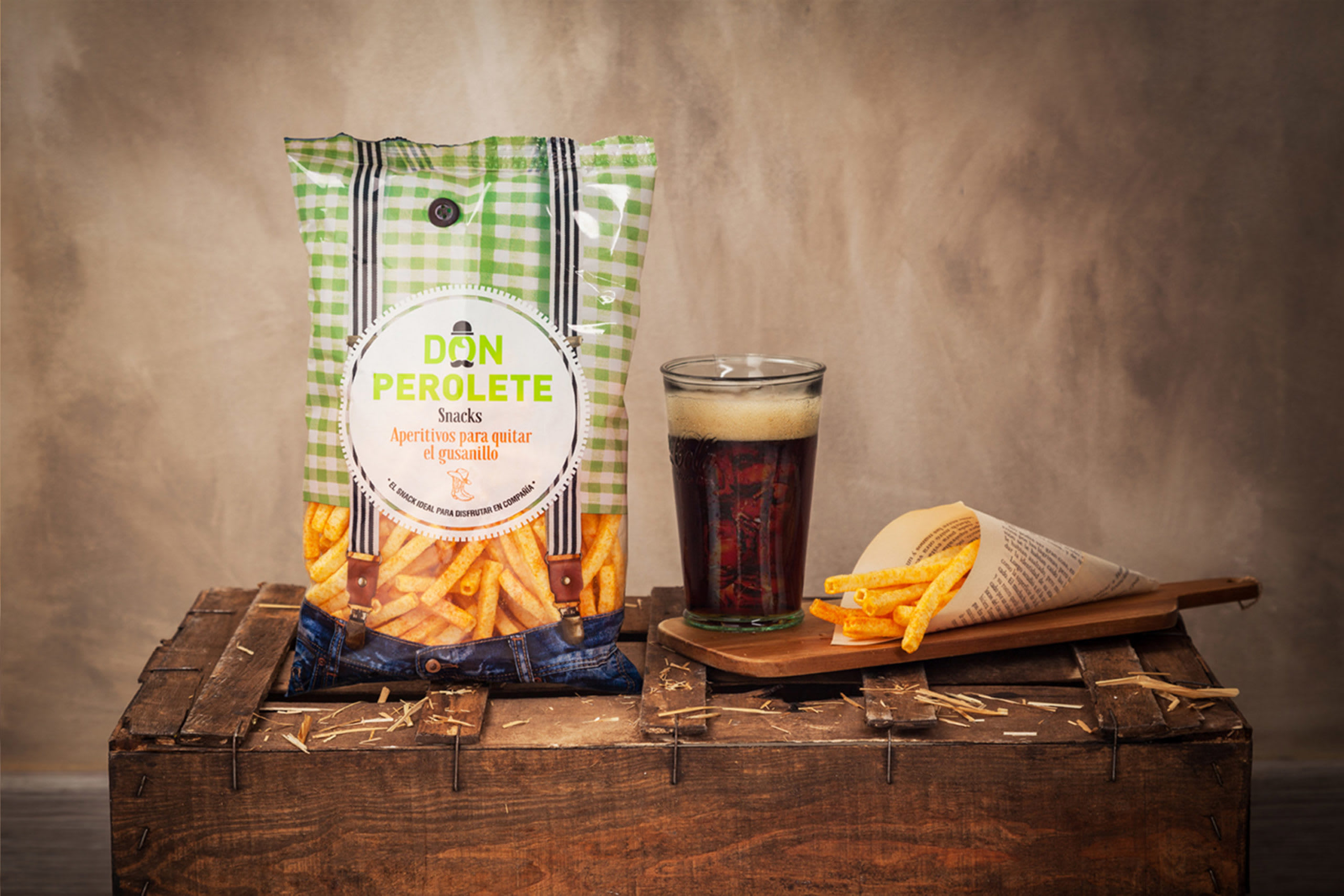
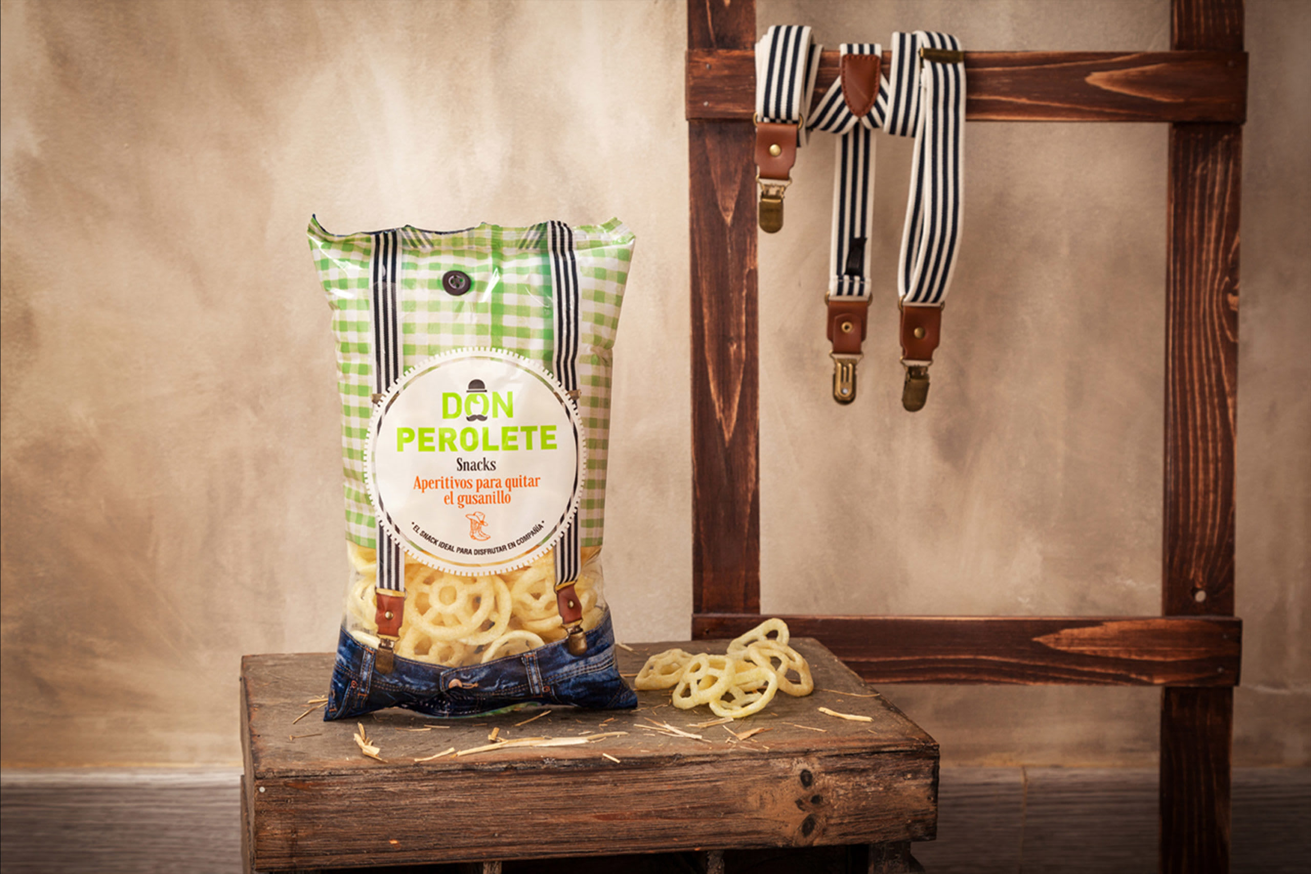
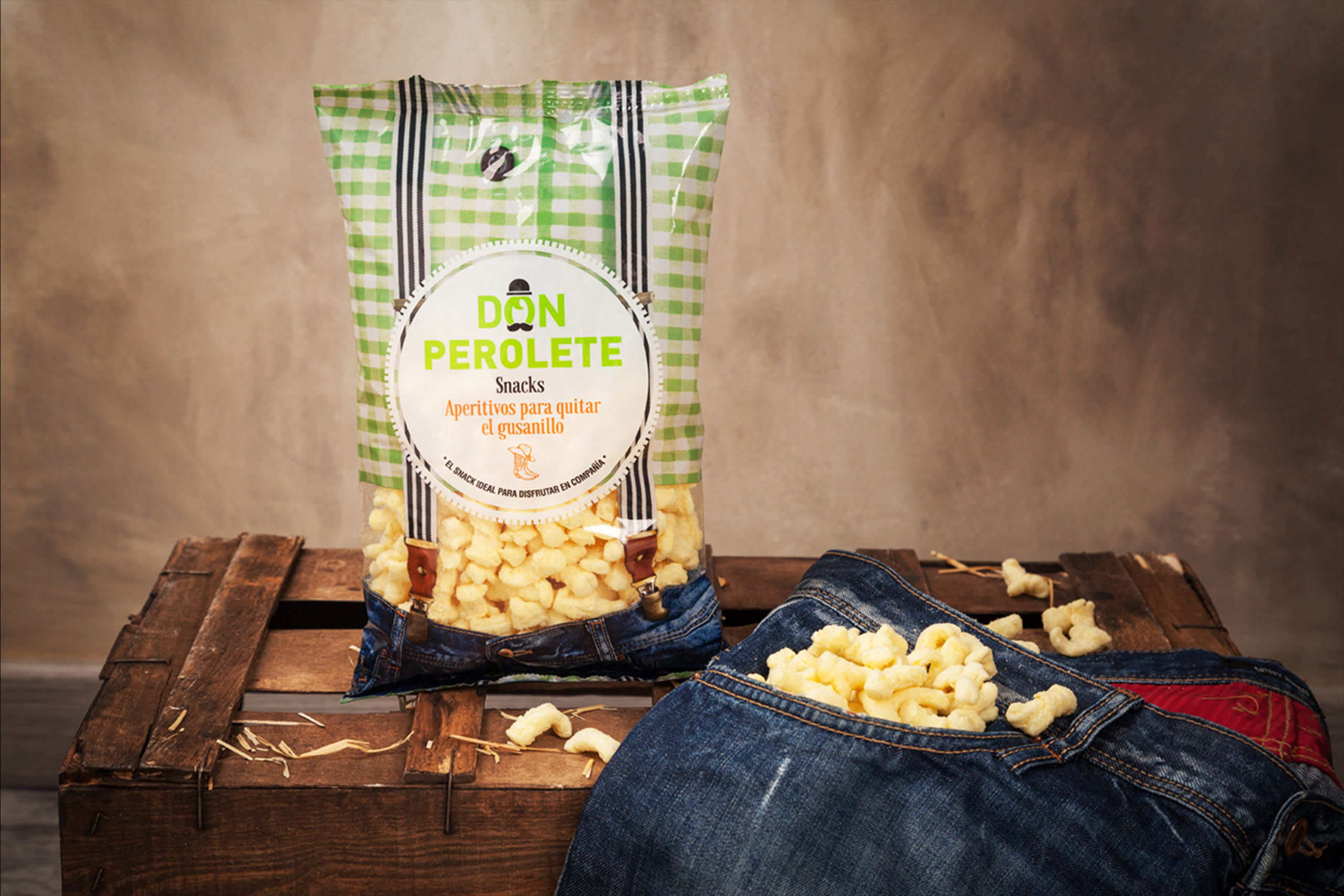
Es una empresa familiar y artesana de patatas fritas situada en Arcos de la Frontera (Cádiz). Su nombre proviene del típico Perol, con el que se freian históricamente las patatas fritas. El objetivo era crear una estrategia de comunicación para poder vender sus productos al mercado internacional gourmet, ampliando la gama y creando un impacto diferente y original en el sector de las “chips”. Para ello, nuestra labor fue hacer un rediseño de la marca y posteriormente un lineal de packaging rompedor, bajo los valores de artesanía, tradición y familia.
Eng | Brief and objectives
Don Perolete is a family business and artisan of chips located in Arcos de la Frontera (Cádiz). Its name comes from the typical Perol, an oil with which chips were historically fried. The objective was to create a communication strategy to sell their products to the international gourmet market, broadening the range and creating an original impact in the chips sector. To do this, our task was to redesign the brand and to create a ground-breaking packaging line, under the values of craftsmanship, tradition and family
Esp | Story-telling
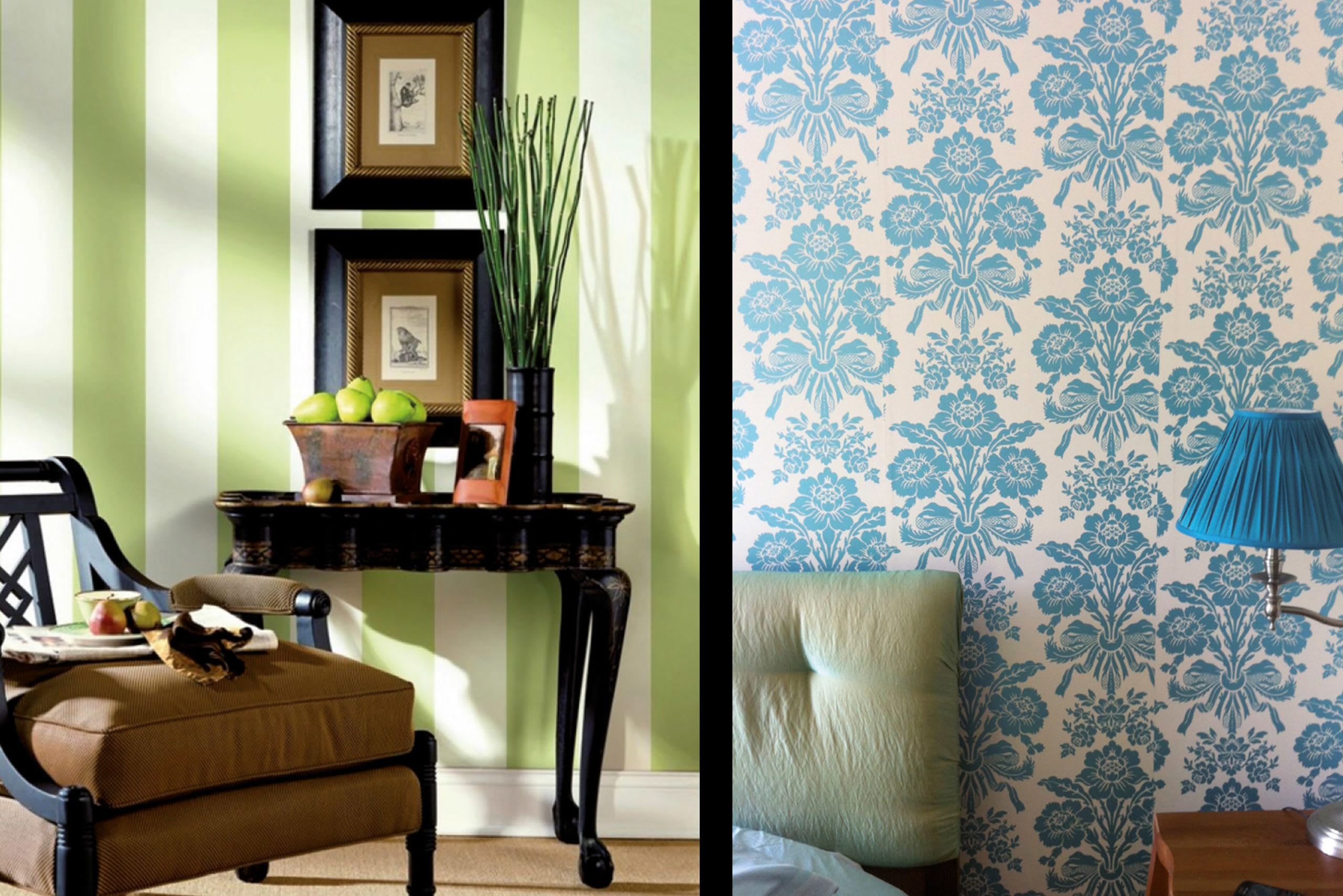
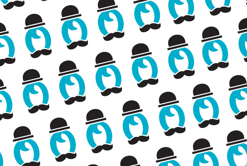
Para crear una marca sólida, decidimos inspirarnos en un personaje ficticio reconocible por todos, como es el clásico abuelo con bombín y bigote. Utilizando este contexto, nos apropiamos de la idea del pattern de William Morris, para colocar al personaje en una escena claramente reconocida: Los papeles clásicos de paredes. Con todo esto creamos una atmósfera con la que llegamos emocionalmente al público, transmitiendo añoranza, familiaridad y tradición.
Eng | Story-telling
To create a solid bland, we got inspired by a fictional character recognizable to all of us, such as the typical grandfather with a bowler hat and a moustache. Using this context, we took Willian Morris’ pattern idea, and put the character in an easily recognizable scene: classic wallpapers. With all this, we created an atmosphere with which we reached the audiences’ emotions, transmitting longing, familiarity and tradition.
Esp | Formulación
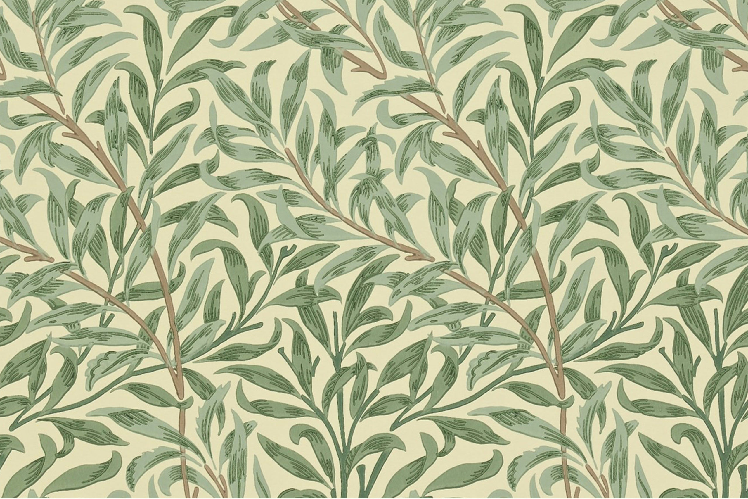
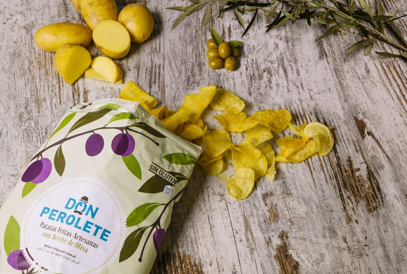
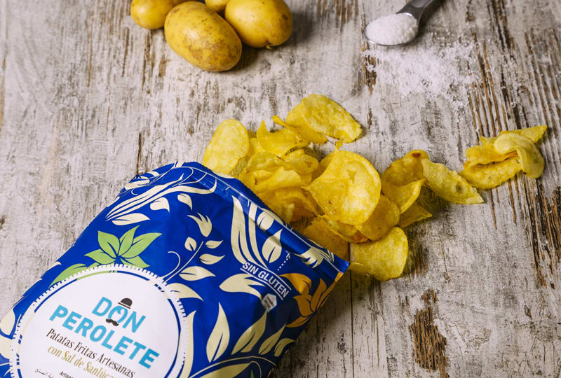
En el rediseño optamos por mejorar el impacto del logotipo; profesionalizando y refinando la tipografía y eliminando el dibujo infantil para así poder competir en el mercado gourmet. Para el tagline, sumamos el valor artesano con una tipografía que recuerda a la tradición en contraposición de la del logotipo más moderna y actual. Como complemento para apoyar gráficamente los packs, decidimos interpretar los motivos de William Morris, adaptándolo a los nuevos tiempos en color y forma y diferenciándolo por sus elementos. El producto final es un regalo para la vista y sobre todo, para el paladar.
Eng | Formulation
For the redesign, we chose to improve the logo’s impact; professionalizing and refining the typography, and eliminating children’s drawings to compete in the gourmet market. For the tagline, we added the artisan value with a typography that reminds to the tradition, as opposed to the modern logo’s. As a complement to graphically support the packs, we decided to interpret William Morris’ motives, adapting them to the new times in colour and shape and differentiating them by their elements. The final product is a gift for the eye, and above all, for the palate.


Esp | Nutrir
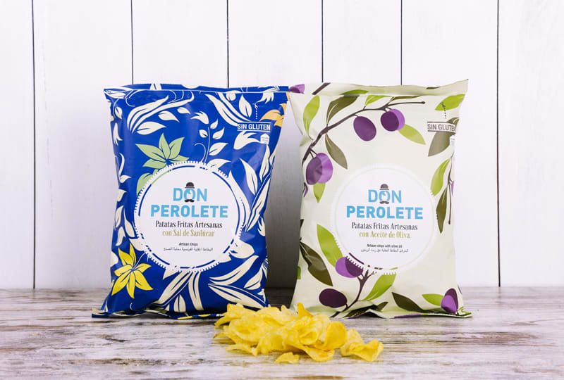
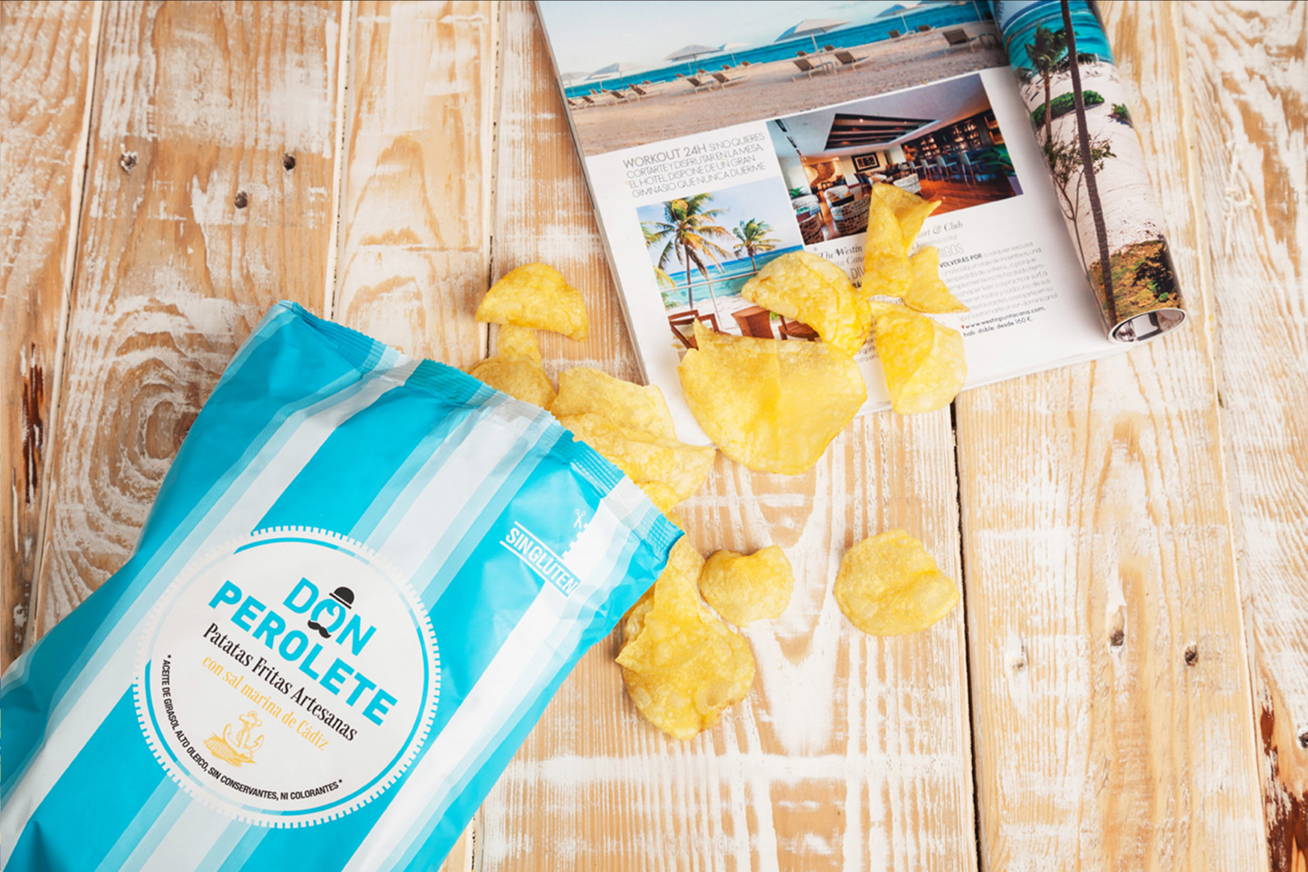
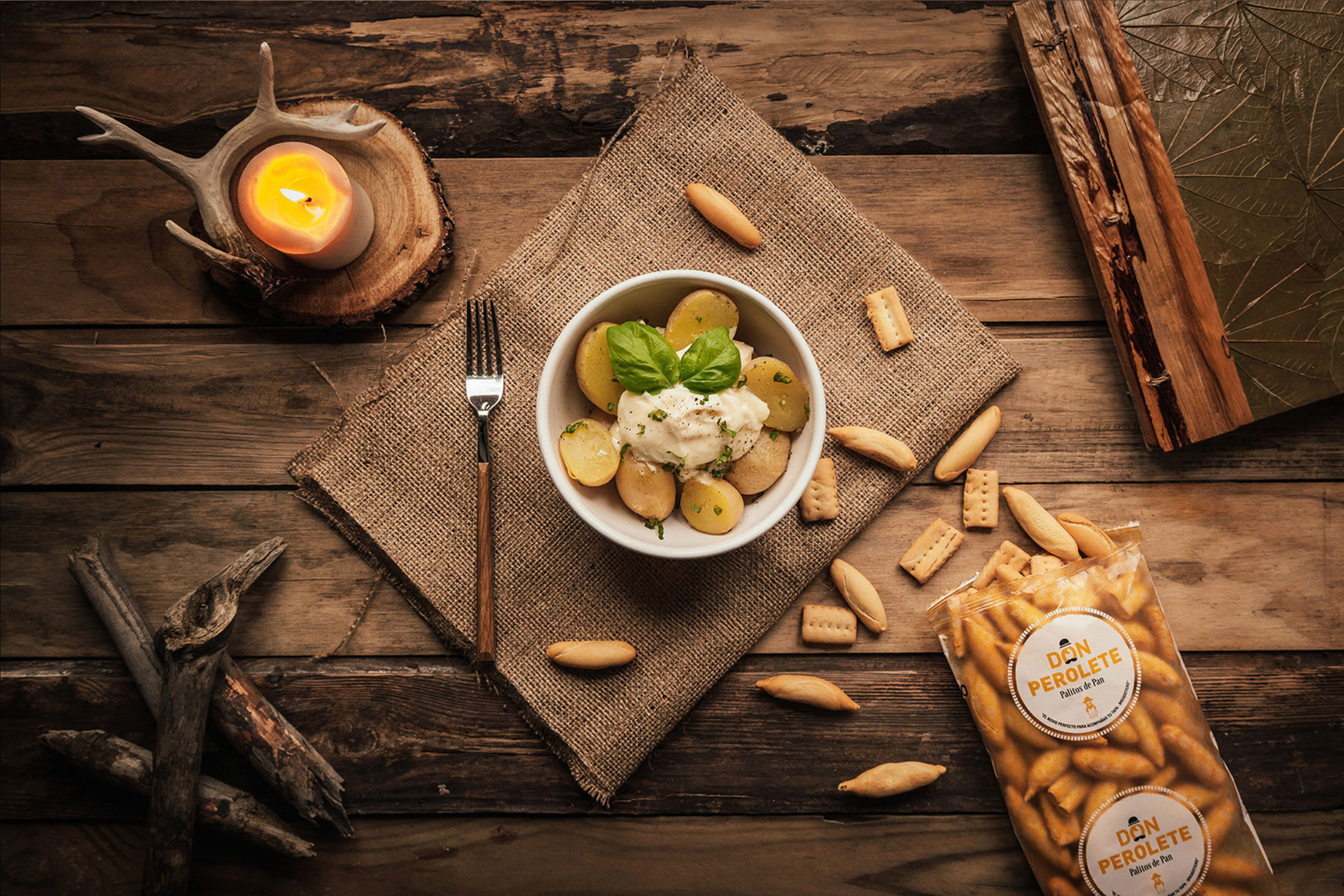
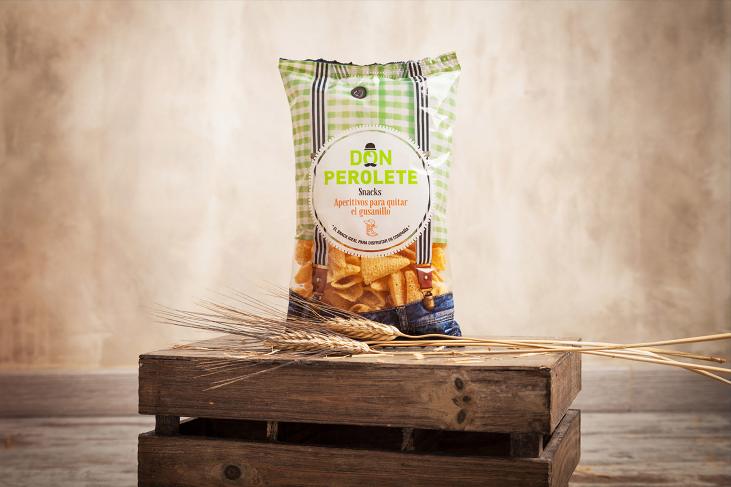
Para que la marca siga creciendo, bajo las mismas pautas se han ido desarrollando diferentes diseños para así poder diferenciar y ampliar las diferentes gamas de productos; todos bajo la misma premisa de artesanía, tradición y familia; sin olvidar el objetivo gourmet y de venta internacional. Por ello, nos encontramos varios casos donde hemos tenido que actualizar y ampliar el discurso de la marca.
Eng | Nurturing
For the brand to continue growing, we have been developing different designs following the same guidelines, in order to differentiate and broaden the range of products, all of them under the same premise of craftsmanship, tradition and family, not forgetting about the gourmet and international sale goal. Because of this, we found various cases in which we had to update and broaden the brand’s discourse.


13 comentarios
Rosa Navas
Muy buen trabajo :)
salvartesdesign
Muchas Gracias Rosa! :D
CarolMotta
¡Fantástico!
Ver original
Ocultar original
albertoojeda
me gusta!!!
artesvisuales
Un gran trabajo Salva. Un saludo.
tamsanserif
Impresionante trabajo, me encanta!
salvartesdesign
Muchas Gracias TamSanSerif, nos alegra que te encante! :D
salvartesdesign
Artes visuales Muchas gracias , estamos muy contentos con este proyecto! :D
Casmic Lab
¡primavera!
Ver original
Ocultar original
salvartesdesign
Gracias Casmic Lab
enca.guerrero
Chulíiiissiiimoooo!!! me encanta :-)
marova
¡Hermoso!
salvartesdesign
Muchas gracias marova :D :D :D
Entra o únete Gratis para comentar