


Course project
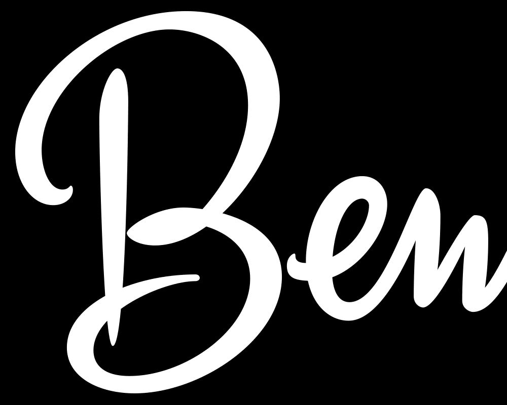
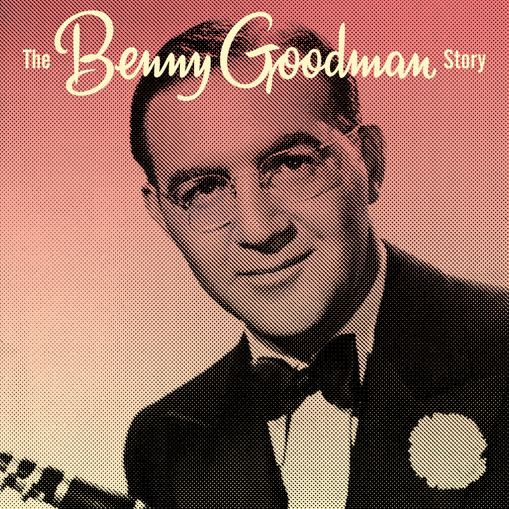
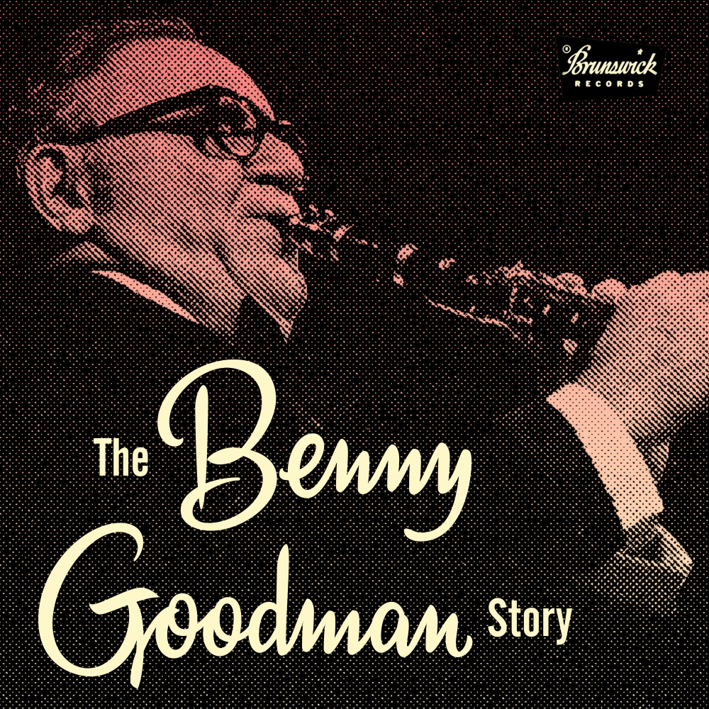
The Benny Goodman Story
by Bogidar Mascareñas Vizcaíno @bogidar_mascarenas
- 1553
- 52
- 22
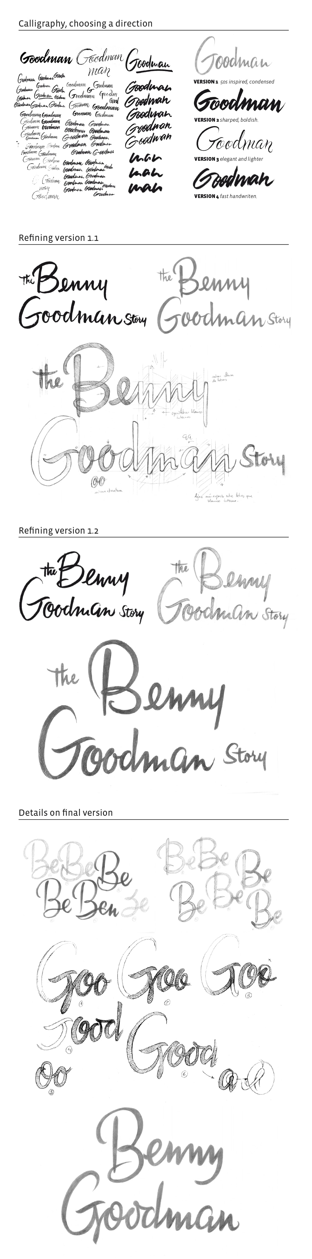
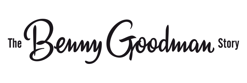
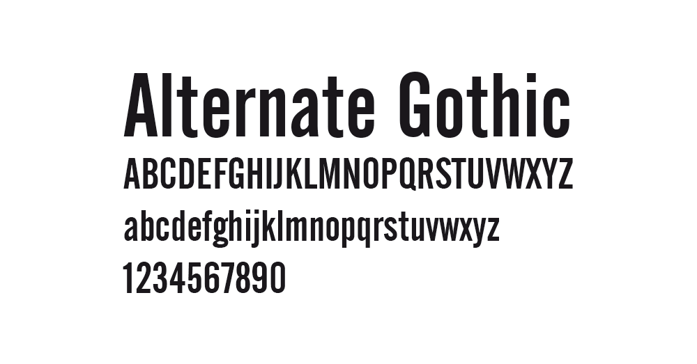
Pues aqui está el logo! finalmente he escogido una tipografia de palo seco para acompañar lo. Se llama Alternate Gothic y es de los 50.
Gracias Iván por tu paciencia conmigo en las correcciones! he aprendido una burrada con este curso!
ps: siento no haber traducido el proceso al castellano.


22 comments
relajaelcoco
Teacher PlusHow cool you have the Benny Goodman for the old and new gods.
See original
Hide original
Bogidar Mascareñas
@relajaelcoco jajjajja @relajaelcoco you very muchc cracken!
See original
Hide original
miguelon
Staff PlusIt's great! very cool. It would be good if you also put here in Domestika, the process that you have followed to be able to enjoy it without having to visit another site. It is much easier for everyone to comment. !! Congratulations!!
See original
Hide original
Bogidar Mascareñas
Voucher! only I was hesitant to put everything in order not to make it too long! but I don't mind putting the process here too! I will change it ;)
See original
Hide original
alberto__alvarez
No words, exquisite work, Bodigar ... thank you for sharing it, and for explaining the process. Could you tell us a bit about that program you use? RoboFont? What advantages does it have over a program like Illustrator?
See original
Hide original
Bogidar Mascareñas
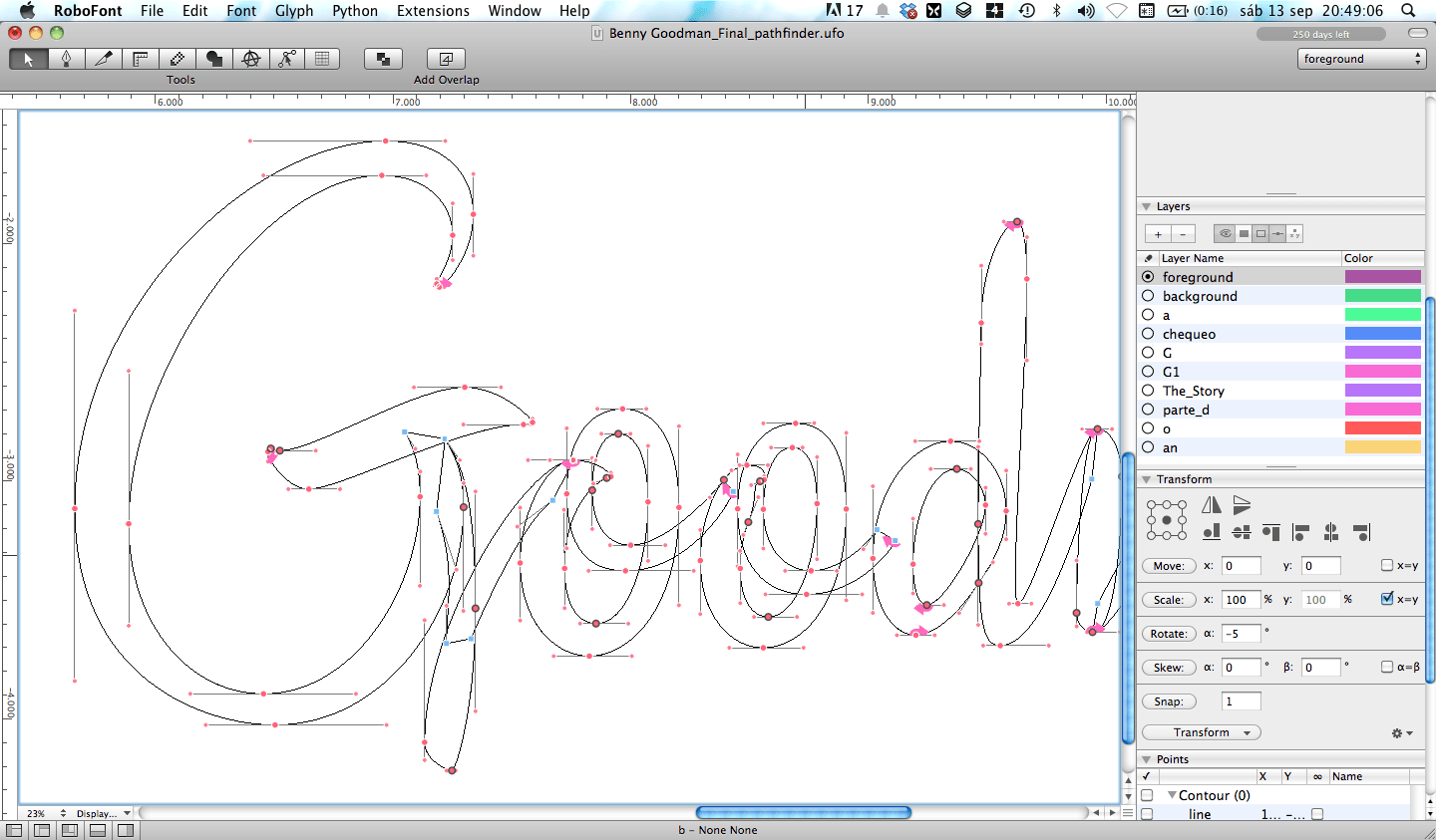
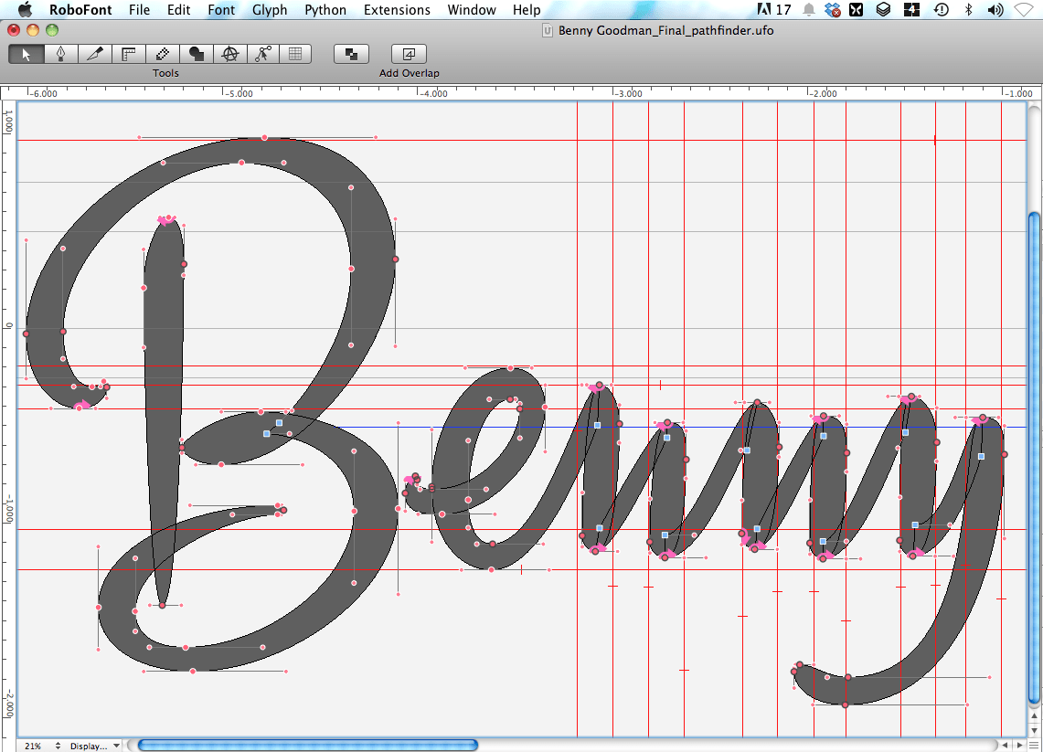
Hello @albertoalvarez at the moment of truth it does not matter with what you vectorize, if you learn to do it well, orthogonal (putting "only" vertical and horizontal) will look just as good for you whatever you use. Then Robofont is designed to do typography, but I have gotten used to working in this program so for me it is easier to work from here.
Robofont, has some little things that make your life a little easier, such as moving the midpoint without moving the handles, I don't know if I explain myself? It is not easy haha without showing images. Also when you eliminate an excess point, the curve does not go to hell for example. The truth is that it has things that make it very pleasant when you have been around for a while. But it is difficult to do at first. You can try it, there is a 30 day trial;)
See original
Hide original
miguelon
Staff PlusGreat Bogidar !! This has more body. Great.
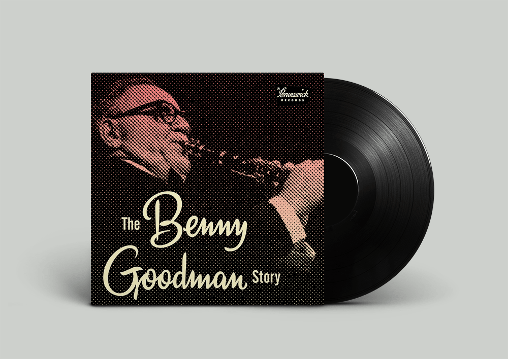
One last recommendation. If you put the image at the end with the disc first, when people say they like it, it will be the image that appears in the activity (it is very cool and it is good for people to see it. They are little tricks that will help your project have more presence.
Congratulations on all the development, it is not long at all. Nice to see the process !!
See original
Hide original
Bogidar Mascareñas
Thank you very much @miguelon for the advice;) it helps to know! ^^
See original
Hide original
microbians
StaffBig project. I have shared it with you on FB;)
See original
Hide original
miguelon
Staff PlusThank you very much Bogidar for participating with such a great project. !! Congratulations!!
See original
Hide original
Bogidar Mascareñas
Thank you very much @microbians if you are all very nice here at Domestika! : P
See original
Hide original
alberto__alvarez
Thanks for the advice of "orthogonality", I had not fallen into that of vectoring at right angles ... nor have I ever done it ... let's see what I get, either in robofont or illustrator.
See original
Hide original
Bogidar Mascareñas
Check out this article: http://theagsc.com/community/tutorials/so-whats-the-big-deal-with-horizontal-vertical-bezier-handles-anyway
@albertoalvarez maybe I'll clarify a bit. Think that by putting them like this, you have much fewer options of where to put them and in the end you control the curve much better;)
See original
Hide original
ivancastro
Teacher PlusVery good work, Bogidar. the work process has been very meticulous and it has cost to polish all the details, but the finish is very good. Congratulations!
See original
Hide original
Bogidar Mascareñas
Thank you very much @ivancastro !
See original
Hide original
Bogidar Mascareñas
thanks @andressanchez ;)
See original
Hide original
julio_rodriguez
Congratulations, you have been great !!
See original
Hide original
manugarcia
Bodigar. Good idea putting the process and different close-ups of the design. I will do the same when I present mine, although I still have a way to go :)
The design comes off!
See original
Hide original
baptistepons
Great Bogidar, I love the process and the result. The only thing that doesn't quite convince me is the two-line version of the label and perhaps the relationship of size and composition of the letters with the format of the cover, but the one-line version has a lot of strength and is very well compensated. Congratulations!
See original
Hide original
Bogidar Mascareñas
Thank you very much @baptistepons is true that it works worse in 2 lines! thanks for the constructive criticism;)
See original
Hide original
Log in or join for Free to comment